Poster and Poster Presentation
advertisement
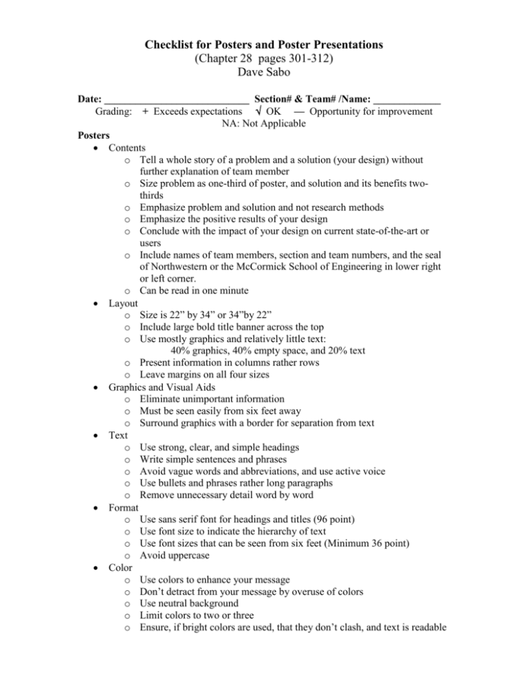
Checklist for Posters and Poster Presentations (Chapter 28 pages 301-312) Dave Sabo Date: ____________________________ Section# & Team# /Name: _____________ Grading: + Exceeds expectations OK — Opportunity for improvement NA: Not Applicable Posters Contents o Tell a whole story of a problem and a solution (your design) without further explanation of team member o Size problem as one-third of poster, and solution and its benefits twothirds o Emphasize problem and solution and not research methods o Emphasize the positive results of your design o Conclude with the impact of your design on current state-of-the-art or users o Include names of team members, section and team numbers, and the seal of Northwestern or the McCormick School of Engineering in lower right or left corner. o Can be read in one minute Layout o Size is 22” by 34” or 34”by 22” o Include large bold title banner across the top o Use mostly graphics and relatively little text: 40% graphics, 40% empty space, and 20% text o Present information in columns rather rows o Leave margins on all four sizes Graphics and Visual Aids o Eliminate unimportant information o Must be seen easily from six feet away o Surround graphics with a border for separation from text Text o Use strong, clear, and simple headings o Write simple sentences and phrases o Avoid vague words and abbreviations, and use active voice o Use bullets and phrases rather long paragraphs o Remove unnecessary detail word by word Format o Use sans serif font for headings and titles (96 point) o Use font size to indicate the hierarchy of text o Use font sizes that can be seen from six feet (Minimum 36 point) o Avoid uppercase Color o Use colors to enhance your message o Don’t detract from your message by overuse of colors o Use neutral background o Limit colors to two or three o Ensure, if bright colors are used, that they don’t clash, and text is readable (over) Presentations Contents o Entice viewer with an opening line, leading to problem statement o Tell a whole story of a problem and a solution (your design) Describe problem briefly Describe how the design works…overview first then a few key features and benefits Emphasize the positive results of your design Conclude with the impact of your design on current state-of-the-art or users o Be prepared to improve parts of your presentations “on the fly” o Ask viewers periodically if they have any questions Two versions o Two minute version for casual viewers o Five minute version for interested viewers including judges Props to be displayed by other teammates during presentation (This is not covered in text) o Make use of prototype, current design, if available, and handout in addition to poster o Show shortcomings of current design in problem statement very briefly o Point out features of the prototype o Demonstrate the use of the prototype o Point to sections of the poster for the speaker to enable the speaker to keep focus on the viewers Body language o Look at the viewers, maintaining good eye contact o Stand up straight and avoid slouching o Stand to the side of the poster o Speak up; it’s crowded and a noisy hallway o Point to sections of the poster but don’t read directly from the poster o Don’t put your hands in your pockets o Don’t use note cards. o Memorize your opening sentence, if necessary, but not the rest of your talk Professional demeanor o Dress code Men: Nice slacks, shirt with collar, tie, and possibly a jacket or suit coat Women: A skirt, dress or nice slacks o Greet viewers o Read body language of viewers to determine understanding o Solicit questions during your presentations o Thank viewers when they leave
