Elastic map From Wikipedia, the free encyclopedia Linear PCA
advertisement
Elastic map
From Wikipedia, the free encyclopedia
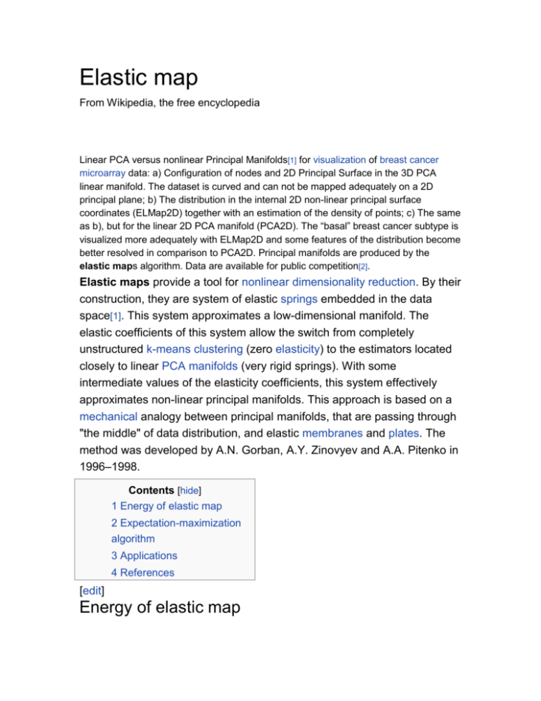
Linear PCA versus nonlinear Principal Manifolds[1] for visualization of breast cancer
microarray data: a) Configuration of nodes and 2D Principal Surface in the 3D PCA
linear manifold. The dataset is curved and can not be mapped adequately on a 2D
principal plane; b) The distribution in the internal 2D non-linear principal surface
coordinates (ELMap2D) together with an estimation of the density of points; c) The same
as b), but for the linear 2D PCA manifold (PCA2D). The “basal” breast cancer subtype is
visualized more adequately with ELMap2D and some features of the distribution become
better resolved in comparison to PCA2D. Principal manifolds are produced by the
elastic maps algorithm. Data are available for public competition[2].
Elastic maps provide a tool for nonlinear dimensionality reduction. By their
construction, they are system of elastic springs embedded in the data
space[1]. This system approximates a low-dimensional manifold. The
elastic coefficients of this system allow the switch from completely
unstructured k-means clustering (zero elasticity) to the estimators located
closely to linear PCA manifolds (very rigid springs). With some
intermediate values of the elasticity coefficients, this system effectively
approximates non-linear principal manifolds. This approach is based on a
mechanical analogy between principal manifolds, that are passing through
"the middle" of data distribution, and elastic membranes and plates. The
method was developed by A.N. Gorban, A.Y. Zinovyev and A.A. Pitenko in
1996–1998.
Contents [hide]
1 Energy of elastic map
2 Expectation-maximization
algorithm
3 Applications
4 References
[edit]
Energy of elastic map
Let data set be a set of vectors S in a finite-dimensional Euclidean space.
Elastic map is represented by a set of nodes Wj in the same space. For
each datapoint a host node is the closest node Wj (if there are several
closest nodes then one takes the node with the smallest number). The
data set S is divided on classes .
The approximation energy is distortion
this is the energy of the springs with unite elasticity which connect each
data point with its host node.
On the set of nodes an additional structure is defined. Some pairs of
nodes, (Wi,Wj), are connected by elastic edges. Let this set of pairs be E.
Some triples of nodes, (Wi,Wj,Wk) are the bending ribs. Let this set of
triples be G.
The stretching energy is
The bending energy is
where λ and μ are the stretching end bending modules.
For example, in the 2D rectangular grid the elastic edges are just vertical
and horizontal edges (pairs of closest vertices) and the bending ribs are
the vertical or horizontal triples of consecutive (closest) vertices.
The energy of the elastic map is U
= D + UE + UG.
The elastic map should be in the mechanical equilibrium: it should
minimise the energy U.
[edit]
Expectation-maximization algorithm
For a given splitting of the dataset S in classes Kj minimization of the
quadratic functional U is a linear problem with the sparse matrix of
coefficients. Therefore, similarly to PCA or k-means, a splitting method is
used:
For given {Wj} find {Kj};
For given {Kj} minimize U and find {Wj};
If no change, terminate.
This expectation-maximization algorithm guarantees a local minimum of U.
For improving the approximation various additional methods are proposed.
For example, the softening strategy is used. This strategy starts with a rigid
grids (small length, small bending and large elasticity modules λ and μ
coefficients) and finishes with soft grids (small λ and μ). The training goes
in several epochs, each epoch with its own grid rigidness. Another
adaptive strategy is growing net: one stars from small amount of nodes
and gradually adds new nodes. Each epoch goes with it own number of
nodes.
[edit]
Applications
Application of principal curves build by the elastic maps method: Nonlinear quality of life
index[3]. Points represent data of the UN 171 countries in 4-dimensional space formed
by the values of 4 indicators: gross product per capita, life expectancy, infant mortality,
tuberculosis incidence. Different forms and colors correspond to various geographical
locations and years. Red bold line represents the principal curve, approximating the
dataset.
Most important applications are in bioinformatics[4] [5], for exploratory data
analysis and visualisation of multidimensional data, for data visualisation in
economics, social and political sciences[6], as an auxiliary tool for data
mapping in geographic informational systems and for visualisation of data
of various nature.
Recently, the method is adapted as a support tool in the decision process
underlying the selection, optimization, and management of financial
portfolios.[7]
[edit]
Linear PCA versus nonlinear Principal Manifolds[1] for visualization of breast cancer
microarray data: a) Configuration of nodes and 2D Principal Surface in the 3D PCA
linear manifold. The dataset is curved and can not be mapped adequately on a 2D
principal plane; b) The distribution in the internal 2D non-linear principal surface
coordinates (ELMap2D) together with an estimation of the density of points; c) The same
as b), but for the linear 2D PCA manifold (PCA2D). The “basal” breast cancer subtype is
visualized more adequately with ELMap2D and some features of the distribution become
better resolved in comparison to PCA2D. Principal manifolds are produced by the
elastic maps algorithm. Data are available for public competition[2].

