FEEDBACK as of 10/3/11 The "About NAMI CA
advertisement
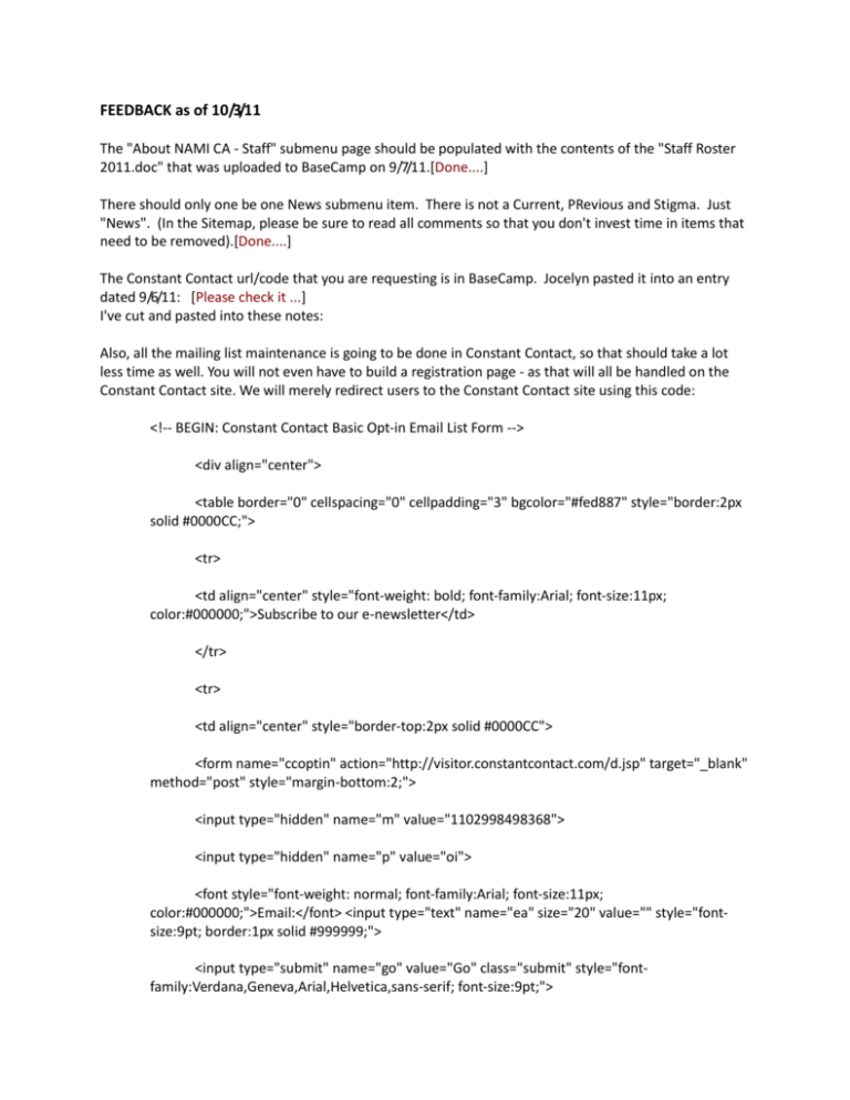
FEEDBACK as of 10/3/11 The "About NAMI CA - Staff" submenu page should be populated with the contents of the "Staff Roster 2011.doc" that was uploaded to BaseCamp on 9/7/11.[Done....] There should only one be one News submenu item. There is not a Current, PRevious and Stigma. Just "News". (In the Sitemap, please be sure to read all comments so that you don't invest time in items that need to be removed).[Done....] The Constant Contact url/code that you are requesting is in BaseCamp. Jocelyn pasted it into an entry dated 9/6/11: [Please check it ...] I've cut and pasted into these notes: Also, all the mailing list maintenance is going to be done in Constant Contact, so that should take a lot less time as well. You will not even have to build a registration page - as that will all be handled on the Constant Contact site. We will merely redirect users to the Constant Contact site using this code: <!-- BEGIN: Constant Contact Basic Opt-in Email List Form --> <div align="center"> <table border="0" cellspacing="0" cellpadding="3" bgcolor="#fed887" style="border:2px solid #0000CC;"> <tr> <td align="center" style="font-weight: bold; font-family:Arial; font-size:11px; color:#000000;">Subscribe to our e-newsletter</td> </tr> <tr> <td align="center" style="border-top:2px solid #0000CC"> <form name="ccoptin" action="http://visitor.constantcontact.com/d.jsp" target="_blank" method="post" style="margin-bottom:2;"> <input type="hidden" name="m" value="1102998498368"> <input type="hidden" name="p" value="oi"> <font style="font-weight: normal; font-family:Arial; font-size:11px; color:#000000;">Email:</font> <input type="text" name="ea" size="20" value="" style="fontsize:9pt; border:1px solid #999999;"> <input type="submit" name="go" value="Go" class="submit" style="fontfamily:Verdana,Geneva,Arial,Helvetica,sans-serif; font-size:9pt;"> </form> </td> </tr> </table> </div> <!-- END: Constant Contact Basic Opt-in Email List Form --> <!-- BEGIN: SafeSubscribe --> <div align="center" style="padding-top:5px;"> <a href="http://www.constantcontact.com/safesubscribe.jsp" target="_blank"><img src="http://img.constantcontact.com/ui/images1/safe_subscribe_logo.gif" border="0" width="168" height="14" alt=""/></a> </div> <!-- END: SafeSubscribe --> I've asked Jessica her preference for the contents of the "Advocacy & Legislation - Legislation Page". She is on vacation through Oct 7th but should have feedback after that. In General, whenever you use the word "NAMI" always use capital letters. It is an acronymn and needs to be spelled with all caps. In Admin Panel "About Mental Illness - Spotlight" is not a highlevel submenu. It should appear that as a submenu of Recovery. [Sorry.. it is already in recovey as lower submenu...] We've kept the "About Mental Illness - Links" submenu even though there are not any entries. In the Admin Panel, is there a way to edit this page if we want to add links to it? [ok... we will provide you to add links for this ] Regarding the "Advocacy & Legislation - Policy Platform Statement" - please use the url that we've given you BUT don't open it as a popup. Make it look like a regular page with the horizontal navigator for "Advocacy & Legislation". http://www.namicalifornia.org/webbdata/ABOUTUS-DTD-0000-00/NAMI California Bylaws Effective 0814-2004/nami public policy platform (rev jan 2009)_eng.pdf. We will continue to store it at this url even when the website is brought down. If it is easier, to store the pdf in the new site, that is also fine but it should NOT display as a popup. [Done...] [I think it is not good to use static link of a file because it may change in future so we providing you admin facility to change it in all 5 languages] Please correct the order of the "Admin" sub-menu items for "Advocacy & Legislation". They need to match the order that they appear on the dev web page. NOTE: The "MHSA Resources" and "MHSA Updates" should appear as admin submenu choices to "MHSA Policy". [Done...] Classes & Events: - The dotted line separator looks Good! - The headers are centered which is good - Left Justify the contents of the first 3 columns of the Classes & Events list (Event Title, City, Email). They should not be centered in each column. They should be left justified. - When the "More" button is pressed, the resulting displayed text should be a combination of what they currently see for that item PLUS ALL additional Content for that item. This means that when More is pressed, the user should see Event Title, City, email, start, End, Cost and any other content that has been inputted by Administrator that is intended for them to see. If we only show them the additional field, it is dangerous because they could've clicked on the wrong "More" button. Plus often people like to printout a screen shot of the info. [Done...Please check display of detail page] Programs & Services: - The headers are centered which is good - The contents of each column (below the headers) needs to be left justified NOT centered - When the "More" button is pressed, the resulting displayed text should be a combination of what they currently see for that item PLUS ALL additional Content for that item. This means that when More is pressed, the user should see Affiliate, City, Contact, Phone, Email and any other content that has been inputted by Administrator that is intended for them to see. If we only show them the additional field, it is dangerous because they could have clicked on the wrong "More" button. Plus often people like to printout a screen shot of the info. [Done...Please check display of detail page ] Admin Panel - Criminal Justice: - Order the admin submenu items so that they match the order they appear on the Dev page. [Done...] Admin Panel - About NAMI CA: - Rename the spelling of this Admin menu item so that it is correct. Currently is says "NAMI AND CA". It should be "About NAMI CA". - The submenu item in the menu should be spelled with the abbreviation for California as CA "NAMI CA Governance" [Done...] The "About NAMI CA - Contact Us" form is looking good. A few more adjustments to make it look more polished. - Can you please move the radio buttons away from the left margin a bit. They are too close to the left margin. - Please get rid of the extra white space between the radio buttons and the first required email address field. - Use the "Find Your Local NAMI" link as a popup for the link "List of Affiliates". [Done...]
