River Valley Civilizations Infographic Project
advertisement
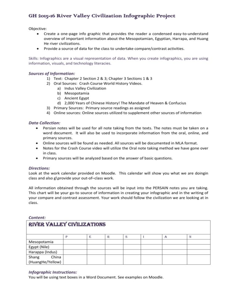
GH 2015-16 River Valley Civilization Infographic Project Objective: Create a one-page info graphic that provides the reader a condensed easy-to-understand overview of important information about the Mesopotamian, Egyptian, Harrapa, and Huang He river civilizations. Provide a source of data for the class to undertake compare/contrast activities. Skills: Infographics are a visual representation of data. When you create infographics, you are using information, visuals, and technology literacies. Sources of Information: 1) Text: Chapter 2 Section 2 & 3; Chapter 3 Sections 1 & 3 2) Oral Sources: Crash Course World History Videos. a) Indus Valley Civilization b) Mesopotamia c) Ancient Egypt d) 2,000 Years of Chinese History! The Mandate of Heaven & Confucius 3) Primary Sources: Primary source readings as assigned 4) Online sources: Online sources utilized to supplement other sources of information Data Collection: Persian notes will be used for all note taking from the texts. The notes must be taken on a word document. It will also be used to incorporate information from the oral, online, and primary sources. Online sources will be found as needed. All sources will be documented in MLA format. Notes for the Crash Course video will utilize the Oral note taking method we have gone over in class. Primary sources will be analyzed based on the answer of basic questions. Directions: Look at the work calendar provided on Moodle. This calendar will show you what we are doingin class and also g\provide your out-of–class work. All information obtained through the sources will be input into the PERSAIN notes you are taking. This chart will be your go-to source of information in creating your infographic and in the writing of your compare and contrast assessment. Your work should follow the civilization we are looking at in class. Content: River Valley Civilizations P E R S I Mesopotamia Egypt (Nile) Harappa (Indus) Shang China (HuangHe/Yellow) Infographic Instructions: You will be using text boxes in a Word Document. See examples on Moodle. A N GH 2015-16 River Valley Civilization Infographic Project Format: 1. One page infographic 2. Incorporates all the info in the above chart 3. Uses visuals to enhance information Rubric: CATEGORY Exemplary Proficient Unsatisfactory Arrangement of Concepts Main concept easily identified; sub concepts branch appropriately from main idea Main concept easily Main concept not clearly identified; most sub identified; sub concepts concepts branch from don’t consistently branch main idea. from main idea. Graphics Graphics used appropriately; greatly enhance the topic and aid in comprehension; are clear, crisp and well situated on the page. Graphics used appropriately most of the time; most graphics selected enhance the topic, are of good quality, and are situated in logical places on the page. Graphics used inappropriately and excessively; graphics poorly selected and don’t enhance the topic; some graphics are blurry and illplaced. Content Reflects essential information; is logically arranged; concepts succinctly presented; no misspellings or grammatical errors Reflects most of the essential information; is generally logically arranged; concepts presented without too many excess words; fewer than three misspellings or grammatical errors. Contains extraneous information; is not logically arranged; contains numerous spelling and grammatical errors. Text Easy to read/ appropriately sized; no more than three different fonts; amount of text is appropriate for intended audience; boldface used for emphasis. Most text is easy to read; uses no more than four different fonts; amount of text generally fits intended audience. Font too small to read easily; more than four different fonts used; text amount is excessive for intended audience. Design Clean design; high visual appeal; four or fewer symbol shapes; fits page without a lot of scrolling; color used effectively for emphasis. Design is fairly clean, with a few exceptions; diagram has visual appeal; four or fewer symbol shapes; fits page well; uses color effectively most of time. Cluttered design; low in visual appeal; requires a lot of scrolling to view entire diagram; choice of colors lacks visual appeal and impedes comprehension.
