Tableau Visualization Assignment
advertisement
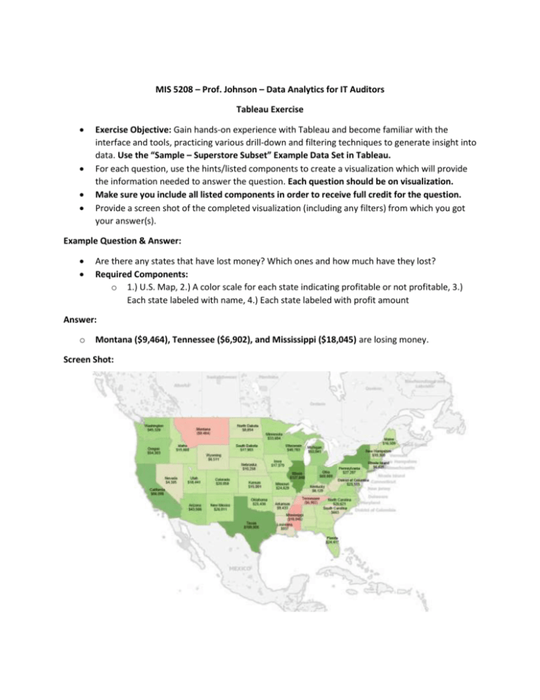
MIS 5208 – Prof. Johnson – Data Analytics for IT Auditors Tableau Exercise Exercise Objective: Gain hands-on experience with Tableau and become familiar with the interface and tools, practicing various drill-down and filtering techniques to generate insight into data. Use the “Sample – Superstore Subset” Example Data Set in Tableau. For each question, use the hints/listed components to create a visualization which will provide the information needed to answer the question. Each question should be on visualization. Make sure you include all listed components in order to receive full credit for the question. Provide a screen shot of the completed visualization (including any filters) from which you got your answer(s). Example Question & Answer: Are there any states that have lost money? Which ones and how much have they lost? Required Components: o 1.) U.S. Map, 2.) A color scale for each state indicating profitable or not profitable, 3.) Each state labeled with name, 4.) Each state labeled with profit amount Answer: o Montana ($9,464), Tennessee ($6,902), and Mississippi ($18,045) are losing money. Screen Shot: Question #1: o o Which state has the highest Sales (Sum)? What is the total Sales for that state? Required Components: o A.) Map of U.S. B.) A color scale indicating total sales C.) Each state labeled with state name D.) Each state labeled with total sales Question #2: o o Which customer segment has both the highest order quantity and average discount rate? What is the order quantity and average discount rate for that state? Required Components: o A.) Bar Chart displaying Order Quantity for each Customer Segment B.) A color scale indicating average discount rate C.) Each customer segment labeled with average discount rate D.) Each customer segment labeled with total Order Quantity Question #3: o o Which Product Category has the highest total Sales? Which Product Category has the worst Profit? Name the Product Category and $ amount for each. Required Components: o A.) Bar Chart displaying total Sales for each Product Category B.) A color scale indicating Profit C.) Each Product Category labeled with total Sales D.) Each Product Category labeled with Profit Question #4: o o o Use the same visualization created for Question #3 What was the Profit on Computer Peripherals (Product Category) in Boca Raton (City) in 2010? Required Components: o A.) All components from Question #3 B.) Filters for each of the Dimensions needed to create a visualization with only one Bar indicating the answer to the question o Hint: Use Quick Filters Question #5: o o o Use a “Packed Bubbles” chart Which Product Department has the highest Shipping Costs? Name the Department and cost. Required Components: o A.) Packed bubble chart showing each Product Department as a colored bubble B.) Use Shipping Cost to display the size of each bubble Question #6: o o o Use the same visualization created for Question #5 What was the shipping cost of Office Supplies for Belkin products (Supplier) in the Corporate Customer Segment in California? Required Components: o A.) All components from Question #5 B.) Filters for each of the Dimensions needed to create a visualization indicating the answer to the question Question #7: o o o Use a Bar Chart Which Supplier products have the highest total Sales? Highest Profit? In which Product Department are these products? Required components: o A.) One Bar chart displaying all information needed to answer the question B.) Each bar labeled with total Sales C.) Each bar labeled with total Profit Question #8: o o o Use a geographic map Which state has the worst Gross Profit Ratio on Envelopes in the Corporate Customer Segment that were Shipped in 2012? Required Components: o A.) A map displaying information required to answer the question B.) A color scale indicating Gross Profit Ratio C.) Each state labeled with state name D.) Each state labeled with Gross Profit Ratio
