Line Graphs Activity
advertisement
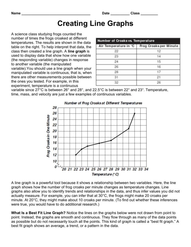
Name ____________________________________ Date __________ Class _________ Creating Line Graphs A science class studying frogs counted the number of times the frogs croaked at different temperatures. The results are shown in the data table on the right. To help interpret that data, the class then created a line graph. A line graph is used to display data that show how one variable (the responding variable) changes in response to another variable (the manipulated variable).You should use a line graph when your manipulated variable is continuous, that is, when there are other measurements possible between the ones you tested. For example, in this experiment, temperature is a continuous variable since 27°C is between 26° and 28°, and 22.5°C is between 22° and 23°. Temperature, time, mass, and velocity are just a few examples of continuous variables. A line graph is a powerful tool because it shows a relationship between two variables. Here, the line graph shows how the number of frog croaks per minute changes as temperature changes. Line graphs also allow you to identify trends and relationships in the data, and thus infer values you did not actually measure. For example, you can infer that at 30°C, the frogs might make 20 croaks per minute. At 20°C, they might make about 10 croaks per minute. (To find out whether these inferences were true, you would have to do additional research.) What Is a Best Fit Line Graph? Notice the lines on the graphs below were not drawn from point to point. Instead, the graphs are smooth and continuous. They flow through as many of the data points as possible but do not necessarily touch all the points. This kind of graph is called a “best fit graph.” A best fit graph shows an average, a trend, or a pattern in the data. You may wonder how scientists know when to use a best fit graph. As you continue to study science, you will see that certain kinds of graphs commonly result from scientific experiments. The graphs shown below are three examples. The first graph shows a straight line, or linear relationship. (Notice that the word linear comes from the word line.) You can read that straight-line graph to see that as the volume of a liquid (the manipulated variable) increases, the mass of that liquid (the responding variable) also increases. The graphs in the center and on the right are described as nonlinear, meaning they are not straight lines. The center graph shows a curve that continues to rise. You can read that graph to see that over time (the manipulated variable), a corn plant’s height (the responding variable) continues to increase. The graph on the right shows a curve that rises and then flattens out. Here, as time (the manipulated variable) passes, the size of the bacteria population (the responding variable) increases steadily until it reaches a certain size. Then, the size of the population becomes constant. Look for these and other patterns as you examine additional graphs. Recognizing the pattern of a graph will help you to understand the actual events it represents. Remember your graph tips! 1. Label the horizontal axis with the name of the manipulated variable. Label the vertical axis with the name of the responding variable. Include the units of measure. 2. Plot each point where the variables intersect. You can do this by following an imaginary line up from the measurement on the x-axis. Then follow a second imaginary line across from the corresponding measurement on the y-axis. Place a dot where the two lines intersect. 3. Consider whether you will plot from point to point or make a best fit graph. If you plot from point to point, each segment connecting two adjacent points should be straight. If you make a best fit graph, the connecting line should be smooth. 4. Give your graph a title that identifies the variables or the relationship between the variables in the graph. SKILLS PRACTICE Creating Line Graphs Use the graph provided to make a graph of the data given below. Then answer the questions that follow . A group of researchers were investigating the properties of an unknown substance. They decided to heat the material to study its melting and boiling behavior. They heated a 1-kg sample of the solid material at a steady rate. They measured and recorded the temperature of the sample every 5 minutes. 1. On your graph paper, make a line graph of the data the group collected. 2. What does the graph tell you about the temperature of the substance at different times during the investigation? 3. Think About It: Use the information from the third column of the data table to explain what is happening during the various sections of your graph. 4. Think About It: How could you use a line graph to help you make predictions about data that were not actually measured?
