CO2 Temp Lab Student Guide
advertisement
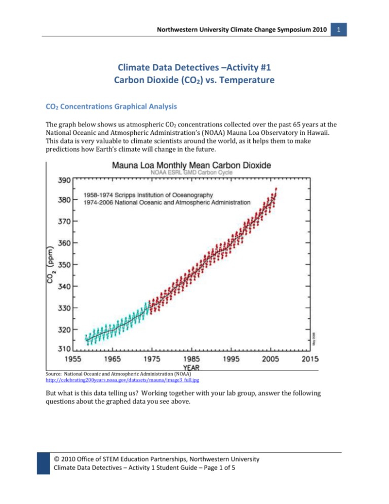
Northwestern University Climate Change Symposium 2010 Climate Data Detectives –Activity #1 Carbon Dioxide (CO2) vs. Temperature CO2 Concentrations Graphical Analysis The graph below shows us atmospheric CO2 concentrations collected over the past 65 years at the National Oceanic and Atmospheric Administration’s (NOAA) Mauna Loa Observatory in Hawaii. This data is very valuable to climate scientists around the world, as it helps them to make predictions how Earth’s climate will change in the future. Source: National Oceanic and Atmospheric Administration (NOAA) http://celebrating200years.noaa.gov/datasets/mauna/image3_full.jpg But what is this data telling us? Working together with your lab group, answer the following questions about the graphed data you see above. © 2010 Office of STEM Education Partnerships, Northwestern University Climate Data Detectives – Activity 1 Student Guide – Page 1 of 5 1 Northwestern University Climate Change Symposium 2010 2 Questions 1. What is the overall trend (pattern) you see in CO2 concentrations over time, from 1958 to 2006? 2. Why is there a zigzag pattern to the CO2 concentration data? What could be causing this to occur? 3. Recalling what you know about greenhouse gases and the greenhouse effect, why is it important for scientists to maintain and analyze this chart over time? 4. What factors could be contributing to the overall trend (pattern) you see in the graphed data? 5. Make a prediction as to what you think will happen to CO2 concentrations 10 years into the future. Explain your prediction. © 2010 Office of STEM Education Partnerships, Northwestern University Climate Data Detectives – Activity 1 Student Guide – Page 2 of 5 Northwestern University Climate Change Symposium 2010 3 Global Annual-Mean Surface Air Temperature Change Graphical Analysis The graph below shows us average yearly surface air temperature change readings collected from meteorological (weather) stations around the world for the last 130 years. This data is also used by climate scientists to help create global climate models and predictions. Source: National Aeronautics and Space Administration (NASA) Goddard Institute for Space Studies (GISS) Surface Temperature Analysis (http://data.giss.nasa.gov/gistemp/graphs/Fig.A.lrg.gif) But again, what is all this data telling us? Working together with your lab group, answer the following questions about the graphed data you see above. Questions 1. What is the overall trend that you see in surface air temperature change over time, starting in 1880 and continuing on through 2009? 2. The zigzag pattern we saw in the previous graph of CO2 data seems to be repeating here again. Do you think the same factor(s) that caused the rise and fall of CO2 concentrations over time could be contributing to the pattern you see on this graph? Explain your answer. © 2010 Office of STEM Education Partnerships, Northwestern University Climate Data Detectives – Activity 1 Student Guide – Page 3 of 5 Northwestern University Climate Change Symposium 2010 4 3. When looking at the 5-year running mean (average) line, we see that at times surface air temperature change rises and falls. From the early 1890s to 1900, there is a significant up in that line. What could have caused this increase in surface air temperature change to have occurred at that time? 4. Make a prediction as to what you think will happen to the global annual-mean surface air temperature change 10 years into the future. Explain your prediction. 5. Do you see any relationship between the graphed CO2 data you looked at in the previous section and the surface air temperature change data in this section? Explain your answer. Temperature & Atmospheric CO2 Concentrations over the Past 420 Thousand Years The graphed data shown below comes from Vostok ice core samples collected in Greenland. This data shows us a strong connection between CO2 concentrations in our atmosphere and temperature. Source: National Oceanic and Atmospheric (NOAA) Paleoclimatology Global Warming website (http://www.ncdc.noaa.gov/paleo/globalwarming/images/temperature-change.jpg) Working together with your lab group, answer the following questions about the graphed data you see above. The blue line is temperature change in degrees Celsius (oC) and the red line is CO2 concentrations. © 2010 Office of STEM Education Partnerships, Northwestern University Climate Data Detectives – Activity 1 Student Guide – Page 4 of 5 Northwestern University Climate Change Symposium 2010 5 Questions 1. Describe the relationship that you see between CO2 concentrations and temperature change over time in the graph. 2. Which data set changes first: temperature change or CO2 concentrations? What could be causing this? 3. How would you describe the condition of the planet during the decreasing trend periods seen on the graph? And during the increasing trend times? 4. Based on this new data set, make a prediction as to where you think CO2 concentrations and temperature change are headed 10 years into the future? © 2010 Office of STEM Education Partnerships, Northwestern University Climate Data Detectives – Activity 1 Student Guide – Page 5 of 5
