Using Excel to Create a Frequency Histogram
advertisement

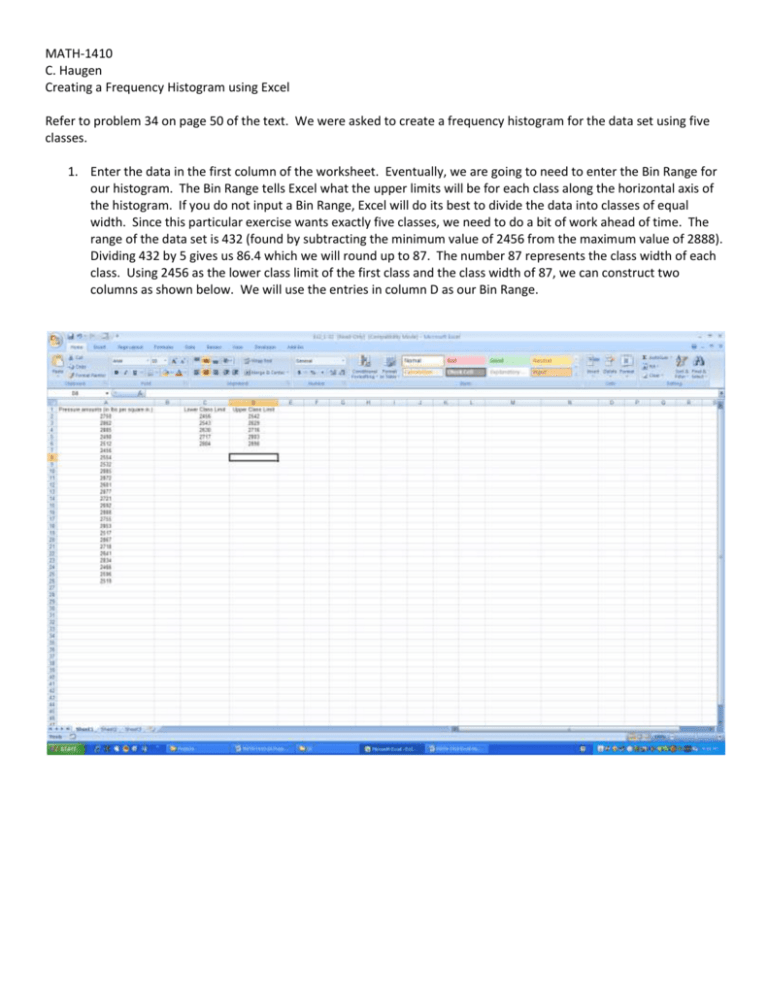
MATH-1410 C. Haugen Creating a Frequency Histogram using Excel Refer to problem 34 on page 50 of the text. We were asked to create a frequency histogram for the data set using five classes. 1. Enter the data in the first column of the worksheet. Eventually, we are going to need to enter the Bin Range for our histogram. The Bin Range tells Excel what the upper limits will be for each class along the horizontal axis of the histogram. If you do not input a Bin Range, Excel will do its best to divide the data into classes of equal width. Since this particular exercise wants exactly five classes, we need to do a bit of work ahead of time. The range of the data set is 432 (found by subtracting the minimum value of 2456 from the maximum value of 2888). Dividing 432 by 5 gives us 86.4 which we will round up to 87. The number 87 represents the class width of each class. Using 2456 as the lower class limit of the first class and the class width of 87, we can construct two columns as shown below. We will use the entries in column D as our Bin Range. 2. Next, we click on the Data tab and then click on Data Analysis in the Data ribbon. The Data Analysis dialog box should open at this point. Select Histogram from the list of options. 3. The Histogram dialog box should appear on your screen. Enter the Input Range (can be done by left clicking on cell A1 and then dragging all the way down to the last value in column A), enter the Bin Range (I left clicked on cell D1 and dragged the mouse down to cell D6), click on the Labels box (because our Input Range has a label as the first entry), and then select New Worksheet Ply under Output options. I went ahead and typed “Histogram” in to the field next to New Worksheet Ply. Whatever you type in that box will be the name of the new worksheet. Finally, make sure to select Chart Output at the bottom of the dialog box. And here is the output: Initially, the histogram is difficult to read. Fortunately, there are plenty of tools available to spruce it up. We can expand the chart area by clicking on the lower right-hand corner of the chart and then dragging the mouse. Now that we can see everything, we need to take care of a few problems. First of all, consecutive bars in any frequency histogram should touch. To make that happen in our histogram, right-click on any of the vertical bars and select Format Data Series from the shortcut menu. The Format Data Series dialog box should appear on your screen. There should be an area where you can set the Gap Width. We can click on the Gap Width arrow and drag it left until we hit zero or we can simply enter 0 in the gap width box. Feel free to explore the other options in the Format Data Series dialog box. Next, we will change the labels on the horizontal axis to the midpoints of each class. To do that, we need to create a column that has each class midpoint. I decided to enter these values into column C next to the histogram. Once we have done that, right-click on any of the bars in the histogram and choose Select Data from the shortcut menu. The Select Data dialog box should appear on your screen. Click the Edit button in the Horizontal (Category) Axis Labels box. The Axis Labels dialog box should appear on your screen. Left-click on the cell containing the first class midpoint and drag the mouse down to the last midpoint. Click on the Ok button and then click Ok again back in the Select Data dialog box. We also need to change the title of the histogram and the horizontal axis label. If we click on any of the labels, a box with a solid border should appear. We can move the label anywhere we want and/or resize it. Clicking again on the label should allow us to add our own text. We can eliminate the Frequency legend on the right by clicking on it and then pressing the delete key. As a final touch, we can add gridlines to our chart area to make things easier to read. We do this by right-clicking on any number along the vertical axis, select Add Major Gridlines from the shortcut menu and voila! The gridlines are shown below. I have also added borders along the bars in the chart (I will leave it to you to discover how that is done).


