Name _________________________________
Period _______
How are the properties of stars related?
Essential Questions: How can we make meaning out of numbers?
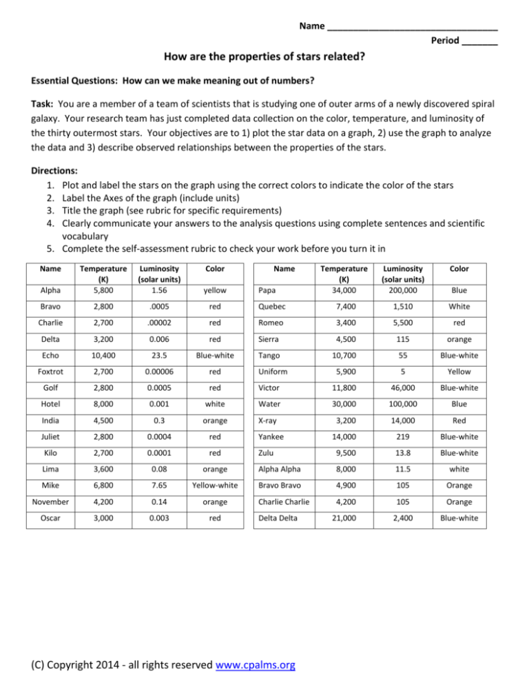
Task: You are a member of a team of scientists that is studying one of outer arms of a newly discovered spiral
galaxy. Your research team has just completed data collection on the color, temperature, and luminosity of
the thirty outermost stars. Your objectives are to 1) plot the star data on a graph, 2) use the graph to analyze
the data and 3) describe observed relationships between the properties of the stars.
Directions:
1. Plot and label the stars on the graph using the correct colors to indicate the color of the stars
2. Label the Axes of the graph (include units)
3. Title the graph (see rubric for specific requirements)
4. Clearly communicate your answers to the analysis questions using complete sentences and scientific
vocabulary
5. Complete the self-assessment rubric to check your work before you turn it in
Name
Alpha
Temperature
(K)
5,800
Luminosity
(solar units)
1.56
Color
yellow
Bravo
2,800
.0005
red
Charlie
2,700
.00002
Delta
3,200
Echo
Name
Temperature
(K)
34,000
Luminosity
(solar units)
200,000
Color
Quebec
7,400
1,510
White
red
Romeo
3,400
5,500
red
0.006
red
Sierra
4,500
115
orange
10,400
23.5
Blue-white
Tango
10,700
55
Blue-white
Foxtrot
2,700
0.00006
red
Uniform
5,900
5
Yellow
Golf
2,800
0.0005
red
Victor
11,800
46,000
Blue-white
Hotel
8,000
0.001
white
Water
30,000
100,000
Blue
India
4,500
0.3
orange
X-ray
3,200
14,000
Red
Juliet
2,800
0.0004
red
Yankee
14,000
219
Blue-white
Kilo
2,700
0.0001
red
Zulu
9,500
13.8
Blue-white
Lima
3,600
0.08
orange
Alpha Alpha
8,000
11.5
white
Mike
6,800
7.65
Yellow-white
Bravo Bravo
4,900
105
Orange
November
4,200
0.14
orange
Charlie Charlie
4,200
105
Orange
Oscar
3,000
0.003
red
21,000
2,400
Blue-white
Papa
Delta Delta
(C) Copyright 2014 - all rights reserved www.cpalms.org
Blue
Data Analysis - Please respond with complete sentences and scientific vocabulary.
1. Identify the color classification that represents the mode of the data. Use the data as evidence to justify your
answer. (2 points)
2. Identify the relationship between a star’s temperature and luminosity as causal or correlation. Explain your
rationale. (2 points)
3. Identify the relationship between a star’s temperature and luminosity as directly or inversely proportional.
Explain your rationale. (2 points)
4. Use data points from your graph to complete the table below. Sequence the colors and temperatures from
hottest at the top to coolest at the bottom (1 point per cell)
Spectral Class
O
B
A
F
G
K
M
Color
Temperature
5. Which color classification had the largest temperature range? What is the range for that data subset? (2 points)
6. Which color classification had the largest luminosity range? What is the range for that data subset? (2 points)
7. Make a logical prediction to explain why there are outliers from the data trend on the graph. (2 points)
Advanced/Gifted (answer these instead of 2 and 3 above)
2. One of your teammates on the research team states that luminosity determines a star’s color, but you argue that
color is determined by the star’s temperature. Use specific data from your graph as evidence to support this argument.
(2 points)
3. Another of your colleagues states that the relationship between temperature and luminosity must be inversely
proportional because the slope of the data is negative. Do you agree or disagree? Explain. (2 points)
(C) Copyright 2014 - all rights reserved www.cpalms.org
100000
10000
1000
100
10
1
0.1
0.01
0.001
0.0001
40 000
35 000
30 000
25 000
(C) Copyright 2014 - all rights reserved www.cpalms.org
20 000
15 000
10 000
5 000
0
Scatterplot Rubric – Please use the self-assessment to check your graph before turning it in.
CATEGORY
Title
Accuracy
of Plot
Labeling of
X axis
Labeling of
Y axis
5
3
1
0
Title clearly relates
to the problem
being graphed
(includes both
properties). It is
printed at the top of
the graph.
All points are
plotted correctly
and are easy to see.
A ruler is used to
neatly make a trend
line.
The X axis has a
clear, neat label
that correctly
identifies the units
used to measure
temperature.
Title relates to the
problem being
graphed (lacks
clarity in one or
both properties)
and is printed at the
top of the graph.
A title is present at
the top of the graph
but does not relate
to the problem
being graphed.
A title is not
present.
Most points are
plotted correctly
and are easy to see.
Some points are
plotted correctly,
but there are many
inaccuracies.
Most points are
plotted incorrectly
OR extra points
were included.
The X axis has a
clear label that
correctly identifies
the unit used to
measure
temperature.
The X axis has a
label but the correct
unit is not included.
The X axis is not
labeled.
The Y axis has a
clear, neat label
that identifies the
units used to
measure luminosity.
The Y axis has a
clear label that
correctly identifies
the units used to
measure luminosity.
The Y axis has a
label but the correct
unit is not included.
The Y axis is not
labeled.
SelfAssessment
Graph Score _______
Total Score
Graph Score
/ 20
Analysis Score
/ 26
Total Score
/ 46
(C) Copyright 2014 - all rights reserved www.cpalms.org
Teacher
Assessment
_______
The following
pages are
intended for
teacher use only.
(C) Copyright 2014 - all rights reserved www.cpalms.org
Data Analysis - KEY
1. Identify the color classification that represents the mode of the data. Use the data as evidence to justify your answer.
(2 points)
The mode is represented by red stars because there more red stars than any of the other colors. There are 11 red
stars, 7 blue-white stars, 6 orange stars, 2 yellow stars, 2 white stars, two blue stars, and 1 white star.
2. Identify the relationship between a star’s temperature and luminosity as a causal or correlation. Explain your rationale.
(2 points)
The relationship between a star’s temperature and luminosity is a correlation because one does not affect the other. Each
of these properties is dependent upon the star’s mass.
3. Identify the relationship between a star’s temperature and luminosity as directly or inversely proportional. Explain your
rationale. (2 points)
The relationship between a star’s temperature and luminosity is directly proportional because one increases as the other
is increasing and/or one decreases as the other is decreasing.
4. Use data points from your graph to complete the table below. Sequence the colors and temperatures from hottest at
the top to coolest at the bottom (1 point per cell)
5. Which color classification had the largest temperature range? What is the range for that data subset? (2 points)
Based on the data, blue-white stars have the largest range of approximately 12,500K.
Spectral Class
O
B
A
F
G
K
M
Color
Blue
Blue-White
White
Yellow White
Yellow
Orange
Red
Temperature
30,000 – 34,000
9,500 -21,000
7,400-8,000
6,000 – 7,400
4,900 – 6000
3,500 - 4,900
2,000 - 3,500
6. Which color classification had the largest luminosity range? What is the range for that data subset? (2 points)
The red stars had the largest range of approximately 10,000 solar units.
7. Make a logical prediction to explain why there are outliers from the data trend on the graph. (2 points)
The stars that lie above the main set of data are larger than the others of the same color (Giants and Supergiants) and the
one that falls below the main sequence is much smaller (Dwarf). Accept any other reasonable explanation.
Advanced/Gifted (answer these instead of 2 and 3 above)
2. One of your teammates on the research team states that luminosity determines a star’s color, but you argue that color
is determined by the star’s temperature. Use specific data from your graph as evidence to support this argument. (2
points)
Outliers show that luminosity may vary when temperature is constant, but temperature ranges will correlate with color
regardless of the luminosity. For example, star Victor has a temperature is 48,000 which falls within the blue range;
however, its luminosity is much higher than the other blue and blue-white stars.
3. Another of your colleagues states that the relationship between temperature and luminosity must be inversely
proportional because the slope of the data is negative. Do you agree or disagree? Explain. (2 points)
I disagree with my colleague. Even though the slope of the graph appears to be negative at first, the numeric values along
the x axis are reversed compared to the typical format of a graph, which goes from lower values on the left to higher
values on the right. Evaluating the data points on the graph, the general trend shows that luminosity increases
proportionally to temperature because one increases as the other increases and/or one decreases as the other decreases.
(C) Copyright 2014 - all rights reserved www.cpalms.org
Star data used to create table
Name
Temperature
Luminosity
(K)
(solar units)
Name
Temperature
Luminosity
(K)
(solar units)
34,000
200,000
A
Alpha Centauri
5,800
1.56
P
UW Canis Majoris
B
Barnard's Star
2,800
.0005
Q
Canopus
7,400
1,510
C
Wolf 359
2,700
.00002
R
Antares
3,400
5,500
D
Lalande 21185
3,200
0.006
S
Arcturus
4,500
115
E
Sirius
10,400
23.5
T
Vega
10,700
55
F
Proxima Centauri
2,700
0.00006
U
Capella
5,900
166
G
Ross 154
2,800
0.0005
V
Rigel
11,800
46,000
H
Procyon B
8,000
.001
W
Beta Centauri
30,000
100,000
I
Epsilon Eridani
4,500
0.3
X
Betelgeuse
3,200
14,000
J
Ross 128
2,800
0.0004
Y
Achernar
14,000
219
K
Luyten 789-6
2,700
0.0001
Z
Fomalhaut
9,500
13.8
L
61 Cygni
3,600
0.08
AA
Altair
8,000
11.5
M
Procyon
6,800
7.65
BB
Pollux
4,900
41.7
N
Epsilon Indi
4,200
0.14
CC
Aldebaran
4,200
105
O
Sigma 2398
3,000
0.003
DD
Spica
21,000
2,400
Star data obtained from: http://upload.wikimedia.org/wikipedia/commons/1/17/Hertzsprung-Russel_StarData.png
(C) Copyright 2014 - all rights reserved www.cpalms.org
The relationship between star temperature and luminosity
P
100000
V
W
10000
X
DD
R
Q
Luminosity (solar units)
1000
Y
S
100
T
10
E
BB
CC
M
Z AA
U
A
1
I
0.1
L
0.01
D
O
0.001
G
J
K
F
C
0.0001
0.00001
40,000
N
35,000
30,000
25,000
20,000
15,000
Temperatures (degrees Kelvin)
(C) Copyright 2014 - all rights reserved www.cpalms.org
10,000
5,000
0
