ISP_display -Even more tips
advertisement
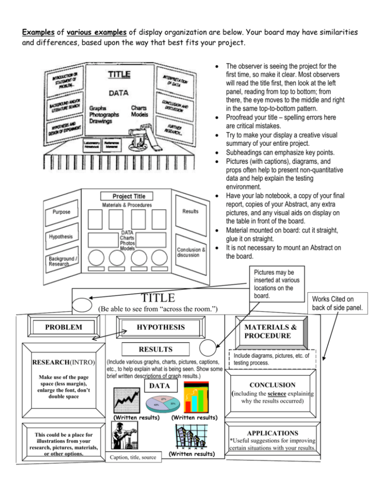
Examples of various examples of display organization are below. Your board may have similarities and differences, based upon the way that best fits your project. TITLE The observer is seeing the project for the first time, so make it clear. Most observers will read the title first, then look at the left panel, reading from top to bottom; from there, the eye moves to the middle and right in the same top-to-bottom pattern. Proofread your title – spelling errors here are critical mistakes. Try to make your display a creative visual summary of your entire project. Subheadings can emphasize key points. Pictures (with captions), diagrams, and props often help to present non-quantitative data and help explain the testing environment. Have your lab notebook, a copy of your final report, copies of your Abstract, any extra pictures, and any visual aids on display on the table in front of the board. Material mounted on board: cut it straight, glue it on straight. It is not necessary to mount an Abstract on the board. Pictures may be inserted at various locations on the board. (Be able to see from “across the room.”) PROBLEM HYPOTHESIS RESULTS RESEARCH(INTRO) Make use of the page space (less margin), enlarge the font, don’t double space (Include various graphs, charts, pictures, captions, etc., to help explain what is being seen. Show some brief written descriptions of graph results.) MATERIALS & PROCEDURE Include diagrams, pictures, etc. of testing process. CONCLUSION DATA (including the science explaining why the results occurred) (Written results) This could be a place for illustrations from your research, pictures, materials, or other options. Works Cited on back of side panel. (Written results) APPLICATIONS Caption, title, source (Written results) *Useful suggestions for improving certain situations with your results. ISP Oral presentation and display hints: Helpful hints: a. Rubber cement usually works well on the foam board; it allows you to move items around up to a certain point of drying time; 2-sided or poster tape also may be useful. Avoid staples, tacks, spray glue, and white school glue, because they often do not hold well, or papers begin coming loose from the board. Also, be careful not to stack (or staple together) many papers on top of each other on the board. b. Sometimes the glue or cement seems to “seep through” the paper that you have used to print written information or graphs. A good solution to avoid this problem is to print onto card stock, which comes in sizes equal to the paper size. It can be purchased in various sizes of packaging. c. Use an accent color “backing” to frame the pictures written information on your pages to give it a nice look. Be sure that the contrast between the colors that you use is not too extreme (ex. neon yellow on an electric blue background). Some students buy poster board and cut it to the sizes you need for written information or pictures (I have used the paper cutters at the copy stores) or could get presized packages of card stock. One or two colors could be used as framing accents. d. A good “rule of thumb” suggested has been to use a 2- to 4-color scheme for the display (ex. one color for the board, an accent color for the labels or framing behind the mounted pages, and 1 or 2 other colors, perhaps as border or a second color accent backing) and to not overload it with so many colors that it proves distracting. e. Include graphs and pictures; label them neatly and completely. For pictures, write captions and put a small label on the board stating that “all pictures were taken by the researcher or assistant.” For graphs, “Unless otherwise noted, graphs were generated by student researcher data.” f. Arrange the information on the board so that the “flow” of information makes sense. We read from left to right, so the left panel should contain pre-experiment information. People generally read from the top to the bottom of each panel. The middle usually contains information from experimentation (diagrams, data, graphs, pictures, etc.). The right panel should contain conclusions, analysis, and applications. Every project will have slight variations to best fit the need of that project, but all should clearly display the: Problem, Introduction (or Research – which may be summarized, to shorten it), Hypothesis, Procedure, Results (including Data which can be labeled separately, if you wish), Conclusion, and if possible, Applications. You do not need to put the References (bibliog.) or Abstract on the board (you may have copies of the Abstract available in front of the board). You may include Materials, (use minimal space – a small single-spaced/double column section may work). g. Try switching to size 18 or larger bold font or larger for the Problem and Hypothesis, to make it a little easier to see. Single space some sections in the larger font, if it makes things fit better. Other font suggestions: - Use size 16 for main body text; bold print is okay here. - Use traditional fonts (Times N.R., Arial), not artistic fonts. - Don’t use ALL CAPS, because it makes reading more difficult. - Beware of using colored fonts that are not easily visible. h. Put the title board on top of the board and see how much of the top of the board is covered before attaching other information, to make sure your title board doesn’t cover up anything, once in place. i. The favorite techniques in the past for making titles have included using preformed punched letters or peel-and-stick letters that accent the board colors, as well as computer generated titles. Other choices have included stenciling, painting, and even some creative use of other materials to form letters. The key is for the observer to easily be able to read the title from around 10-15 ft. away. j. Neatness is important. Erase pencil marks and make sure your papers are glued on straight and that all edges are straight (a paper cutter is helpful, if you have access to one).
