Powerpoint Review Exercises
advertisement
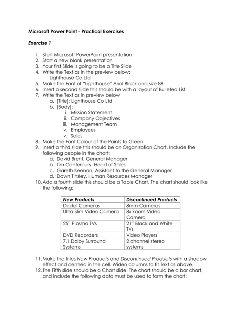
Microsoft Power Point - Practical Exercises Exercise 1 1. 2. 3. 4. Start Microsoft PowerPoint presentation Start a new blank presentation Your first Slide is going to be a Title Slide Write the Text as in the preview below: Lighthouse Co Ltd 5. Make the Font of “Lighthouse” Arial Black and size 88 6. Insert a second slide this should be with a layout of Bulleted List 7. Write the Text as in preview below a. [Title]: Lighthouse Co Ltd b. [Body]: i. Mission Statement ii. Company Objectives iii. Management Team iv. Employees v. Sales 8. Make the Font Colour of the Points to Green 9. Insert a third slide this should be an Organization Chart. Include the following people in the chart: a. David Brent, General Manager b. Tim Canterbury, Head of Sales c. Gareth Keenan, Assistant to the General Manager d. Dawn Tinsley, Human Resources Manager 10. Add a fourth slide this should be a Table Chart. The chart should look like the following: New Products Digital Cameras Ultra Slim Video Camera 25” Plasma TVs DVD Recorders 7.1 Dolby Surround Systems Discontinued Products 8mm Cameras 8x Zoom Video Camera 21” Black and White TVs Video Players 2 channel stereo systems 11. Make the titles New Products and Discontinued Products with a shadow effect and centred in the cell. Widen columns to fit Text as above. 12. The Fifth slide should be a Chart slide. The chart should be a bar chart, and include the following data must be used to form the chart: January TVs 20 DVDs 30 Hifi equipment 45 Video Recorders 25 February 27 38 46 29 March 90 34 45 15 April 75 31 43 40 13. Change the colours of the chart so that the series of bars are red, yellow, pink, and green. 14. Add a light coloured background to all slides in the presentation. 15. Add also Transition effects between each slides and also different effects for all text and pictures it the presentation. 16. Reverse the order of the second and third slides 17. Save the presentation as Light House Ltd. Exercise 2 1. Load your Presentation Application and start a new presentation 2. The first slide is a Title Slide. Select the appropriate layout and enter the title: a. Annual Food Fair. 3. Add the sub-title: a. A Celebration of Eating 4. Insert a small, red circle at the bottom right of the title slide. 5. Change the font colour for the whole title and sub-title to blue, and apply a text shadow effect just to the words Food and Fair. 6. Insert a second slide to the presentation, selecting a layout appropriate for a series of bullet points, and using the title: The Menu. Enter the following text: i. · Chocolate Desserts ii. · Cakes and Puddings iii. · Roast Meals iv. · Using Pasta Creatively 7. Change the line spacing for these bullet points to 1.5 lines. 8. Increase the font size for the words The Menu in the title. 9. Add a footer with your name and the text: Food Fair so they both appear on every slide, and number all the slides. (Make sure the number is not obscured by the red circle on the title slide) 10. Insert a third slide, which is to be an organisation chart. Use the title Meet The Team. Enter: Maggie Peet, Manager at the top of the chart, and show the following three as reporting to Maggie Peet: Brian Webb. Bookings; Janine Newton, Publicity; Gregg Brown, Accounts 11. Embolden the text in the title of the third slide, and change the font to Arial. 12. Apply a light coloured background to all the slides in the presentation 13. On the third slide, insert an image suitable for the topic of food from an image library. Reduce the size of the image and place it where it will not interfere with text. 14. Save the presentation as foodfair. 15. Print the presentation with three slides per page, and close the presentation. Exercise 3 1. Load your Presentation Application and start a new presentation 2. The first slide is a Title Only Slide. Select the appropriate layout and enter the title: a. Cook Family Cruises. 3. Add a small blue rectangle at the top left of this slide. 4. Change the font colour for the whole title to red, and apply a text shadow effect just to the word Cruises. 5. Insert a second slide to the presentation, selecting a layout appropriate for a series of bullet points, and using the title: Our Itinerary. Enter the following text: a. Canary Islands b. Mediterranean c. Greek Islands 6. Change the line spacing for these bullet points to 2 lines. Increase the font size of the word Itinerary in the title. Add a footer with your name and the text: Cruise Information so they both appear on every slide, and number all the slides. 7. Insert a third slide, which is to be a graph. Use the title Our Market Share. Use the following data to produce a pie chart: Cook 54%; Jackson 28%; Wilson 12%; Bennett 5% 8. Embolden the text in the title of the third slide, and change the font to Arial. 9. Apply a different background to each slide in the presentation 10. On the third slide, insert an image suitable for the topic of holidays from an image library. Reduce the size of the image and place it where it will not interfere with text. 11. Add a 4th slide containing nothing but the text: Travel with us for less!! 12. Save the presentation as holidays. 13. Print the presentation with 4 slides per page, and close the presentation.
