Static images visual techniques
advertisement
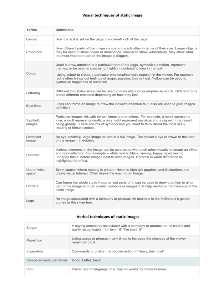
Visual techniques of static image Terms Definitions Layout How the text is set on the page, the overall look of the page. Proportion How different parts of the image compare to each other in terms of their size. Larger objects may be used to show power or dominance, smaller to show vulnerability. May show what the most important part of the image is (bigger). Used to draw attention to a particular part of the page, symbolise emotion, represent themes, or be used in contrast to highlight contrasting idea in the text. Colour Using colour to create a particular emotional/sensory reaction in the viewer. For example red is often brings out feelings of anger, passion, love or heat. Yellow can be used to symbolise happiness or sunshine. Lettering Different font styles/sizes can be used to draw attention or emphasise words. Different fonts create different emotions depending on how they look. Bold lines Lines can frame an image to draw the viewer's attention to it, also are used to give images definition Symbolic images Particular images link with certain ideas and emotions. For example, a heart represents love, a skull represents death, a ring might represent marriage and a pig might represent being greedy. There are lots of symbols and you need to think about the most likely reading of these symbols. Dominant image An eye-catching, large image as part of a full image. The viewer’s eye is drawn to this part of the image immediately. Contrast Various elements in the image can be contrasted with each other visually to create an effect and draw attention. For example – white next to black, smiling, happy faces next to unhappy faces, before images next to after images. Contrast is when difference is highlighted for effect. Use of white space Blank spaces where nothing is printed. Helps to highlight graphics and illustrations and create visual interest. Often draws the eye into an image. Borders Can frame the whole static image or just parts of it, can be used to draw attention to all or part of the image and can contain symbols or images that help reinforce the message of the static image Logo An image associated with a company or product. An example is the McDonald’s golden arches or the silver fern. Verbal techniques of static images Slogan A saying commonly associated with a company or product that is catchy and easily recognisable. “I’m lovin’ it” “I’m worth it” Repetition Using words or phrases many times to increase the chances of the viewer remembering it. Imperative Commands or orders that require action – “Hurry, buy now!” Comparatives/superlatives Good, better, best! Pun Clever use of language or a ‘play on words’ to create humour.
