Yoga godess
advertisement
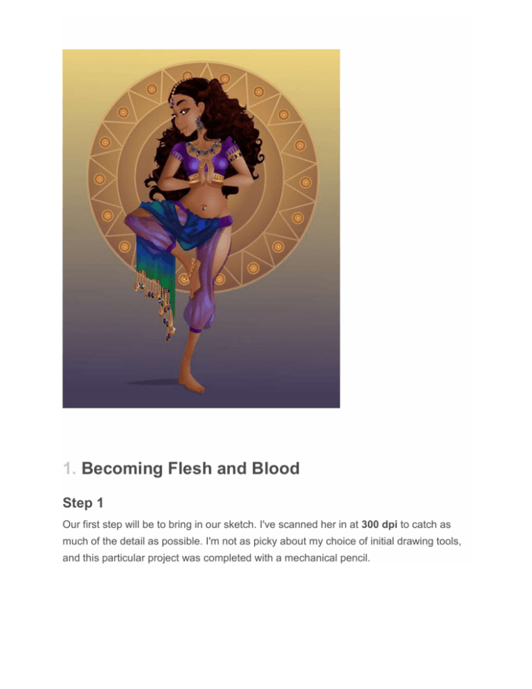
1. Becoming Flesh and Blood Step 1 Our first step will be to bring in our sketch. I've scanned her in at 300 dpi to catch as much of the detail as possible. I'm not as picky about my choice of initial drawing tools, and this particular project was completed with a mechanical pencil. We'll be working with a clean line quality from Adobe Photoshop and now we can begin to work. I'm working in Adobe Illustrator at a size of 8.5 x 11 inches for this specific project. When I'm ready to start my layers, I'll label my first layer as "Sketch" and lock the layer to make sure that I won't accidentally move or delete the sketch. We'll be loosely following this as our guideline. Step 2 Now that our area is ready for rendering, we can start to lay down our colors. I like to go with a two-color Linear Gradient. This allows for a bit more dimension and directional light. Using our Pen Tool (P), we'll start with the body shape. Step 3 Follow the contours of the body with your Pen Tool (P). You'll notice that I've rendered her skin in three parts. The arms are overlapping the body, which will be useful in our future steps. 2. Adding Facial Contours Step 1 During this step, we'll apply our most prominent contour lines. We'll use the same color as the skin, but this burnt sienna will take on a darker tone. Step 2 Layering in the shadows using the same Radial Gradient is recommended. The lightest point of the gradient's Opacity has been lowered to 0%. Step 3 Upon finishing the eye shading, we can layer on our eyebrows, eyelashes, and sclera of the eye. This is a light silver grey in preparation for future details, which we will cover shortly. 3. Body Highlights and Shadow Shaping Step 1 Once our initial skin colors have been laid down, we can cover the skin with highlights and shadows to give it more dimension. I like to use a Radial Gradient to create my highlights. Using two gradients of pure white, I've lowered the Opacity to0% for the outer pure white, which gives us a smooth softness to the skin. Lower theTransparency to 40% and that will allow the highlight to blend with the skin-tone. Step 2 Progression of the highlights is going well at this stage, but as you can see, she still looks pretty flat. We'll fix that in the next steps. Step 3 Using a slightly darker version of our skin gradient, we'll include shading and shadows. Step 4 Even if you won't see all of the shading that we're doing once the clothes have been rendered, it's still helpful to do complete it all. While working as a vector artist for a very well-known company, I was instructed to always finish the body and shading underneath the clothes, just in case anything needed to be moved during editing. I appreciated this process and so follow it even now. Step 5 Our female figure has now undergone shading and is ready to be enhanced with detail. 4. A Vision of Beauty Step 1 One of my favorite assets are the eyes. Personality comes through, and they're the first thing to pop off the page. I've begun to create my iris color, a mix of sage green and burnt sienna to create a greenish hazel. Step 2 Using a pure black solid while using my Pen Tool (P), I'll make the pupil. You'll notice that I've also used a pure white to insert into the sclera. This will give more enhancement to the eye as a whole. Step 3 Using a dark chocolate, create more depth to the iris of our green hazel eyes as well as a reflection to overlay over the pupil. 5. Makeup Application Step 1 Add a bit of shine to the lips, to give the appearance of lip gloss. Step 2 I've made the lip color just a bit darker to complement her skin tone. With the embellishments we'll be creating, we won't need any vibrant makeup. Step 3 Next, we'll add a little eye shadow to her very low-key look. I'm using a mauve-like color at the end of a two-color Radial Gradient. You'll notice I prefer Radial toLinear because of the shape that the gradient takes. It has a bit of an organic feel and tends to blend better to its base colors. 6. A Touch of Gold Next, I've started to make the jewelry. You'll notice that I'll be using this combination of color for all of the gold accents. Other than the jewel tones, you won't see much in the use of Stroke lines. This particular Stroke Line is at 0.15 pt. 7. Beauty Is Only Skin Deep Step 1 While we're enhancing her skin, I wanted to make sure to add a few freckles. I love freckles on skin, and adding a cluster like this and Grouping (Control-G) them together makes it easier to place them. Step 2 At this point, we've added freckles to the chest area. They will be barely noticeable, but a very nice touch once the entire piece comes together. Step 3 While I'm finishing up the freckles, I couldn't help but add a few to the bridge of the nose and across the cheeks. 8. Colorful Garb Step 1 Our figure is finally ready to wear clothes. There are quite a few earth tones included in her skin, so to complement this, I wanted to use a royal purple. Step 2 This shirt is reminiscent of the traditional choli. A choli is a midriff-baring blouse worn in countries such as India, Sri Lanka, Bangladesh and other countries that wear the traditional sari most complemented by the wearing of this particular garment. By making a three-color Radial Gradient, we can give our choli an almost iridescent glow. Step 3 Once the choli base color has been made, we can focus on our harem pants. Harem pants are more of a Turkish or Arabic fashion but they're so fun to draw, I just couldn't resist! Here, we've rendered the waist band just parallel to the hips, which is customary to the fashion. Step 4 Using our amazing iridescent color, we've made folds in the fabric of the pants. To give them a flowy feel, we've used a Feather Effect with a Radius of 0.07 in. Step 5 Once we've finished our pants, they'll look like this. We acquired a lot of depth from a small bit of work. 9. Rendering Your Peacock Scarf Step 1 After finishing the pants, we'll move on to our peacock-inspired scarf. I've chosen these colors specifically because of their jewel tones. These rich colors really bring a sense of luxury to our piece. Step 2 We will apply highlight folds similar to the way we applied the folds to our harem pants. We're still following our sketch underneath loosely. Step 3 Where there is light, there is dark. Make sure to add a few dark shades to our folds. 10. Embroidering Your Choli Step 1 We are finally ready to embellish our clothing. Step 2 As mentioned, I'll be using the same gold from our earrings to create our main embellishments. It's a warm Radial Gradient gold that I hope you'll enjoy seeing in our jewelry as well. Step 3 In this step, we'll create our smooth jewels. As mentioned, we will be using theStroke lines very rarely with this particular project. Since it's a very simple shape made effectively with our Ellipse Tool (L), the Stroke is very subtle. Step 4 After Grouping (Control-G) all of my elements, I'll create a Symbol from this particular jewel. This allows me to make duplicates of it without creating an overly large file. If you're sending this away to a client, this little trick will come in handy. As I make these Symbols, I can also manipulate the shape. I've taken our already ovalshaped jewel and have Transformed it into a circle. 11. All That Glitters Step 1 This is another of my favorite things to work on, the jewelry. I'll start the arm bracelet off by using my gold, previously used on the earrings and choli embroidery. We've made a very simple, thick band, which we will encrust with jewels. Using our template for the purple jewels, we made another set of symbols, but used blue tones to complement the orange in the gold. We've also made a many-faceted sapphire to offset the simplicity of our other smooth jewels. Textures pique interest, and since our goal is to have a project that will take on more than a glance or two from onlookers, this works in our favor. Step 2 In this step, we've built up a cluster of jewels, using what we already have available. After creating the cluster, we can place several of them together in an arch to form her necklace. Step 3 Using our gold color, we have formed multiple rings. With such elaborate embroidery and jewelry, the simple statement comes off modestly without looking too showy or gaudy. Step 4 Making the anklet is an easy step as well. In Middle Eastern countries, this is a customary decoration to adorn the legs. To create the chain, I've used a singleDashed Stroke with Rounded Caps and Rounded Joint Corners. The coins were made with Ellipses (L) with the centers Excluded. Step 5 Our next piece of jewelry will be the belly piercing. We will again use one of our blue jewel Symbols, and our signature gold color. Step 6 We have created our scarf tassels using our smooth jewel Symbols. In the project file, you will find each of the three color jewels that are featured here as well as in the jewelry. Step 7 Once we have built up our necklace, we can create matching earrings using the pieces already made. You can see that I've edited two of the jewels to break up the coloring. In order to produce an individual color, you can right-click with your mouse over the Symbol which will bring down an option panel. Move to Break Link with Symbol and Select. This will break that particular Symbol's link and it can now be edited without fear of affecting all of them. Step 8 This particular string of jewelry is called the Maang Tikka. It is worn on the parting of the hair in place of the red spot (tilaka or 'tika') on the foreheads of Hindu women. It's a beautiful addition to our piece, and I hope you'll appreciate it as well. 12. Lovely Lady Locks Step 1 We are finally able to start our hair. Using our Pen Tool (P), we can loosely follow our sketch to create the shape we want. Step 2 After laying down the main color which should remain a bit darker than the rest of our hair as we make it, we can start with our braid. Notice again that you can plainly see the strands of hair, even though we are using the same two-toned Gradient. We'll continue with this treatment even into the longer hair strands. You do not need to make each one the same width or length. Hair is an organic texture, and you'll appreciate it's wavy, playful nature even more once you have completed your illustration. 13. Just a Bit More Sparkle We're putting a little more shine on an already glitzy piece, but these will act more as focal points. They can be placed in various places, but use them sparingly. 14. A Balanced Background Step 1 Now that we have completed our figure, we will make a very simple background to finish up our project. I've used two very calm and tranquil colors that complement the jewel tones. Using a brighter color would unbalance and overtake the composition. Advertisement Step 2 One more accent to include will be this sun-inspired background piece. Again, I've used our gold color with Ellipses (L) and Stroke lines. The main sun accent has been Grouped (Control-G) and its Transparency dropped to 50%.
