Notes 2 Word file
advertisement
DATA VISUALIZATION FOR MULTIVARIATE DATA ANALYSIS
with ggobi and Splus/R
1. Data Visualization.
Data visualization methods are attractive tools to use for analyzing such datasets for
several reasons:
Data visualization methods show many features (expected and unexpected)
of a dataset at once and, as such, are well equipped to pick up subtle
structures of interest and anomalies as well as clear patterns.
They allow (in fact, encourage) flexible interaction with the data.
They can be more readily understood by non-statisticians (although their
properties may not be).
Good user-friendly graphics software is becoming more readily available.
For the type of problems considered here, the main goals of exploration are to find
out if there are non random structures in the data. This means
(i)
Relations between the variables.
(ii)
Clusters.
(iii)
Outliers.
(iv)
Other nonlinear structures.
We also interested in finding the detailed geometric intuition of a geometric object
and of its local properties.
“ggobi/xgobi” and R are a public domain statistical software for the mining and
analysis of multivariate data using graphical methods that runs under Windows on
PC’s and under the X-windows system on Unix workstations.
Splus, SAS, SPSS, Clementine, Spott Fire are commercial software.
2. Methodology.
Large datasets create visualization challenges.
Scatterplots: Large numbers of points may hide the underlying structure.
- Apply data binning and use an image graph.
- Sometimes is enough to graph a subset selected at random.
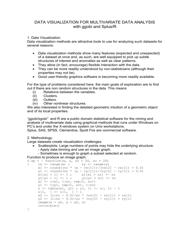
Function to produce an image graph:
f.sp < - function(x, y, nr = 20, nc = 20)
{
rx <- range(x) ;
ry <- range(y)
x1 <- round((nr * (x - rx[1]))/(rx[2] y1 <- round((nc * (y - ry[1]))/(ry[2] x1[x1 < 1] <- 1 ;
x1[x1 > nr] <- nr
y1[y1 < 1] <- 1 ;
y1[y1 > nc] <- nc
x1 <- c(x1, 1:nr, rep(1, nc))
y1 <- c(y1, rep(1, nr), 1:nc)
z <- table(x1, y1) ; z[, 1] <- z[, 1] z[1, ] <- z[1, ] - 1
x2 <- (1:nr - 0.5)/nr * (rx[2] - rx[1])
y2 <- (1:nc - 0.5)/nc * (ry[2] - ry[1])
image(x = x2, y = y2, z)
invisible()
}
rx[1]) + 0.5)
ry[1]) + 0.5)
1
+ rx[1]
+ ry[1]
Many variables at once. There are many ingenious tools for this.
Scatterplot matrix
- all variables
- all descriptor variables with color coding according to one response
- all response variables with color coding according to one descriptor
plot selected 2D views to highlight some feature of the data:
- principal components analysis (spread)
- projection pursuit (clustering)]
conditional plots
multiple windows with brush and link
look at “all” 2D views of the data via a dynamic display[rotating 3D display, grand
tour]
Other features of interest that are part of ggobi let us apply a wide variety of
methods. For example, the scaling panel allows to zoom into and out of any
particular region of the data, and to focus on the structure of the data at different
scales.
The tour panel incorporates the gran tour visualization tool for high dimensional
data sets, and the data can be transformed into principal components.
3 The Grand Tour and its implementation.
For multivariate data, two dimensional projections suitable for
displaying on a computer screen can be obtained by computing the
first two coordinates of the points with respect to an
orthogonal basis.
Rotations can be implemented by multiplying the basis by an
orthogonal matrix between consecutive redisplays. If the
rotations are close enough to the identity the display may
be made to look continuous.
The standard way in statistics to do explorations with multivariate data has been the
``grand tour'' or random jump walk tour, which is the way that rotations are
implemented in ggobi. The grand tour consists of starting at a two dimensional
projection, selecting another two dimensional projection at random and moving by
small rotations towards the new projection geodesic interpolation between the two.
When the new projection is attained a different one is selected and the path is
continued. The sequence of all intermediate projections is displayed giving the
appearance of continuous motion. Perhaps a more precise definition of this is a
`random walk on a Grassmann manifold in the k dimensions.
4. Brushing and linking.
Another important part of the implementation of the graphics interface is ``brushing.''
In the middle of exploring visually the data one frequently finds visually patterns and
regions for which a more detailed analysis would be particularly desirable. Most of
the diagnostic tools considered here are local in nature and require essentially the
selection of a neighborhood.
Since the interesting places are identified visually, it is natural to use a pointing
device such as a mouse to select points that can be subject to further analysis. This
is usually referred to as ``brushing.''
If ``brushing'' and ``unbrushing'' operations can be intertwined with rotations, one
can select rather precisely neighborhoods in the space.
Since many of the details of interest may be on a scale much smaller than that of
the whole data set, it is useful to be able to focus only on a smaller set selected by
brushing. While we focus on this set, it becomes the whole data set.
5. Scaling
The scale of data is very important because the structure of the data can be hidden
on the scale. Sometimes the structure of the variables are different so one has to
detect that.
Outliers tend to obscure the structure on the majority of the data. By brushing them
out and rescaling the data we can overcome this. Also variance covariance matrix
scaling is not robust so it will give the wrong scaling in the presence of outliers.
6. Projection Pursuit Indices
When the dimension is high we should use an index which selects a subset
of projection to look at. Some of this can be static and some
can be dynamic if combined with the grand tour.
7. Calling ggobi from Windows.
Open ggobi, and open a data file. The data must be placed on a text file
where the data is stored as a matrix with n rows and p columns. Each row on the file
contains the coordinates of a point separated by spaces and the file name must end
in “.dat”.
In addition to the data file other files can contain information regarding the
observations, such as color ....Their names must be filename plus an extension
which will depend on the info. These are the names and meanings:
filename.col : Column labels, variable names
filename.row : Row labels, variable names
filename.doc : documentation file.
filename.vgroups : variable groups
filename.colors : color assigned to each observation.
filename.glyphs : glyphs assigned to each observation.
8. Unix information
Before calling xgobi you must remember to add the path of xgobi to your
.login_user and .cshrc_user files. This is done by the command:
% set path=($path /staff/im/imsj/xgobi)
Calling xgobi from the Unix prompt.
There are two modes for calling xgobi, the first one is for a data set on a Unix file in
which case the data must be placed on a text file as a matrix with n nrows and k
columns, were each row contains the coordinates of a point separated by spaces.
To call xgobi type
% xgobi filename
filename.glyphs : glyphs assigned to each observation.
Calling xgobi from Splus.
The second mode for calling xgobi is from Splus under Unix. To load the xgobi
function into Splus enter Splus and type the command:
> source(``/usr/local/xgobi/Sfunction'')
You are now ready to use xgobi from Splus, but remember taht this is only done
once. The next time you start Splus the function xgobi will be there. To use xgobi
just type
> xgobi(data)
The following arguments are allowed by the function xgobi:
data
collab = dimnames(matrx)[[2]],
rowlab = dimnames(matrx)[[1]],
colors = NULL,
glyphs = NULL,
erase
= NULL,
lines
= NULL,
linecolors = NULL,
resources = NULL,
title
= NULL,
vgroups = NULL,
std
= "mmx",
dev
= 2.0,
nlinkable = NULL,
display = NULL
# the following makes a coplot of NOx against C given E
# with smoothings of the scatterplots on the dependence panels:
E.intervals <- co.intervals(ethanol$E, 16, 0.25)
coplot(NOx ~ C | E, given.values = E.intervals, data = ethanol,
panel = function(x, y) panel.smooth(x, y, span = 1,
degree = 1))
Given : E
0.6
0.8
10
12
14
16
1.2
18
8
10
12
14
16
18
1
2
3
4
1
2
3
4
NOx
1
2
3
4
1
2
3
4
8
1.0
8
10
12
14
16
18
8
10
12
14
16
18
C
car.ex <- car.all[ ,c("Weight" ,"Disp.","Trans1" ,"Mileage","Type",)]
for(i in 1:5) car.ex <- car.ex[!is.na(car.ex[,i]),]
ex)
scatter.smooth(Mileage ~ Disp. , data = car.ex)
scatter.smooth(Mileage ~ Disp. + Weight, data = car.ex)
coplot(Mileage ~ Disp. | Type , data = car.ex)
coplot(Mileage ~ Weight | Type , data = car.ex)
coplot(Mileage ~ Disp. + Weight | Type , data = car.ex)
Given : Weight
2000
2500
200
300
100
200
3500
300
100
200
300
Sporty
Small
Medium
Large
20
30
20
Mileage
Compact
30
20
30
20
100
200
300
100
200
300
Disp.
100
200
300
Given : Type
30
20
30
Van
20
30
100
3000
![[#EL_SPEC-9] ELProcessor.defineFunction methods do not check](http://s3.studylib.net/store/data/005848280_1-babb03fc8c5f96bb0b68801af4f0485e-300x300.png)
![[#CDV-1051] TCObjectPhysical.literalValueChanged() methods call](http://s3.studylib.net/store/data/005848283_1-7ce297e9b7f9355ba466892dc6aee789-300x300.png)
