3 Techniques of Graphing
advertisement
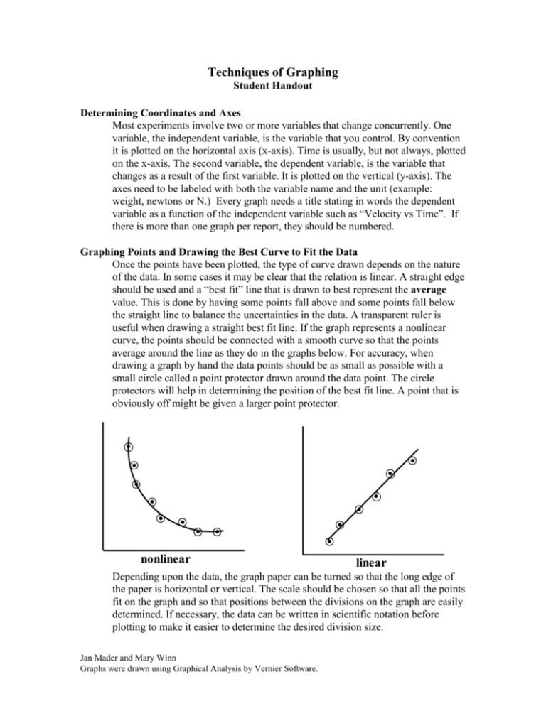
Techniques of Graphing Student Handout Determining Coordinates and Axes Most experiments involve two or more variables that change concurrently. One variable, the independent variable, is the variable that you control. By convention it is plotted on the horizontal axis (x-axis). Time is usually, but not always, plotted on the x-axis. The second variable, the dependent variable, is the variable that changes as a result of the first variable. It is plotted on the vertical (y-axis). The axes need to be labeled with both the variable name and the unit (example: weight, newtons or N.) Every graph needs a title stating in words the dependent variable as a function of the independent variable such as “Velocity vs Time”. If there is more than one graph per report, they should be numbered. Graphing Points and Drawing the Best Curve to Fit the Data Once the points have been plotted, the type of curve drawn depends on the nature of the data. In some cases it may be clear that the relation is linear. A straight edge should be used and a “best fit” line that is drawn to best represent the average value. This is done by having some points fall above and some points fall below the straight line to balance the uncertainties in the data. A transparent ruler is useful when drawing a straight best fit line. If the graph represents a nonlinear curve, the points should be connected with a smooth curve so that the points average around the line as they do in the graphs below. For accuracy, when drawing a graph by hand the data points should be as small as possible with a small circle called a point protector drawn around the data point. The circle protectors will help in determining the position of the best fit line. A point that is obviously off might be given a larger point protector. . . . .. . . . . . . . . . nonlinear linear Depending upon the data, the graph paper can be turned so that the long edge of the paper is horizontal or vertical. The scale should be chosen so that all the points fit on the graph and so that positions between the divisions on the graph are easily determined. If necessary, the data can be written in scientific notation before plotting to make it easier to determine the desired division size. Jan Mader and Mary Winn Graphs were drawn using Graphical Analysis by Vernier Software. Interpretation of Data Direct Proportionality There are several relationships that occur frequently in physical processes. The following graphs will show examples of some of these. The slope of a direct relationship is the rate of change of the dependent variable with respect to the independent variable. By definition the slope is m y d x t In the diagram on the right, the change in distance Δd divided by the change in time Δt is 30 kilometers per hour which is an average speed. The slope of a distance versus time graph is an average velocity or speed distance in kilometers Best fit line drawn through data points which represent a linear relationship. If the dependent variable varies directly with the independent variable, the graph will be a straight line. The relationship is described as direct or linear. If the line slants upward to the right, the slope of the line is positive. If the line slants downward to the right, the slope of the line is negative. Jan Mader and Mary Winn Graphs were drawn using Graphical Analysis by Vernier Software. Inverse (or indirect) proportionality The curve represents an inverse (or indirect) proportionality. If the dependent variable varies inversely with the independent variable the graph will be a hyperbola. An inverse relationship is one in which one variable increases as the second variable decreases. Another name for an inverse relationship is an indirect relationship. For this type of relationship, plotting the dependent variable vs. the reciprocal of the independent variable will produce a straight line. Directly proportional to the square An example of a direct square relationship is distance vs. time for accelerated motion. If the object is starting from rest which makes the initial velocity zero, the formula becomes d = ½ at2. From the formula it can be seen that distance is directly proportional to the square of time. The graph of d vs. t is a parabola. If distance is graphed vs. time squared, a straight line will be produced. Inverse square Relationship Jan Mader and Mary Winn Graphs were drawn using Graphical Analysis by Vernier Software. Direct square relationship There are many inverse square relationships in physics. Gravitational force, electrical force, magnetic force and the intensity of light versus distance are all inverse square relationships. This means that as the distance increases the values for the dependent variable will decrease as the inverse square of the independent variable. In the graph to the left, the force of gravitational attraction is plotted vs the distance between the centers of mass. F For the gravitational attraction between two masses the force between An inverse the massessquare will vary with relationship. the square of the distance between the centers of the masses. This is called an inverse square relationship. Gm1m2 r2 If the force were plotted against the inverse square of the distance between the masses, the result would be a straight line. Direct Square Root Proportionality Sometimes one variable is directly proportional to the square root of the other variable. This is the situation in the graph on the right where the length of a pendulum is plotted against the period of the pendulum according to the formula: T 2 l g Jan Mader and Mary Winn Graphs were drawn using Graphical Analysis by Vernier Software. A direct square root relationship
