Embedding cues about travel time in schematic maps
advertisement
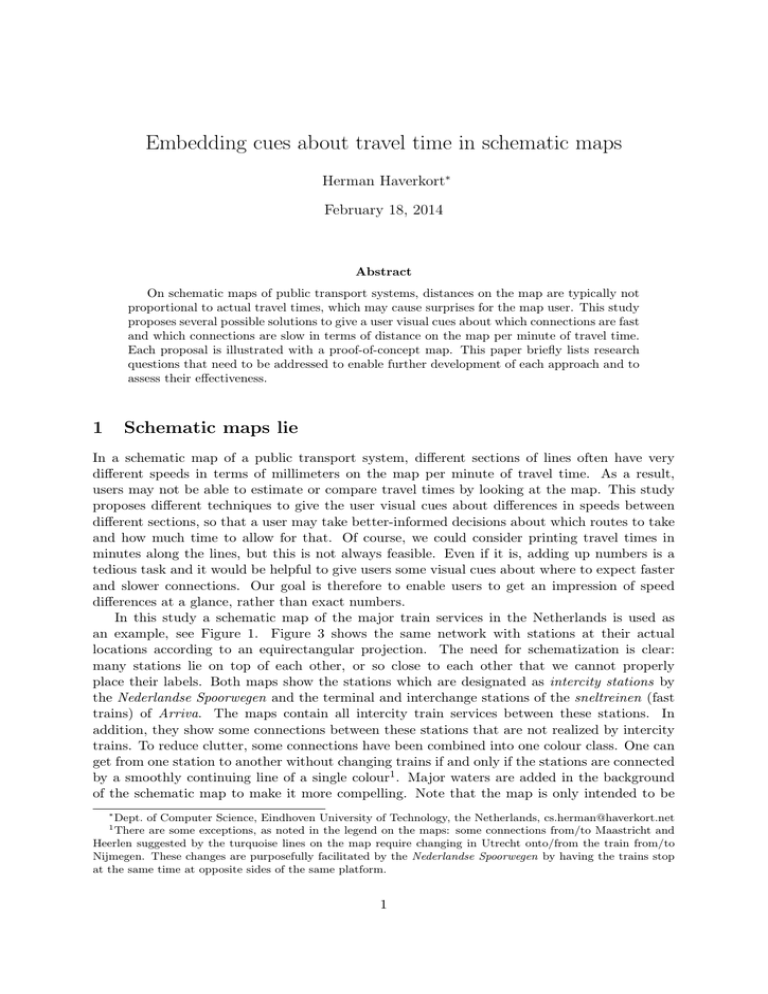
Embedding cues about travel time in schematic maps Herman Haverkort∗ February 18, 2014 Abstract On schematic maps of public transport systems, distances on the map are typically not proportional to actual travel times, which may cause surprises for the map user. This study proposes several possible solutions to give a user visual cues about which connections are fast and which connections are slow in terms of distance on the map per minute of travel time. Each proposal is illustrated with a proof-of-concept map. This paper briefly lists research questions that need to be addressed to enable further development of each approach and to assess their effectiveness. 1 Schematic maps lie In a schematic map of a public transport system, different sections of lines often have very different speeds in terms of millimeters on the map per minute of travel time. As a result, users may not be able to estimate or compare travel times by looking at the map. This study proposes different techniques to give the user visual cues about differences in speeds between different sections, so that a user may take better-informed decisions about which routes to take and how much time to allow for that. Of course, we could consider printing travel times in minutes along the lines, but this is not always feasible. Even if it is, adding up numbers is a tedious task and it would be helpful to give users some visual cues about where to expect faster and slower connections. Our goal is therefore to enable users to get an impression of speed differences at a glance, rather than exact numbers. In this study a schematic map of the major train services in the Netherlands is used as an example, see Figure 1. Figure 3 shows the same network with stations at their actual locations according to an equirectangular projection. The need for schematization is clear: many stations lie on top of each other, or so close to each other that we cannot properly place their labels. Both maps show the stations which are designated as intercity stations by the Nederlandse Spoorwegen and the terminal and interchange stations of the sneltreinen (fast trains) of Arriva. The maps contain all intercity train services between these stations. In addition, they show some connections between these stations that are not realized by intercity trains. To reduce clutter, some connections have been combined into one colour class. One can get from one station to another without changing trains if and only if the stations are connected by a smoothly continuing line of a single colour1 . Major waters are added in the background of the schematic map to make it more compelling. Note that the map is only intended to be ∗ Dept. of Computer Science, Eindhoven University of Technology, the Netherlands, cs.herman@haverkort.net There are some exceptions, as noted in the legend on the maps: some connections from/to Maastricht and Heerlen suggested by the turquoise lines on the map require changing in Utrecht onto/from the train from/to Nijmegen. These changes are purposefully facilitated by the Nederlandse Spoorwegen by having the trains stop at the same time at opposite sides of the same platform. 1 1 Den Helder Hoorn Amsterdam C ASloterdijk Alkmaar Castricum Beverwijk Almere C Leeuwarden Lelystad Heerenveen Steenwijk Hilversum Zwolle AAmstel Zaandam Haarlem Heemstede-A. Amersfoort Apeldoorn A-Zuid Schiphol Zutphen DenH- Ln v NOI Den Haag C Gouda Den Haag HS Delft Schiedam C Nijmegen ur g R-Blaak Dordrecht Breda NS Intercity Direct other train services between IC stations Venlo ilb T Weert Roosendaal A portrait of the Dutch Intercity railway network NS Intercity Oss ’s Hertogen bosch Helmond Eindhoven Etten-L. Vlissingen Dieren Ede-Wag. Arnhem R-Alexander Rotterdam C Assen Emmen Mari¨ enberg Almelo Hengelo Deventer Enschede Utrecht Leiden Groningen Roermond Sittard Heerlen Change in Utrecht for: • Maastricht↔A-Zuid/Schiphol; • Heerlen↔A-Amstel...Den Helder. Intercities from Maastricht go to Alkmaar but not Den Helder. c Herman Haverkort, 2014. Map is for illustration only, not for travel planning! Maastricht Figure 1: Schematic map Hoorn 26 12 Castricum 11 13 Beverwijk 11 Haarlem Heemstede-A. 11 AAmstel 23 13 15 7 Zaandam 10 21 26 11 6 19 46 18 Utrecht 42 10 DenH- Ln v NOI 4 Den Haag C 8 Den Haag HS Delft 8 Schiedam C 27 Gouda R-Alexander 9 Rotterdam C 5 R-Blaak 12 Dordrecht 15 19 Breda 26 9 16 17 21 25 Eindhoven Etten-L. 19 Vlissingen Roosendaal 13 Dieren 24 15 Oss 54 ’s Hertogen bosch Helmond 11 Weert NS Intercity Direct other train services between IC stations Venlo 24 14 Roermond 17 Sittard 16 16 Heerlen 22 Maastricht Figure 2: Schematic map with travel times 2 A portrait of the Dutch Intercity railway network NS Intercity 30 11 63 Zutphen Nijmegen 20 15 25 11 38 14 33 10 6 13 Ede-Wag. Arnhem 13 29 12 38 35 22 10 5 Assen Emmen Mari¨ enberg 23 41 Almelo 26 12 Hengelo 8 Deventer Enschede 19 18 17 34 25 12 20 Schiphol 15 Groningen 42 Amersfoort 25 26 Apeldoorn 17 A-Zuid 8 Leiden 12 23 ur g Alkmaar 21 Amsterdam C A- 8 Sloterdijk ilb 37 Almere C Leeuwarden 38 16 Lelystad 20 Heerenveen 29 23 14 Steenwijk Hilversum 41 Zwolle 30 25 25 T Den Helder Change in Utrecht for: • Maastricht↔A-Zuid/Schiphol; • Heerlen↔A-Amstel...Den Helder. Intercities from Maastricht go to Alkmaar but not Den Helder. c Herman Haverkort, 2014. Map is for illustration only, not for travel planning! The Dutch Intercity Railway network with stations at actual locations Groningen Leeuwarden Assen Den Helder Heerenveen Alkmaar Castricum Beverwijk Haarlem Heemstede-A. Mari¨ enberg Lelystad Zwolle C ere Alm um s ort ver Hil ersfo Am Apeldoorn uid l A-Zhipho Sc Leiden Den Haag-Ln v NOI Den Haag C Den Haag HS Delft Schiedam C Rotterdam C R-Blaak Za an da A m S A lo A ms te H -A te rd o m rd ijk orn st am el C Emmen Steenwijk Utrecht Gouda R-Alexander Ede-Wag. Almelo Hengelo Deventer Enschede Zutphen Dieren Arnhem Nijmegen Dordrecht nd os e Helmond Eindhoven Venlo Ro Vlissingen a Et al te n B -L. re da T ilb ur g Oss ’s Hertogenbosch Weert Roermond Sittard Maastricht Heerlen Figure 3: Map showing stations at actual locations between 50◦ 45 and 53◦ 30 N and 3◦ 30 and 7◦ 00 E. used as a test case for our study; it does not give a complete account of all fastest connections between intercity stations that can be realized by using non-intercity trains and/or changing trains at non-intercity stations. One could debate which stations and connections I should have considered major enough to include in this map, and how exactly one should determine typical travel times per section, but this is irrelevant for the purposes of this study. The point is that the schematic map gives no visual cues about the speed differences between different sections. It may be good to know that the travel time from ’s Hertogenbosch to Deventer via Arnhem is the same as via Amersfoort, although the latter option looks like a big detour on the schematic map. This may be interpreted as a shortcoming of the schematization, and arguably, a quality criterion for schematic maps of transport systems is how well they maintain that the shortest route on the map is the fastest route in reality [4]. However, I do not know of any successful attempts at taking this criterion into account in automated map schematization methods. Moreover, violations of the shortest-is-fastest principle may not always be avoidable, especially when merely fitting all lines and all stations and their labels on the map is a challenge already. Another example on our map is the travel time from Den Helder to Alkmaar, which is about eight times the travel time from Den Haag C to Den Haag HS, and slightly more than the travel time from Utrecht to Amsterdam C. For further reference, 3 Figure 2 shows the typical travel times in minutes for each section of the network. 2 Existing solutions for related problems I am not aware of any prior work on how to visualize travel times or speeds on schematized maps of complete public transport systems, but we may draw inspiration from several types of maps designed for related problems. Wide-spread isochrone maps visualize travel times from a single point in the network to any other, but we face a much bigger challenge: visualize travel times between any pair of points (stations in our case) in a network. I have found several different solutions for this in the literature that have been applied to different types of networks. Time-space transformations [1] attempt to distort the shape of the network, such that the distance between any pair of points on the map becomes proportional to the travel time between them. Unfortunately, in our case, applying this technique would defeat the purpose. It would distort our carefully designed schematic map into something that is more similar to a geographical lay-out: there would be too much clutter in central or urban regions, and too much space in the peripheral or suburban regions. Nevertheless, restricted local distortion of our schematic map can be useful, and was in fact applied to produce the maps in this paper. For example, starting from an initial design in which most stations on the big circle in the map were at unit distances from each other, I adjusted the spacing to avoid unnecessary speed differences between consecutive sections of the circle. I moved Rotterdam-Blaak closer to Rotterdam Centraal than to Dordrecht, and Heemstede-Aerdenhout closer to Haarlem than to Leiden. Given a schematic map with fixed positions of the lines and the terminal and interchange stations, it might be possible to determine optimal positions of the remaining stations automatically by quadratic programming, somewhat similar to solutions for focus maps [3], but I have not investigated this solution completely2 . In any case, local distortions cannot eliminate speed differences among line sections between interchange stations. Stevens and Goldsberry [6] discuss how speeds can be visualized on traffic maps, which are often used to give real-time information about the traffic situation on motorways. Well-known solutions—not preferred by the authors—colour the roads for this purpose, typically using red to signify congestion. The alternative proposed by Stevens and Goldsberry, the fixed-minute method, is to place marks along the roads that cut them into segments of equal travel time—one minute in this case. While it is clear that this enables users to determine fairly exact travel times by counting the marks along any particular route, it does not necessarily give users a strong visual cue about what routes to consider. In our setting, the visual impact of the marks would have to be balanced carefully against the visual impact of other symbols on the map, particularly symbols for stations—so far, I did not manage to tackle this challenge in a satisfactory manner. Buchin et al. [2] replace line sections by wiggly lines with length proportional to the travel time. As can be seen in their maps, the wiggles need quite a bit of space, and thus seem to be a bad fit with the dense bundles of thick lines on typical schematic maps of public transportation systems. Nevertheless, I believe a closely related approach may work, as I will explain later. 2 The position of each station can be encoded by a single variable between 0 and 1 that encodes it position along the line between the neighbouring interchange stations. Linear constraints on these variables can ensure that stations are placed in the correct order along each line and that sufficient spacing is maintained. The square of the speed difference between consecutive sections along a line can now be expressed as a quadratic function of these variables, and we could find an optimal solution using quadratric programming by minimizing the sum of these squared speed differences over all sections. What still remains to figure out at this point, is whether the objective function is convex, which would allow optimal solutions to be computed efficiently, or non-convex, which could make optimal solutions hard to compute. 4 Note that in all solutions discussed so far, more symbols or longer lines are used to indicate long travel times, thus giving visual emphasis to less preferable connections. Besides maps that aim to visualize travel times, there are maps that are not primarily designed to visualize travel times but hint at differences in travel times or speeds as a side effect. Consider a twisted mountain road and a dual carriage motorway between two given towns on a typical road map. A user may guess from the map that the mountain roads takes ten times more time than the motorway by combining the observations that the mountain road looks about two times longer on the map; that in reality, the difference is probably substantially bigger (because many serpentines were lost in generalization); and that the mountain road admits only one third of motorway speed—both as a result of its lower road class (typically communicated by a thinner line and fainter colour) and the sharp turns. Note that here, line width and colour are used to give visual emphasis to more preferable connections, in contrast to the solutions discussed before. Another example of maps giving hints about travel times as a side effect are public transport maps showing tariff zones. Typically the number of tariff zones crossed determines not only the price of a trip but also correlates with travel time. However, this correlation tends to be be far from perfect, because zone boundaries may be influenced by many economical and political factors, and often correlation with travel distance is stronger than with travel time. Further inspiration may be found in visualizations of vector fields, which tend to visually emphasize regions of larger speed (vector magnitude) by using thicker or larger arrows. Another idea can be found in how, for example, Ahmed and Miller [1] and Haunert and Sering [3] visualize the distortion as compared to true geography in their time-space maps and focus maps, respectively: they interpolate a function that maps locations on the surface of the Earth to locations on the map for points for which this mapping is known, and use this to map a grid of equidistant parallels and meridians onto the map. The resulting warped grid gives a strong visual cue about the distortion of true geography on the map. 3 Eight proposals for visualizing speed differences To achieve our goal, we may vary properties of the lines on the map, add new elements to the lines, vary properties of the background, or add new elements to the background. When we add elements tot the map, we must make sure that we do not create clutter that distracts, confuses, or otherwise disturbs the user; otherwise we are only limited by our imagination. When we vary properties of existing elements of the map, we are limited by what properties are there to vary and what other purposes they are used for. Lines may have colour (hue, brightness, saturation), a dash pattern, width, and shape at different levels. We will now discuss these properties one by one to see what we can do with them. Typical public transit maps need to distinguish between a large number of lines, and colour is the only reasonable candidate for doing so. This effectively ties up the hue, saturation and brightness of the lines. Even when hue suffices to distinguish the lines, it is hard or impossible to vary the remaining colour parameters in such a way that users can compare lines on these parameters independently of their hues under all conditions. Stevens [5] gives several reasons why it is a bad idea to use hue to signify speed differences. Thus, colour (particularly brightness, not hue) seems to be available for the visualization of speed differences only in the special case of maps that do not use colours to distinguish different lines—I have not tried such a solution. One could imagine at least one more way in which colour may be used: rather than making brightness (or maybe saturation) a function of speed, one could alternate between bright and dark along each line section with a frequency that depends on the speed. This would create an effect that may look like one-minute marks (comparable to Stevens and Goldsberry’s) or pulses 5 that may suggest a frequency of service. Note that these two views indicate that the solution may be rather ambiguous as to whether it is high- or low-frequency alternation of bright and dark that will be perceived as most preferable. As making a proof-of-concept map for this technique would be extremely time-consuming, compared to other, more promising solutions discussed below, I refrained from making an attempt. Dash patterns are loaded with meaning, usually negative, for example: “line not operational at time of printing”. The global shape of a line is used to tell us where it leads. I concluded that this leaves only line width and local shape as practical candidates to be used for our purposes; below I will propose solutions that use these parameters in a way that is consistent with what we learn from typical road maps and vector field visualizations. The background may also have colours, hash patterns, and some kind of shape or rather, structure. On existing maps of public transport systems, background colour is typically not used as intensively as line colour, leaving it available for us to experiment with. Below, a solution is presented which does so. Furthermore, we can consider solutions that give the background some shape or structure, inspired by the tariff zone and warped-grid maps discussed above. I will now describe eight possible solutions to visualizing speed differences. Many of these solutions may be combined for greater effect. Width adjustment: (Figures 4, 8, and 9) The width of each line section is a sublinear function of its speed: the faster the wider. The function needs to be sublinear, otherwise line width would grow as fast as the distance between stations when, in the schematization, we inflate cluttered areas of the geographic map, and clutter would persist. The example maps use a continuous mapping from speed to line width, that is, the line widths are not restricted to the three example values illustrated in the legends of the maps. Shape adjustment: (Figures 5 and 9) The wiggliness of each line section is inversely proportional to its speed: slow lines get many serpentines, medium-slow lines a few slight swerves, medium-fast lines only an occasional bend, and fast lines follow a smooth course. Note that here, we vary wiggliness as a property in its own right and not as a tool to merely make a line section longer, as with Buchin et al. [2]. The example maps use a continuous mapping from speed to wiggliness, that is, wiggles are not restricted to the three examples in the legends of the maps. Low-speed markers: (Figure 6) Serpentine-like markers are placed on slower lines, each marker signifying a five minutes’ delay as compared to a typical medium-fast line. The markers are designed so that they cannot be confused with stops, while at the same time having a visual impact somewhat similar to a typical stop symbol, and signifying a delay somewhat similar to the delay incurred by a typical stop. Heat map: (Figures 7, 8 and 9) The brightness of the background is related to the speed of travel. More precisely, a continuous function f from location to inverse speed (minutes per millimeter) is constructed, such that the integral of f over a line section on the map gives us the travel time for that section. The function f is displayed on the background as a map with dark shades for high values of f (low speeds) and bright shades for low values of f (high speeds). Note that the travel times along each line segment on the map do not uniquely determine f : a choice for a reasonable interpolation method should be made. For the proof-of-concept map provided, no function f was actually computed, but a rough estimate was made by hand. Warped grid: (Figure 10) The map shows a regular grid of parallels and meridians at approximately equal intervals3 that is distorted in a way that is consistent with the mapping from geographical locations of stations to locations on the map. 3 Due to the fact that the Earth is not flat, the distance between the meridians differs by a factor 1.06 between the southern edge and the northern edge of the map. 6 Den Helder Hoorn Amsterdam C ASloterdijk Alkmaar Castricum Beverwijk Almere C Leeuwarden Lelystad Heerenveen Steenwijk Hilversum Zwolle AAmstel Zaandam Haarlem Heemstede-A. Amersfoort Apeldoorn A-Zuid Schiphol Utrecht Leiden Gouda Den Haag HS Delft Schiedam C Ede-Wag. Arnhem R-Alexander ur g ilb Eindhoven Etten-L. Dieren NS Intercity Direct other train services between IC stations Venlo Travel time/unit distance: 5 min. 10 min. 20 min. Roermond Sittard Heerlen Hoorn Amsterdam C ASloterdijk Alkmaar Castricum Beverwijk Almere C Leeuwarden Lelystad Heerenveen Steenwijk Hilversum Zwolle AAmstel Zaandam Haarlem Heemstede-A. Amersfoort Apeldoorn A-Zuid Schiphol Utrecht Leiden Gouda R-Alexander Eindhoven Etten-L. Vlissingen Assen Emmen Mari¨ enberg Almelo Hengelo Deventer Enschede Roosendaal Dieren Nijmegen ur g R-Blaak Dordrecht Breda ilb Rotterdam C Ede-Wag. Arnhem T Den Haag HS Delft Schiedam C Groningen Zutphen DenH- Ln v NOI Den Haag C Change in Utrecht for: • Maastricht↔A-Zuid/Schiphol; • Heerlen↔A-Amstel...Den Helder. Intercities from Maastricht go to Alkmaar but not Den Helder. c Herman Haverkort, 2014. Map is for illustration only, not for travel planning! Maastricht Den Helder A portrait of the Dutch Intercity railway network NS Intercity Oss ’s Hertogen bosch Helmond Weert Roosendaal Vlissingen Mari¨ enberg Almelo Hengelo Deventer Enschede Nijmegen T R-Blaak Dordrecht Breda Rotterdam C Assen Emmen Zutphen DenH- Ln v NOI Den Haag C Groningen A portrait of the Dutch Intercity railway network NS Intercity Oss ’s Hertogen bosch Helmond NS Intercity Direct other train services between IC stations Venlo Travel time/unit distance: 5 min. 10 min. 20 min. Weert Roermond Sittard Maastricht Heerlen Change in Utrecht for: • Maastricht↔A-Zuid/Schiphol; • Heerlen↔A-Amstel...Den Helder. Intercities from Maastricht go to Alkmaar but not Den Helder. c Herman Haverkort, 2014. Map is for illustration only, not for travel planning! Figure 4: Schematic map with adjusted line widths, without and with major waters 7 Den Helder Hoorn Amsterdam C ASloterdijk Alkmaar Castricum Beverwijk Almere C Leeuwarden Lelystad Heerenveen Steenwijk Hilversum Zwolle AAmstel Zaandam Haarlem Heemstede-A. Amersfoort Apeldoorn A-Zuid Schiphol Utrecht Leiden Gouda Den Haag HS Delft Schiedam C Ede-Wag. Arnhem R-Alexander ur g ilb Eindhoven Etten-L. Dieren NS Intercity Direct other train services between IC stations Venlo Travel time/unit distance: 5 min. 10 min. 20 min. Roermond Sittard Heerlen Hoorn Amsterdam C ASloterdijk Alkmaar Castricum Beverwijk Almere C Leeuwarden Lelystad Heerenveen Steenwijk Hilversum Zwolle AAmstel Zaandam Haarlem Heemstede-A. Amersfoort Apeldoorn A-Zuid Schiphol Utrecht Leiden Gouda R-Alexander Eindhoven Etten-L. Vlissingen Assen Emmen Mari¨ enberg Almelo Hengelo Deventer Enschede Roosendaal Dieren Nijmegen ur g R-Blaak Dordrecht Breda ilb Rotterdam C Ede-Wag. Arnhem T Den Haag HS Delft Schiedam C Groningen Zutphen DenH- Ln v NOI Den Haag C Change in Utrecht for: • Maastricht↔A-Zuid/Schiphol; • Heerlen↔A-Amstel...Den Helder. Intercities from Maastricht go to Alkmaar but not Den Helder. c Herman Haverkort, 2014. Map is for illustration only, not for travel planning! Maastricht Den Helder A portrait of the Dutch Intercity railway network NS Intercity Oss ’s Hertogen bosch Helmond Weert Roosendaal Vlissingen Mari¨ enberg Almelo Hengelo Deventer Enschede Nijmegen T R-Blaak Dordrecht Breda Rotterdam C Assen Emmen Zutphen DenH- Ln v NOI Den Haag C Groningen A portrait of the Dutch Intercity railway network NS Intercity Oss ’s Hertogen bosch Helmond NS Intercity Direct other train services between IC stations Venlo Travel time/unit distance: 5 min. 10 min. 20 min. Weert Roermond Sittard Maastricht Heerlen Change in Utrecht for: • Maastricht↔A-Zuid/Schiphol; • Heerlen↔A-Amstel...Den Helder. Intercities from Maastricht go to Alkmaar but not Den Helder. c Herman Haverkort, 2014. Map is for illustration only, not for travel planning! Figure 5: Schematic map with adjusted line shapes, without and with major waters 8 Den Helder Hoorn Amsterdam C ASloterdijk Alkmaar Castricum Beverwijk Almere C Leeuwarden Lelystad Heerenveen Steenwijk Hilversum Zwolle AAmstel Zaandam Haarlem Heemstede-A. Amersfoort Apeldoorn A-Zuid Schiphol Utrecht Leiden Gouda R-Alexander Eindhoven Etten-L. Vlissingen Mari¨ enberg Almelo Hengelo Deventer Enschede Roosendaal Dieren Nijmegen ur g R-Blaak Dordrecht Breda ilb Rotterdam C Ede-Wag. Arnhem T Den Haag HS Delft Schiedam C Assen Emmen Zutphen DenH- Ln v NOI Den Haag C Groningen A portrait of the Dutch Intercity railway network NS Intercity Oss ’s Hertogen bosch Helmond NS Intercity Direct other train services between IC stations Venlo Max. minutes travel time: 10 15 20 +5 Weert Roermond Sittard Maastricht Heerlen Change in Utrecht for: • Maastricht↔A-Zuid/Schiphol; • Heerlen↔A-Amstel...Den Helder. Intercities from Maastricht go to Alkmaar but not Den Helder. c Herman Haverkort, 2014. Map is for illustration only, not for travel planning! Figure 6: Schematic map with major waters and low-speed markers Checkerboard: (Figure 10) Same as above, clarified by shading the grid squares in a checkerboard pattern. Subdivision: (Figure 11) The map is divided into zones, such that, as long as one stays on the same train, a zone boundary is crossed once every 20 minutes. This causes zones to have small diameter on the map where speeds are low, and large diameter where speeds are high—the pattern of small and large zones may thus give the user a visual cue about speed differences. Zones are visualized by drawing the boundaries between them. Blob collection: (Figure 12) Same as above, but instead of drawing the boundaries between zones, a loosely packed collection of blob-shaped zones is drawn. In fact, on the proof-of-concept map provided, I tried to make the blobs perfectly circular wherever possible, but sometimes I had to use ovals or even non-convex shapes. 4 Preliminary evaluation and directions for further research To realize the full potential of each of the techniques presented above, we need to establish design rules to achieve an optimal balance of usability, applicability and general appearance of each approach. For width adjustment, design rules would encompass the shape of the function that maps speed to width; whether this function would map to a discrete or a continuous set of width values; whether the width should be limited to a certain maximum and/or minimum, and if so, what proportion of line sections on the map should have maximum or minimum width; and what would be a good ratio of maximum to minimum width on a map. For shape adjustment and heat maps, similar questions need to be answered. What additional rules should govern the shapes of wiggled line sections—for example, how wiggled should a median-speed line section 9 Den Helder Hoorn Amsterdam C ASloterdijk Alkmaar Castricum Beverwijk Almere C Leeuwarden Lelystad Heerenveen Steenwijk Hilversum Zwolle AAmstel Zaandam Haarlem Heemstede-A. Amersfoort Apeldoorn A-Zuid Schiphol Utrecht Leiden Gouda Den Haag HS Delft Schiedam C Ede-Wag. Arnhem R-Alexander ur g ilb Eindhoven Etten-L. Dieren NS Intercity Direct other train services between IC stations Venlo Travel time/unit distance: 5 min. 10 min. 20 min. Roermond Sittard Heerlen Hoorn Amsterdam C ASloterdijk Alkmaar Castricum Beverwijk Almere C Leeuwarden Lelystad Heerenveen Steenwijk Hilversum Zwolle AAmstel Zaandam Haarlem Heemstede-A. Amersfoort Apeldoorn A-Zuid Schiphol Utrecht Leiden Gouda R-Alexander Eindhoven Etten-L. Vlissingen Assen Emmen Mari¨ enberg Almelo Hengelo Deventer Enschede Roosendaal Dieren Nijmegen ur g R-Blaak Dordrecht Breda ilb Rotterdam C Ede-Wag. Arnhem T Den Haag HS Delft Schiedam C Groningen Zutphen DenH- Ln v NOI Den Haag C Change in Utrecht for: • Maastricht↔A-Zuid/Schiphol; • Heerlen↔A-Amstel...Den Helder. Intercities from Maastricht go to Alkmaar but not Den Helder. c Herman Haverkort, 2014. Map is for illustration only, not for travel planning! Maastricht Den Helder A portrait of the Dutch Intercity railway network NS Intercity Oss ’s Hertogen bosch Helmond Weert Roosendaal Vlissingen Mari¨ enberg Almelo Hengelo Deventer Enschede Nijmegen T R-Blaak Dordrecht Breda Rotterdam C Assen Emmen Zutphen DenH- Ln v NOI Den Haag C Groningen A portrait of the Dutch Intercity railway network NS Intercity Oss ’s Hertogen bosch Helmond NS Intercity Direct other train services between IC stations Venlo Travel time/unit distance: 5 min. 10 min. 20 min. Weert Roermond Sittard Maastricht Heerlen Change in Utrecht for: • Maastricht↔A-Zuid/Schiphol; • Heerlen↔A-Amstel...Den Helder. Intercities from Maastricht go to Alkmaar but not Den Helder. c Herman Haverkort, 2014. Map is for illustration only, not for travel planning! Figure 7: Schematic map with heat map in background, without and with major waters 10 Den Helder Hoorn Amsterdam C ASloterdijk Alkmaar Castricum Beverwijk Almere C Leeuwarden Lelystad Heerenveen Steenwijk Hilversum Zwolle AAmstel Zaandam Haarlem Heemstede-A. Amersfoort Apeldoorn A-Zuid Schiphol Utrecht Leiden Gouda Den Haag HS Delft Schiedam C Ede-Wag. Arnhem R-Alexander ur g ilb Eindhoven Etten-L. Dieren A portrait of the Dutch Intercity railway network NS Intercity Oss ’s Hertogen bosch Helmond NS Intercity Direct other train services between IC stations Venlo Travel time/unit distance: 5 min. 10 min. 20 min. Weert Roosendaal Vlissingen Mari¨ enberg Almelo Hengelo Deventer Enschede Nijmegen T R-Blaak Dordrecht Breda Rotterdam C Assen Emmen Zutphen DenH- Ln v NOI Den Haag C Groningen Roermond Sittard Heerlen Change in Utrecht for: • Maastricht↔A-Zuid/Schiphol; • Heerlen↔A-Amstel...Den Helder. Intercities from Maastricht go to Alkmaar but not Den Helder. c Herman Haverkort, 2014. Map is for illustration only, not for travel planning! Maastricht Figure 8: Schematic map with adjusted line widths and heat map in background Den Helder Hoorn Amsterdam C ASloterdijk Alkmaar Castricum Beverwijk Almere C Leeuwarden Lelystad Heerenveen Steenwijk Hilversum Zwolle AAmstel Zaandam Haarlem Heemstede-A. Amersfoort Apeldoorn A-Zuid Schiphol Utrecht Leiden Gouda R-Alexander Eindhoven Etten-L. Vlissingen Mari¨ enberg Almelo Hengelo Deventer Enschede Roosendaal Dieren Nijmegen ur g R-Blaak Dordrecht Breda ilb Rotterdam C Ede-Wag. Arnhem T Den Haag HS Delft Schiedam C Assen Emmen Zutphen DenH- Ln v NOI Den Haag C Groningen A portrait of the Dutch Intercity railway network NS Intercity Oss ’s Hertogen bosch Helmond NS Intercity Direct other train services between IC stations Venlo Travel time/unit distance: 5 min. 10 min. 20 min. Weert Roermond Sittard Maastricht Heerlen Change in Utrecht for: • Maastricht↔A-Zuid/Schiphol; • Heerlen↔A-Amstel...Den Helder. Intercities from Maastricht go to Alkmaar but not Den Helder. c Herman Haverkort, 2014. Map is for illustration only, not for travel planning! Figure 9: Schematic map with adjusted line widths and shapes and heat map in background 11 Den Helder Hoorn Amsterdam C ASloterdijk Alkmaar Castricum Beverwijk Almere C Leeuwarden Lelystad Heerenveen Steenwijk Hilversum Zwolle AAmstel Zaandam Haarlem Heemstede-A. Amersfoort Apeldoorn A-Zuid Schiphol Utrecht Leiden Gouda Den Haag HS Delft Schiedam C Ede-Wag. Arnhem R-Alexander ur g ilb Eindhoven Etten-L. Dieren NS Intercity Direct other train services between IC stations Venlo One square measures approximately 25 × 25 km Roermond Sittard Heerlen Hoorn Amsterdam C ASloterdijk Alkmaar Castricum Beverwijk Almere C Leeuwarden Lelystad Heerenveen Steenwijk Hilversum Zwolle AAmstel Zaandam Haarlem Heemstede-A. Amersfoort Apeldoorn A-Zuid Schiphol Utrecht Leiden Gouda R-Alexander Eindhoven Etten-L. Vlissingen Assen Emmen Mari¨ enberg Almelo Hengelo Deventer Enschede Roosendaal Dieren Nijmegen ur g R-Blaak Dordrecht Breda ilb Rotterdam C Ede-Wag. Arnhem T Den Haag HS Delft Schiedam C Groningen Zutphen DenH- Ln v NOI Den Haag C Change in Utrecht for: • Maastricht↔A-Zuid/Schiphol; • Heerlen↔A-Amstel...Den Helder. Intercities from Maastricht go to Alkmaar but not Den Helder. c Herman Haverkort, 2014. Map is for illustration only, not for travel planning! Maastricht Den Helder A portrait of the Dutch Intercity railway network NS Intercity Oss ’s Hertogen bosch Helmond Weert Roosendaal Vlissingen Mari¨ enberg Almelo Hengelo Deventer Enschede Nijmegen T R-Blaak Dordrecht Breda Rotterdam C Assen Emmen Zutphen DenH- Ln v NOI Den Haag C Groningen A portrait of the Dutch Intercity railway network NS Intercity Oss ’s Hertogen bosch Helmond NS Intercity Direct other train services between IC stations Venlo One square measures approximately 25 × 25 km Weert Roermond Sittard Maastricht Heerlen Change in Utrecht for: • Maastricht↔A-Zuid/Schiphol; • Heerlen↔A-Amstel...Den Helder. Intercities from Maastricht go to Alkmaar but not Den Helder. c Herman Haverkort, 2014. Map is for illustration only, not for travel planning! Figure 10: Schematic map with warped grid, without and with shading in checkerboard pattern 12 Den Helder Hoorn Amsterdam C ASloterdijk Alkmaar Castricum Beverwijk Almere C Leeuwarden Lelystad Heerenveen Steenwijk Hilversum Zwolle AAmstel Zaandam Haarlem Heemstede-A. Amersfoort Apeldoorn A-Zuid Schiphol Utrecht Leiden Gouda Den Haag HS Delft Schiedam C Ede-Wag. Arnhem R-Alexander ur g ilb Eindhoven Etten-L. Dieren A portrait of the Dutch Intercity railway network NS Intercity Oss ’s Hertogen bosch Helmond NS Intercity Direct other train services between IC stations Venlo #border crossings / 3 = travel time (hrs) ±20 min. Weert Roosendaal Vlissingen Mari¨ enberg Almelo Hengelo Deventer Enschede Nijmegen T R-Blaak Dordrecht Breda Rotterdam C Assen Emmen Zutphen DenH- Ln v NOI Den Haag C Groningen Roermond Sittard Heerlen Change in Utrecht for: • Maastricht↔A-Zuid/Schiphol; • Heerlen↔A-Amstel...Den Helder. Intercities from Maastricht go to Alkmaar but not Den Helder. c Herman Haverkort, 2014. Map is for illustration only, not for travel planning! Maastricht Figure 11: Schematic map with subdivision into tightly packed zones Den Helder Hoorn Amsterdam C ASloterdijk Alkmaar Castricum Beverwijk Almere C Leeuwarden Lelystad Heerenveen Steenwijk Hilversum Zwolle AAmstel Zaandam Haarlem Heemstede-A. Amersfoort Apeldoorn A-Zuid Schiphol Utrecht Leiden Gouda R-Alexander Eindhoven Etten-L. Vlissingen Mari¨ enberg Almelo Hengelo Deventer Enschede Roosendaal Dieren Nijmegen ur g R-Blaak Dordrecht Breda ilb Rotterdam C Ede-Wag. Arnhem T Den Haag HS Delft Schiedam C Assen Emmen Zutphen DenH- Ln v NOI Den Haag C Groningen A portrait of the Dutch Intercity railway network NS Intercity Oss ’s Hertogen bosch Helmond NS Intercity Direct other train services between IC stations Venlo #border crossings / 3 = travel time (hrs) ±20 min. Weert Roermond Sittard Maastricht Heerlen Change in Utrecht for: • Maastricht↔A-Zuid/Schiphol; • Heerlen↔A-Amstel...Den Helder. Intercities from Maastricht go to Alkmaar but not Den Helder. c Herman Haverkort, 2014. Map is for illustration only, not for travel planning! Figure 12: Schematic map with loosely packed collection of blob-shaped zones 13 be? What additional rules should govern the interpolation method for the heat map? We will probably want to operationalize such principles as that the heat map should be as smooth as possible, that steep gradients should not be hidden under lines of the transportation network, and that interpolated values should not exceed maximum speeds on the map; we may also want to define a way to select a default speed for the boundary of the map, to avoid the creation of artifacts by extrapolation from the interior of the map. For low-speed markers: what should be the number of markers on a typical line section? For the solutions based on a warped grid, checkerboard, subdivision into zones or blob collection, different types of questions emerge. I postulate that adjacent grid squares or zones should differ in size no more than necessary; they should not deviate more than necessary from the ideal shape of a square or a circle, respectively; and they should be tightly packed without leaving large holes—these requirements may sometimes call for the insertion of empty zones (see the zones northeast of Dordrecht and northwest of Nijmegen in Figure 12). We should try to minimize the errors which users make if they would estimate travel times by multiplying the zone diameter with the number of zone boundaries crossed; we may need rules to be able to choose between two evils where relatively large errors are unavoidable. And how should we select the zone diameter, and thus, implicitly, the approximate number of zones on the map? After establishing design rules we should compare the techniques presented above on expressive power, usability, affordance, demands on visual resources, production complexity and general appearance. To establish the design rules and to make comparisons, further research is still needed. Below I will provide some qualitative observations that can already be made based on my experiences with drawing the proof-of-concept maps, and I will mention some questions that require further investigation. Theoretical expressive power: how accurately can speed differences be visualized? Width adjustment arguably has the largest expressive power, provided a continuous mapping from speed to width is used: it allows a precise mapping from speed to visualization, even where concurrent (parallel) lines have different speeds. The heat map also allows a precise mapping but cannot deal with speed differences between concurrent lines. Low-speed markers, in the current implementation, have limited resolution and cannot be used to distinguish very fast lines from medium-fast lines—both types of lines need to be free of markers to avoid having markers everywhere. (Markers with a smaller visual impact, such as in the fixed-minute design by Stevens and Goldsberry, may alleviate this problem.) For the same reason shape adjustment cannot distinguish between fast and very fast lines, but otherwise it can be quite precise. The warped grid and checkerboard solutions are very coarse as they can only be effective to the extent that geographic distance corresponds to travel time—in reality, trains run at very different speeds. Subdivisions and blob collections are meaningful for long journeys (for short rides they are poor, since a trip across one zone boundary may take anything between 0 and 40 minutes). However, a set of zones with the required properties may not always exist. Blob collections are more powerful than subdivisions, as blob collections allow lines to cross in the space between the zones, thus allowing the depiction of zone networks that cannot be drawn as a subdivision of the plane. Usability: can a user, after having learned how to use this type of map, tell preferable from less preferable routes at a glance? How accurate is the information about travel time which a user can obtain from the map by studying it in detail? Clearly, user studies are needed to assess this. In any case it seems that width adjustment and heat maps visually emphasize faster connections in a positive way, whereas shape adjustment and low-speed markers visually emphasize slower connections in a negative way. To what extent users can judge differences in line width, background brightness and wiggliness accurately and relate these quantitatively to differences in speed and travel time, remains to be seen. This depends not only on the user 14 but also on the quality of print. In practice, shape adjustment and low-speed markers may not allow effective visualization of speed differences between concurrent lines, because the different drawings of the different lines would clash with each other. Affordance: can a user tell preferable from less preferable routes without first learning how to read the map, or is training required? Again, user studies are needed. Demands on visual resources: which parameters of the drawing are used to encode speeds and cannot be used to encode other information? How much does the visualization of speeds clutter the map, making connections harder to find or necessitating a larger map? These questions are hard to answer out of context and without user studies. While drawing the maps, I found that grid- and zone-based approaches seem to cause some amount of clutter and I felt that I had to remove the waterways to compensate for this; width adjustment, shape adjustment and heat maps seem to cause least clutter. Shape adjustment has very modest requirements as it hardly takes up space and does not vary any properties of the lines or the background that are commonly used to encode other information. Production complexity: how difficult is it to construct the map? Width adjustment and lowspeed markers seem easiest to implement. The realization of warped grids and checkerboards requires relatively straightforward interpolation of displacement between the known displacements of stations—see, for example, Ahmed and Miller [1] for references. The other solutions are more challenging and require further research. Heat maps require complicated interpolation, because speeds are given only as average speeds for line sections and no speed values are given for any particular point. Shape adjustment requires careful coordination of global and local shape. The subdivision and blob solutions require a suitable set of zones, and I am not aware of any efficient algorithms to find such sets. Doing it by hand, I found that there are many decisions to take because some zones look better than others: a good set of quality criteria for sets of zones would need to be developed. General appearance: do people find the design stylish or ugly, what associations does the design evoke, and how much do people agree on that? What do you think of these designs? Acknowledgements. The author thanks Anne Driemel, Mathijs Miermans, Maxwell Roberts and Alexander Wolff for feedback on the maps presented in this work, and anonymous reviewers of a shorter version of this work for interesting questions and observations. References [1] N. Ahmed and H. J. Miller. Timespace transformations of geographic space for exploring, analyzing and visualizing transportation systems. J. of Transport Geography, 15:217, 2007. [2] K. Buchin, A. van Goethem, M. Hoffmann, M. van Kreveld, and B. Speckmann. Linear cartograms with fixed vertex locations. 2014. [3] J.-H. Haunert and L. Sering. Drawing road networks with focus regions. IEEE Trans. Vis. Comput. Graph., 17(12):2555–2562, 2011. [4] T. Milea, O. Schrijvers, K. Buchin, and H. Haverkort. Shortest-paths preserving metro maps. In Proc. 19th Int. Symp. Graph Drawing (GD), number 7034 in Lect. Notes Computer Sc. (LNCS), pages 445–446, 2012. [5] J. Stevens. Your favorite traffic map is lying to you. blog post, 2013. 15 [6] J. Stevens and K. Goldsberry. Fixed-interval segmentation for travel time estimations in traffic maps. Presentation at Ann. Meeting Assoc. of American Geographers (AAG) 2012,, 2012. 16
