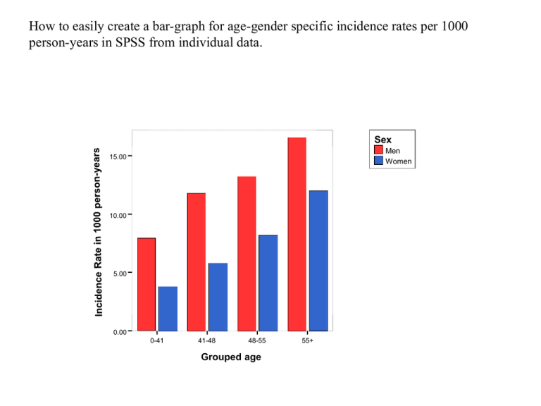
How to easily create a bar-graph for age-gender specific incidence rates per 1000
person-years in SPSS from individual data.
Sex
Men
Women
15.00
10.00
5.00
0.00
0-41
41-48
48-55
Grouped age
55+
In order to create a bar graph for age-sex specific incidence rates, we
need to:
1. Create aggregated data on:
(A) Total number of incidence events in each age-sex category.
(B). Total number of follow-up time in each age-sex category.
2. Compute incidence rate in 1000 person years by diving the above (1) by
(2) multiply by 1000.
3. Create a bar-graph to plots the data.
Dataset to be used (individual patient data):
Read Framchd.sav data into SPSS.
CHDFATE: 1: CHD event, 0: CHD non-event
FUyears: Follow-up length (in years)
How to create aggregated data in SPSS (1):
Go to:
Data,
Aggregate, …
Select
AgeGrp
as Breakdata
Variables
How SEX
to create
aggregated
in SPSS (2):
Select FUyears and CHDFATE as Summaries of Variables (*)
Click on Function (you need to click on the variable * first in order to activate this)
Select Replace working data with aggregated variables only
OK
How to create aggregated variable in SPSS (1).
Select Sum under Number of Cases for both FUyears and CHDFATE , Continue
Aggregated Data
Compute incidence rate in 1000 person years
Create a bar-graph to plots the data.
Graphs
Interactive
Bar
Select INC_RATE as Y-axis, Grouped Age as X-axis, SEX as
Legend variable
Sex
Men
Women
15.00
10.00
5.00
0.00
0-41
41-48
48-55
Grouped age
55+
