Robert Indiana and the Watercolor Project
advertisement
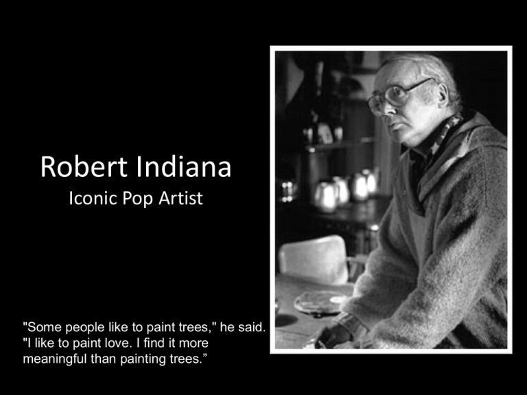
Robert Indiana Iconic Pop Artist "Some people like to paint trees," he said. "I like to paint love. I find it more meaningful than painting trees.” Robert Indiana The Rainbow HOPE Silkscreen on Canvas, 2009 Robert Indiana HOPE (Red/Violet) Painted Aluminum sculpture, 2008 Robert Indiana. He was a painter, sculptor, and graphic design artist. He was born Robert Clark in New Castle, Indiana on September 13th, 1928. He loved everyday symbols along roadside America that he saw as a child growing up in Indianapolis. Examples like “Route 66”, “EAT” at roadside diners, gas station signs, etc. inspired him in his later art work. He created geometric art like the examples you see here. Robert Clark adopted the name of his native state and became known as Robert Indiana. His art work gave new meaning to familiar everyday words such as eat, love, and hope. Since our Onomatopoeia project was based on Pop art, you can probably identify Indiana is a Pop artist. Let’s review… Pop art was and is an art movement that emerged in the 1950s. Pop art was and is characterized by themes and techniques drawn from popular mass culture, such as advertising, comic books, everyday objects, and popular people. COULD YOU GUESS THAT . . . …Robert Indiana was born in Indiana? His parents' last name was "Clark." When he changed his name, Robert Indiana was finding another way to show how important words are to him. …a lot of his childhood was spent along busy highways? Indiana remembers the neon signs and game machines from the roadside restaurants where his mother worked, and he puts their shapes into his artwork. He also likes to use the colors of his father's gasoline-company truck—red and green—with the blue and white of the sky and clouds behind it. …he found some old brass letter stencils when he moved his art studio into an old warehouse? The stencils inspired him to use words in his paintings, and he likes painting letters that look as if they've been printed. …Robert Indiana thinks that most people never stop to think about how beautiful words and numbers are? He said that he thinks his job as an artist is "…to make words and numbers very, very special." Love, NYC, 1966 We will be creating a small painting using water color in the style of Robert Indiana The Main Objective or WHY are we creating this painting? To appreciate the creation and style of art through history AND…. To learn the following concepts of COLOR THEORY. TINT SHADE TONE COMPLEMENTARY TINT - a tint is the mixture of a color with white, which increases lightness PURE COLOR WHITE TINT SHADE - a shade is the mixture of a color with black, which increases darkness PURE COLOR Black SHADE TONE – a tone is the mixture of a color with grey. PURE COLOR Grey (mixture of white and black) Tone Let’s Begin! Thumbnail…. 1. Decide your WORD from this list - Life, Hope, Love, Calm, Luck, Live 2. On your thumbnail paper, using a ruler create SQUARES. 3. Practice drawing your letters in Clarendon Condensed font style to FILL squares. 4. Get approval and help from Ms. Strattan AFTER all your letters for your chosen word are drawn and represent your best effort. Final Draft… 1. Get Watercolor Paper from Ms. Strattan and WRITE YOUR NAME ON IT. 2. Find the middle (@4 ½ Inches) and draw a line both ways. You must make multiple measurements to be sure your line is straight and boxes are equal. 3. Draw your letters LIGHTLY with pencil 4. Decide which color scheme will go where…visualize it first! 5. One the back, label each quad with color scheme. I will check this to see if you painted it correctly. Color Schemes TINT – 1 Color + Tint SHADE – 1 Color+ Shade TONE – 1 Color + Tone Complementary – Red and Green, Blue and Orange, Violet and Yellow Examples: PAY ATTENTION TO SPACING! If you need a different letter reference, please get one! The font style is Clarendon Condensed in BOLD Note Equal space on both sides of letter C EP AFKL M IV H U Note Equal space on both sides of letter

