Sample Poster - SUNY College of Environmental Science and Forestry
advertisement
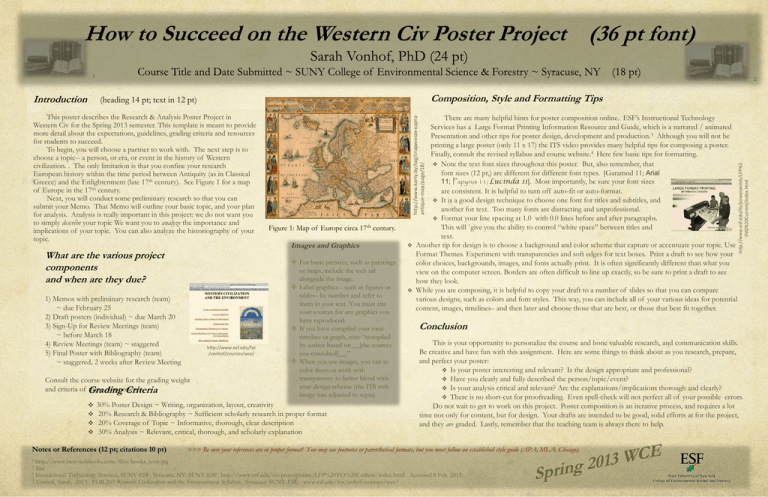
1 Composition, Style and Formatting Tips (heading 14 pt; text in 12 pt) What are the various project components and when are they due? 1) Memos with preliminary research (team) ~ due February 25 2) Draft posters (individual) ~ due March 20 3) Sign-Up for Review Meetings (team) ~ before March 18 4) Review Meetings (team) ~ staggered 5) Final Poster with Bibliography (team) ~ staggered, 2 weeks after Review Meeting http://www.esf.edu/for /vonhof/courses/wce/ Consult the course website for the grading weight and criteria of Grading these components. Criteria 1 Figure 1: Map of Europe circa 17th century. Images and Graphics For basic pictures, such as paintings or maps, include the web url alongside the image. Label graphics-- such as figures or tables– by number and refer to them in your text. You must cite your sources for any graphics you have reproduced. If you have compiled your own timeline or graph, state “compiled by author based on __[the sources you consulted]__.” When you use images, you can recolor them or work with transparency to better blend with your design scheme (the ITS web image was adjusted to sepia). 30% Poster Design ~ Writing, organization, layout, creativity 20% Research & Bibliography ~ Sufficient scholarly research in proper format 20% Coverage of Topic ~ Informative, thorough, clear description 30% Analysis ~ Relevant, critical, thorough, and scholarly explanation Notes or References (12 pt; citations 10 pt) There are many helpful hints for poster composition online. ESF’s Instructional Technology Services has a Large Format Printing Information Resource and Guide, which is a narrated / animated Presentation and other tips for poster design, development and production.3 Although you will not be printing a large poster (only 11 x 17) the ITS video provides many helpful tips for composing a poster. Finally, consult the revised syllabus and course website.4 Here few basic tips for formatting. Note the text font sizes throughout this poster. But, also remember, that font sizes (12 pt,) are different for different font types. [Garamnd 11; Arial 11; Papyrus 11; Lucinda 11]. Most importantly, be sure your font sizes are consistent. It is helpful to turn off auto-fit or auto-format. It is a good design technique to choose one font for titles and subtitles, and another for text. Too many fonts are distracting and unprofessional. Format your line spacing at 1.0 with 0.0 lines before and after paragraphs. This will `give you the ability to control “white space” between titles and text. Another tip for design is to choose a background and color scheme that capture or accentuate your topic. Use Format Themes. Experiment with transparencies and soft edges for text boxes. Print a draft to see how your color choices, backgrounds, images, and fonts actually print. It is often significantly different than what you view on the computer screen. Borders are often difficult to line up exactly, so be sure to print a draft to see how they look. While you are composing, it is helpful to copy your draft to a number of slides so that you can compare various designs, such as colors and font styles. This way, you can include all of your various ideas for potential content, images, timelines– and then later and choose those that are best, or those that best fit together. http://www.karty.by/tag/старинная-картаantique-map/page/18/ This poster describes the Research & Analysis Poster Project in Western Civ for the Spring 2013 semester. This template is meant to provide more detail about the expectations, guidelines, grading criteria and resources for students to succeed. To begin, you will choose a partner to work with. The next step is to choose a topic-- a person, or era, or event in the history of Western civilization. . The only limitation is that you confine your research European history within the time period between Antiquity (as in Classical Greece) and the Enlightenment (late 17th century). See Figure 1 for a map of Europe in the 17th century. Next, you will conduct some preliminary research so that you can submit your Memo. That Memo will outline your basic topic, and your plan for analysis. Analysis is really important in this project: we do not want you to simply describe your topic We want you to analyze the importance and implications of your topic. You can also analyze the historiography of your topic. Conclusion This is your opportunity to personalize the course and hone valuable research, and communication skills. Be creative and have fun with this assignment. Here are some things to think about as you research, prepare, and perfect your poster: Is your poster interesting and relevant? Is the design appropriate and professional? Have you clearly and fully described the person/topic/event? Is your analysis critical and relevant? Are the explanations/implications thorough and clearly? There is no short-cut for proofreading. Even spell-check will not perfect all of your possible errors. Do not wait to get to work on this project. Poster composition is an iterative process, and requires a lot time not only for content, but for design. Your drafts are intended to be good, solid efforts at for the project, and they are graded. Lastly, remember that the teaching team is always there to help. >>> Be sure your references are in proper format! You may use footnotes or parenthetical formats, but you must follow an established style guide (APA, MLA, Chicago). http://www.beecreekbooks.com/files/books_icon.jpg Ibid. 3 Instructional Technology Services, SUNY-ESF. Syracuse, NY: SUNY-ESF. http://www.esf.edu/its/powerpoints/LFP%20VO%20Current/index.html. Accessed 8 Feb. 2013. 4 Vonhof, Sarah. 2013. FOR 203 Western Civilization and the Environment Syllabus. Syracuse: SUNY-ESF. www.esf.edu/for/vohof/courses/wce/ 2 http://www.esf.edu/its/powerpoints/LFP%2 0VO%20Current/index.html Introduction 2
