Animation
The Twelve
Principles of
Animation
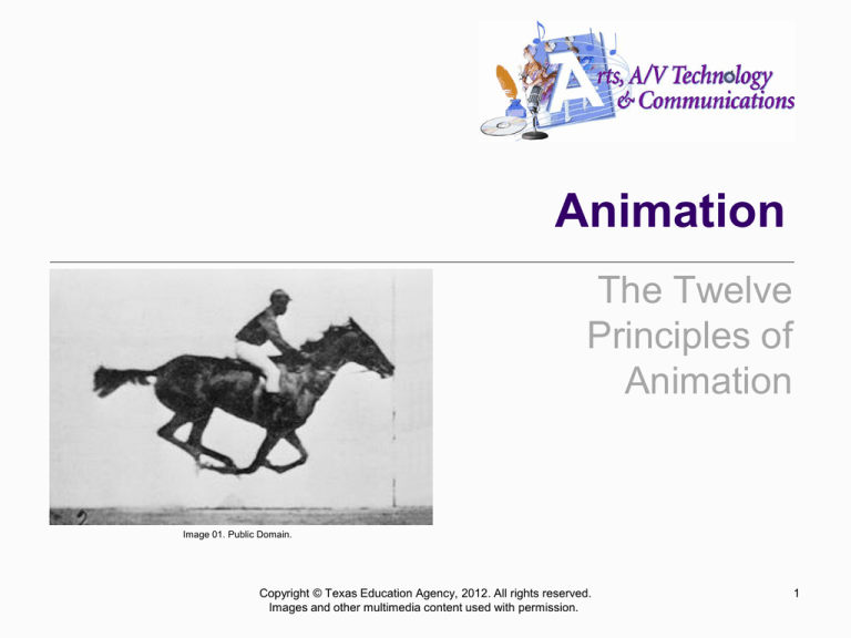
Image 01. Public Domain.
Copyright © Texas Education Agency, 2012. All rights reserved.
Images and other multimedia content used with permission.
1
Principles of Animation
Image 02. Public Domain.
In their book, The Illusion of Life, Ollie
Johnston and Frank Thomas present
the twelve principles of animation used
in animated films that they produced
for Walt Disney.
Most of these concepts were
developed when Disney sent his
animators for drawing classes at the
Chouinard Art Institute in Los Angeles.
These principles have become the
industry standards and are still used to
this day.
Copyright © Texas Education Agency, 2012. All rights reserved.
Images and other multimedia content used with permission.
2
1. Straight Ahead Versus
Pose To Pose
Straight Ahead animation means drawing the frames in
sequence. This leads to spontaneous motion. It works well
with abstract animation and fluids.
Image 03. Used with permission.
Pose To Pose is the more often used animation technique. It
requires the animator to create strong poses (keyframes) first
and then add the in-between frames.
Image 04. Used with permission.
Copyright © Texas Education Agency, 2012. All rights reserved.
Images and other multimedia content used with permission.
3
2. Arcs
Almost all natural motion is in
some form of an arc.
If a ball is thrown, it usually
follows an arched path.
Pivot points often define the arc.
The pivot point for the thigh is the
hip and the pivot point for the calf
is the knee.
Most human motion follows an
arc. If a boxer throws a punch, the
motion of his glove follows an arc.
Image 05. Used with permission.
Image 06. Used with permission.
Copyright © Texas Education Agency, 2012. All rights reserved.
Images and other multimedia content used with permission.
4
3. Timing
Timing is the amount of frames used as
an object moves across the screen.
Timing can imply weight. Light objects
have less resistance and move much
quicker than heavy objects.
Actors work with their timing to get the
maximum impact from their lines.
Speed can imply emotion. A fast walk
may mean happiness and a slow walk
may mean depression.
An animator must determine how many
frames are needed for a given
movement. A stopwatch or video
reference can be helpful.
Image 07. Used with permission.
Copyright © Texas Education Agency, 2012. All rights reserved.
Images and other multimedia content used with permission.
5
4. Slow In and Slow Out
Also known as ease in and ease out.
Most motion starts slowly,
accelerates, and then slows again
before stopping. Imagine a car that
went 40 mph immediately when
stepping on the accelerator and went
to 0 mph when hitting the brake.
Gravity has an effect on slow in /
slow out. When a ball bounces, it
increases in speed as it gets closer
to the ground. It decreases in speed
at the top of the arch.
Copyright © Texas Education Agency, 2012. All rights reserved.
Images and other multimedia content used with permission.
Image 08. Used with permission.
6
5. Squash and Stretch
Living flesh distorts during
motion.
Exaggerated deformations will
emphasize motion and impact.
Although objects deform like
rubber, they must maintain
volume while being squashed
and stretched.
A bouncing ball will squash or
elongate on impact and stretch
vertically as it leaves the point
of impact.
This is the most well known
and often used principle.
Image 09. Used with permission.
Copyright © Texas Education Agency, 2012. All rights reserved.
Images and other multimedia content used with permission.
7
6. Anticipation
Animation can occur before an action. Before you jump,
you bend your knees.
By exaggerating this action, the animator can guide the
viewer’s eyes.
The formula for most animations is anticipation, action,
and reaction.
Image 10. Used with permission.
Copyright © Texas Education Agency, 2012. All rights reserved.
Images and other multimedia content used with permission.
8
7. Follow Through &
Overlapping Action
Follow Through is the action that follows the main action. It is
the opposite of anticipation.
When a baseball bat hits the baseball, it does not stop
abruptly. A boxer does not freeze at the moment a punch
lands.
Overlapping actions means that all elements do not stop at
the same time.
A good example of overlapping action is the movement of an
animal’s tail.
Image 11. Used with permission.
Copyright © Texas Education Agency, 2012. All rights reserved.
Images and other multimedia content used with permission.
9
8. Secondary Actions
Secondary actions are actions caused by the impact of
another object. They movement of a ball that has been
kicked is a secondary action.
Secondary actions are also minor actions that occur due to a
major action. Most people blink their eyes when they turn
their head. Facial expressions are secondary actions.
Image 12. Used with permission.
Copyright © Texas Education Agency, 2012. All rights reserved.
Images and other multimedia content used with permission.
10
9. Staging
Staging is the clear presentation of an idea.
The animator can use the camera viewpoint, the framing of
the shot, and the position of the characters to create a
feeling or strengthen understanding.
Image 13. Used with permission.
Copyright © Texas Education Agency, 2012. All rights reserved.
Images and other multimedia content used with permission.
11
10. Exaggeration
Exaggeration is used to
increase the readability of
emotions and actions.
Animation is not a subtle
medium.
Individual exaggerated
poses may look silly as stills
but add dramatic impact
when viewed for a split
second.
Animators should use
exaggeration to increase
understanding of feeling, but
be careful to not overexaggerate everything.
Image 14. Used with permission.
Copyright © Texas Education Agency, 2012. All rights reserved.
Images and other multimedia content used with permission.
12
11. Solid Drawing
To get maximum feeling from the
audience, animated characters
must be drawn or modeled
precisely.
Proper drawing and modeling can
reveal a characters weight,
character, and emotion.
Proper drawing and modeling are
needed to give the character
proper depth and balance.
When creating animated
characters, it is a good idea to not
add too much detail.
Image 15. Used with permission.
Copyright © Texas Education Agency, 2012. All rights reserved.
Images and other multimedia content used with permission.
13
12. Appeal
Animated characters need to have
a unique personality and have a
wide range of emotions (happy,
excited, fearful, embarrassed,
angry, scared, etc.).
Character flaws are actually a
good thing. Audiences can be
sympathetic to characters that
have a flaw or two.
Complex personalities and moral
ethical dilemmas add to character
appeal.
Image 16. Used with permission.
Copyright © Texas Education Agency, 2012. All rights reserved.
Images and other multimedia content used with permission.
14
Image Credits
Image 01. Photos of running horse. Photos taken by Eadweard Muybridge (died 1904), first published in
1887 at Philadelphia (Animal Locomotion). This image (or other media file) is in the public domain because
its copyright has expired.
Image 02. Photo of Walt Disney. This work is in the public domain because it was published in the United
States between 1923 and 1963 and although there may or may not have been a copyright notice,
the copyright was not renewed.
Image 03. Growing flower animation. Created by Mark Harman. Used with permission.
Image 04. Drinking soda animation. Created by Mark Harman. Used with permission.
Image 05. Bouncing ball path. Created by Mark Harman. Used with permission.
Image 06. Girl moving arm. Created by Mark Harman. Used with permission.
Image 07. Stopwatch on cellphone. Photography by Mark Harman. Used with permission.
Image 08. Swinging pendulum. Created by Mark Harman. Used with permission.
Image 09. Ball squash and stretch. Created by Mark Harman. Used with permission.
Image 10. Girl swatting fly. Created by Julie Stevens. Used with permission.
Image 11. Boy jumping off ledge. Created by Rachel Racanelli. Used with permission.
Image 12. Bowling ball hitting pins. Created by Mark Harman. Used with permission.
Image 13. Old man reading newspaper. Created by Alex Moran. Used with permission.
Image 14. Girl hitting golf ball. Created by Sam Ko. Used with permission.
Image 15. Sherlock Holmes Drawing. Created by Hailey Pier. Used with permission.
Image 16. Man holding wand. Created by Sophia Hopping. Used with permission.
Copyright © Texas Education Agency, 2012. All rights reserved.
Images and other multimedia content used with permission.
15


