TDLC Poster Template - Temporal Dynamics of Learning Center
advertisement
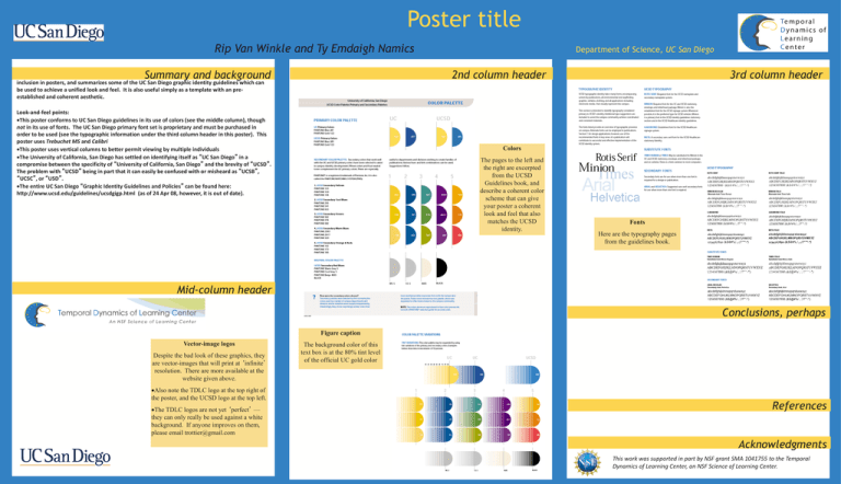
Poster title Rip Van Winkle and Ty Emdaigh Namics Department of Science, UC San Diego 3rd column header 2nd column header Summary and background This poster template is meant to serve as a resource for TDLC members. It contains good graphics for inclusion in posters, and summarizes some of the UC San Diego graphic identity guidelines which can be used to achieve a unified look and feel. It is also useful simply as a template with an preestablished and coherent aesthetic. Look-and-feel points: This poster conforms to UC San Diego guidelines in its use of colors (see the middle column), though not in its use of fonts. The UC San Diego primary font set is proprietary and must be purchased in order to be used (see the typographic information under the third column header in this poster). This poster uses Trebuchet MS and Calibri This poster uses vertical columns to better permit viewing by multiple individuals The University of California, San Diego has settled on identifying itself as “UC San Diego” in a compromise between the specificity of “University of California, San Diego” and the brevity of “UCSD”. The problem with “UCSD” being in part that it can easily be confused with or misheard as “UCSB”, “UCSC”, or “USD”. The entire UC San Diego “Graphic Identity Guidelines and Policies” can be found here: http://www.ucsd.edu/guidelines/ucsdgigp.html (as of 24 Apr 08, however, it is out of date). Colors The pages to the left and the right are excerpted from the UCSD Guidelines book, and describe a coherent color scheme that can give your poster a coherent look and feel that also matches the UCSD identity. Fonts Here are the typography pages from the guidelines book. Mid-column header Conclusions, perhaps Figure caption Vector-image logos Despite the bad look of these graphics, they are vector-images that will print at ‘infinite’ resolution. There are more available at the website given above. Also note the TDLC logo at the top right of the poster, and the UCSD logo at the top left. The TDLC logos are not yet ‘perfect’ — they can only really be used against a white background. If anyone improves on them, please email trottier@gmail.com The background color of this text box is at the 80% tint level of the official UC gold color References Acknowledgments This work was supported in part by NSF grant SMA 1041755 to the Temporal Dynamics of Learning Center, an NSF Science of Learning Center.
