Principles of Design
advertisement
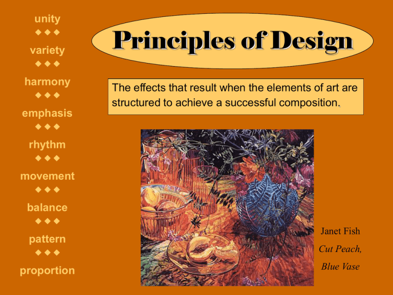
unity variety Principles of Design harmony The effects that result when the elements of art are structured to achieve a successful composition. emphasis rhythm movement balance pattern Janet Fish Cut Peach, proportion Blue Vase Balance The arrangement of the elements to create a feeling of stability in an artwork. Types: • Formal = equal for very similar elements are mirrored along a vertical or horizontal axis or many radiating axis • Informal = artist considers the visual weight of all the elements and places them accordingly, with no consideration of an axis Sometimes an artist will purposely strive for imbalance in their work. Informal balance in Joan Miró’s Landscape (The Hare). The large but thin curvilinear object on the left is balanced by the smaller but heavier shapes on the right. Formal balance along a central vertical axis in Diego Rivera’s Flower Day and radiating from the top center of Dorothy Torivio’s Vase. Proportion Refers to the size relationships of parts to one another and to the whole. The Golden Mean A shape divided into two parts so that the ratio of the smaller part to the larger part is the same ratio of the larger part to the whole. Exaggeration and distortion are deviations from expected or normal proportions. Realistic proportion in Marisol’s The Family and in Duane Hanson’s Tourists II. Disproportion and exaggeration in Amedeo Modigliani’s Head and in Pablo Picasso’s Three Dancers. Variety The inclusion of differences among the elements in a composition to offset unity and add interest to a work. Gustav Klimt Tree of Life Emphasis There is an element or combination of elements that create(s) a focal point for the viewer. Emphasis can be created through contrast, isolation, location, convergence/lead lines or the unusual. Contrast refers to the degree of difference between elements, most commonly value, color and texture. Contrast is the key to a welldefined artwork such as The Girl with a Pearl Earring by Jan Vermeer. Isolation means putting one object alone, apart from all the others as in Andrew Wyeth’s Christina’s World. Location refers to placing objects near the center of the space, causing them to be noticed first as in Odilon Redon’s Red Boat with a Blue Sail. Watch out though; this can be too predictable. Convergence / Lead lines are implied or actual lines that draw your eye to a specific area or the composition as in Vincent Van Gogh’s Café Terrace at Night. The unusual refers to placing something unexpected in the composition to capture and hold the viewer’s attention as in David Alfero Siqueiros’ Echo of a Scream. Unity The sense of wholeness that results from the successful combination of elements in an artwork. Harmony creates unity by stressing the similarities of separate but related parts of the composition. Jasper Johns Numbers Elizabeth Catlett Sharecropper Robert Gwathmey Sunday Morning Rhythm A way of combining elements to produce the appearance of movement, usually through repetition. Movement Refers to the arrangement of parts in an artwork to create a sense of motion, or in some case, actual movement. Marcel Duchamp Nude Descending Staircase Alexander Calder The Star Pattern Concerned with decorative surface decoration in a repetitive and recognizable organization. A motif is the unit that is repeated, sometimes with variations. Types of rhythm and pattern include random, regular, alternating, flowing and progressive. M. C. Escher
