Chapter 13-15 figures/tables
advertisement
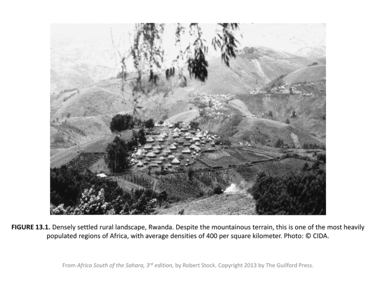
FIGURE 13.1. Densely settled rural landscape, Rwanda. Despite the mountainous terrain, this is one of the most heavily populated regions of Africa, with average densities of 400 per square kilometer. Photo: © CIDA. From Africa South of the Sahara, 3rd edition, by Robert Stock. Copyright 2013 by The Guilford Press. TABLE 13.1. National Population Densities in Relation to Area, 2009 From Africa South of the Sahara, 3rd edition, by Robert Stock. Copyright 2013 by The Guilford Press. FIGURE 13.2. Population density in Zambia. Data source: Central Statistical Office, Zambia. Census Data from Zambia, 2000. (Available online at www.zamstats.gov.zm/census.php). From Africa South of the Sahara, 3rd edition, by Robert Stock. Copyright 2013 by The Guilford Press. FIGURE 13.3. River blindness and settlement: A schematic map. The first panels show the cycle of settlement advances and retreat described by Hunter. The last panel suggests that disease control programs may eliminate the rationale for this cycle—that is, may permit permanent settlement of the valleys. From Africa South of the Sahara, 3rd edition, by Robert Stock. Copyright 2013 by The Guilford Press. FIGURE 13.4. Rural population densities in South Africa’s apartheid homelands. Densities were especially high in comparison to the rest of South Africa. After F. Wilson and M. Ramphale. Uprooting Poverty: The South African Challenge. Cape Town: David Phillip, 1989, p. 36. From Africa South of the Sahara, 3rd edition, by Robert Stock. Copyright 2013 by The Guilford Press. FIGURE 13.5. Urbanization as a percentage of the total population, 2010. Africa is the least urbanized of the continents, but rates of urbanization vary greatly from country to country. Data source: UN-HABITAT. The State of African Cities 2010. Nairobi: UN-HABITAT, 2010. From Africa South of the Sahara, 3rd edition, by Robert Stock. Copyright 2013 by The Guilford Press. FIGURE 13.6. Examples of rural settlement types. (a) Dispersed compounds, Swaziland. (b) Very dense dispersed settlement, western Kenya. (c) Linear pattern of nucleated fishing villages, Nigeria. (d) Nucleated agricultural settlements, The Gambia. From Africa South of the Sahara, 3rd edition, by Robert Stock. Copyright 2013 by The Guilford Press. FIGURE 13.7. Population cartogram. Areas on the map are proportional to national populations in 2010, thus highlighting the dominance of certain countries—particularly Nigeria. From Africa South of the Sahara, 3rd edition, by Robert Stock. Copyright 2013 by The Guilford Press. TABLE 13.2. National Populations, 2011 From Africa South of the Sahara, 3rd edition, by Robert Stock. Copyright 2013 by The Guilford Press. FIGURE14.1. Under-five mortality rate, 2011. Mortality rates for the most disadvantaged groups within each country are often well above the already high national values. Data source: World Bank. Africa Development Indicators 2011. Washington, DC: World Bank, 2011. (Available online at http:// data.worldbank.org/sites/default/files/adi_2011-web.pdf) From Africa South of the Sahara, 3rd edition, by Robert Stock. Copyright 2013 by The Guilford Press. TABLE 14.1. Natural Increase in Selected African Countries From Africa South of the Sahara, 3rd edition, by Robert Stock. Copyright 2013 by The Guilford Press. FIGURE 14.2a. Educating youth about HIV/AIDS in Zambia. (a) Peer educators engage in a street theatre performance outside a bar. Photo: © CIDA (David Trattles). From Africa South of the Sahara, 3rd edition, by Robert Stock. Copyright 2013 by The Guilford Press. FIGURE 14.2b. Educating youth about HIV/AIDS in Zambia. (b) Workers in an AIDS project pose outside a Community Youth Center; the message on the wall asks, “Just how cool are you? Use a condom.” Photo: © CIDA (David Trattles). From Africa South of the Sahara, 3rd edition, by Robert Stock. Copyright 2013 by The Guilford Press. FIGURE 14.3. Percentage of the adult population infected with HIV or diagnosed with AIDS, 2009. Rates of infection are highest in southern Africa. Data source: World Bank. Africa Development Indicators 2011. Washington, DC: World Bank, 2011. From Africa South of the Sahara, 3rd edition, by Robert Stock. Copyright 2013 by The Guilford Press. a b FIGURE 14.4. Population pyramids in the context of demographic change. (a) The broad-based pyramid of South Sudan is typical for African countries with very high fertility. (b) Population pyramid of Botswana in 2006, reflecting its lower fertility and slower population growth. The dark-shaded pyramid shows the impact of AIDS on Botswana’s population pyramid, particularly the large numbers of young children and younger adults who are missing from the pyramid as a result of AIDS. Data sources: (a) Southern Sudan Centre for Census, Statistics, and Evaluation (SSCCSE). Key Indicators for Southern Sudan. Juba: SSCCSE, 2011. (Available online: http://ssnbs.org/storage/key-indicators- for-southern-sudan/Key%20Indicators_A5_final.pdf) (b) V. A. Velkoff and P. R. Kowal. Population Aging in Sub-Saharan Africa: Demographic Dimensions 2006. Washington, DC: U.S. Census Bureau, 2007. From Africa South of the Sahara, 3rd edition, by Robert Stock. Copyright 2013 by The Guilford Press. FIGURE 14.5. Total fertility rate, 2010. Total fertility rate is the average number of children per woman, based on current age-specific fertility rates. Data source: World Bank. Africa Development Indicators, 2011. Washington, DC: World Bank, 2011. From Africa South of the Sahara, 3rd edition, by Robert Stock. Copyright 2013 by The Guilford Press. FIGURE 14.6. Children in Harar, Ethiopia. With a median age below 20 years in most countries, Africa has the world’s most youthful population. Photo: author. From Africa South of the Sahara, 3rd edition, by Robert Stock. Copyright 2013 by The Guilford Press. FIGURE 14.7a. Population planning in Africa. (a) The use of modern contraception by married women of reproductive age continues to increase, but remains low compared to other parts of the world. Data source: World Bank. Africa Development Indicators (http://data.worldbank.org/indicator/SP.DYN. CONU.ZS). From Africa South of the Sahara, 3rd edition, by Robert Stock. Copyright 2013 by The Guilford Press. FIGURE 14.7b. Population planning in Africa. (b) Family-planning clinic, Zimbabwe. Photo: © CIDA (David Barbour). From Africa South of the Sahara, 3rd edition, by Robert Stock. Copyright 2013 by The Guilford Press. TABLE 14.2. Diseases of Underdevelopment. From Africa South of the Sahara, 3rd edition, by Robert Stock. Copyright 2013 by The Guilford Press. FIGURE 15.1. The overland pilgrimage from West Africa to Mecca. After J. S. Birks. “Overland pilgrimage in the savanna lands of Africa.” In L. A. Kosinski and R. M. Prothero, eds. People on the Move. London: Methuen, 1975, p. 303. From Africa South of the Sahara, 3rd edition, by Robert Stock. Copyright 2013 by The Guilford Press. FIGURE 15.2. Labor migration in late colonial times. Note the relationship between the various labor reserve areas and the destinations—that is, islands of economic development. After R. M. Prothero. Migrants and Malaria. London: Longman, 1965, p. 42. From Africa South of the Sahara, 3rd edition, by Robert Stock. Copyright 2013 by The Guilford Press. FIGURE 15.3. Migration routes between Africa south of the Sahara and North Africa used by African migrants hoping to gain entry to Europe. The map shows routes in use during the first decade of the 21st century. After H. de Haas. “Trans-Saharan migration to North Africa and the EU: Historical roots and current trends.” Migration Information Source (November 1, 2006). (Available online at www.migrationinformation.org/feature/display.cfm?id=484). From Africa South of the Sahara, 3rd edition, by Robert Stock. Copyright 2013 by The Guilford Press. FIGURE 15.4. Refugee camp in a remote part of the Ogaden region of Ethiopia houses 20,000 refugees seeking refuge from conflict in Somalia and drought. Photo: © CIDA (Roger LeMoyne). From Africa South of the Sahara, 3rd edition, by Robert Stock. Copyright 2013 by The Guilford Press. TABLE 15.1. African Countries with more than 100,000 People Identified as Populations of Concern by the UNHCR, 2009 (in Thousands) From Africa South of the Sahara, 3rd edition, by Robert Stock. Copyright 2013 by The Guilford Press. FIGURE 15.5. Thousands of returning refugees trek home to Rwanda from Zaire (now the Democratic Republic of the Congo) in 1996. They had sought asylum there following the genocide of 1994, but were displaced once again when fighting broke out in the refugee camps. Photo: © CIDA (Roger LeMoyne). From Africa South of the Sahara, 3rd edition, by Robert Stock. Copyright 2013 by The Guilford Press. FIGURE 15.6. Modern house under construction, Jigawa State, Nigeria. This house, built by an urban-based banker in his home village, symbolizes the importance of migrant remittances as a source of funds for local development. Photo: author. From Africa South of the Sahara, 3rd edition, by Robert Stock. Copyright 2013 by The Guilford Press.
