Usability
advertisement
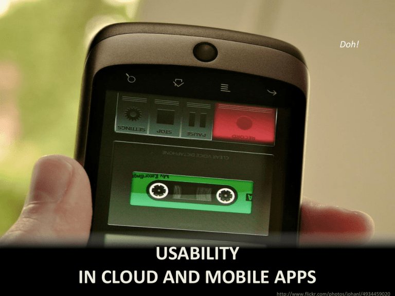
Doh! USABILITY IN CLOUD AND MOBILE APPS http://www.flickr.com/photos/johanl/4934459020 Key usability principles • • • • • Keep it simple Keep it responsive Follow guidelines and patterns Adequate aesthetics so as not to hurt usability Easy to install and start using Keep it simple 1 • There should be a primary task supported – And a clear, 100% obvious path for that task • 90/10 rule – 90% of users will use only 10% of the features • In fact, when you make a mobile+desktop app, design for the mobile screen first – And then add features for the other platform(s) Example: Skype for Android Check out this walkthrough of Skype http://www.youtube.com/watch?feature=player_e mbedded&v=1o6TBezfSpU Notice that the UI makes the right path obvious: • Click Skype icon; Skype shows list of contacts • User clicks contact name; Skype shows profile • User clicks Skype call or Skype video call button Keep it responsive • Responsiveness != performance – Does the app react quickly vs does the system complete work quickly/scalably • Main key: Do long operations asynchronously – E.g., network operations, big database operations – E.g., In Android, use IntentReceiver to perform small chunks of work; use Service for long tasks – E.g., In JavaScript, use function objects, closures, and events and/or setTimeout() 2 Performing a long task • • • • • Acknowledge input immediately Show user the progress so far Show user estimate of how long to wait Let user do work while waiting for long tasks Let users cancel long-running tasks 80% complete Important UI guidelines provided by Apple • • • • • • • • • Give People a Logical Path to Follow Elevate the Content that People Care About Minimize the Effort Required for User Input De-emphasize Settings and File-Handling Make Search Quick and Rewarding Use UI Elements Consistently Delight People with Stunning Graphics Handle Orientation Changes Ask People to Save Only When Necessary 3 iOS guidelines related to widgets • Status bar: is for showing status – Don’t hide it unless you have a really good reason • Navigation bar: is for navigating – Should have a “back”-like button if appropriate • Toolbar: is for tools – Usually bottom of screen • Tab bar: is for switching between views For the full guidelines • http://developer.apple.com/library/ios/#DOC UMENTATION/UserExperience/Conceptual/M obileHIG/Introduction/Introduction.html • http://developer.android.com/guide/practices /ui_guidelines/index.html Note: Not all guidelines are UI! Example: Handling Android lifecycle events • Pause/Resume (e.g., your app is only partially visible) – onPause: release sensor event listeners, store most user data – onResume: register sensor event listeners, restore most user data • Stop/Start and Destroy/Create (e.g., user briefly goes to home screen or changes the orientation from portrait to landscape) – Very similar to pause/resume but used for operations that have heavier startup/shutdown costs (such as connecting to a database) User interface patterns • Users become accustomed to doing tasks in certain ways within mobile apps • User interface patterns describe common ways of laying out the screen for tasks – So users can find stuff and don’t get confused • Different than Design Patterns – Structure of UI vs. structure of code Example: Popup invitation • Situation: App developer wants user to make it easy for user to visit app (website) frequently • Design: Provide a popup box inviting the user to add the app to home http://www.flickr.com/photos/ brettlider/4964755483/sizes/m /in/photostream/ Other common UI patterns • • • • • • • • • • Dashboard Empty data set – invite user Live search Login / authentication Menu of operations Navigation widget Profile screen Settings screens Splash screens User profile screen Places to go for UI patterns • • • • • • • • http://androidpttrns.com/ http://inspired-ui.com/ http://mobile-patterns.com/ http://pttrns.com/ http://www.androiduipatterns.com/ http://www.lovelyui.com/ http://www.mobiledesignpatterngallery.com/ http://www.patternsofdesign.co.uk/ Aesthetics • Aesthetics is not directly about usability – Aesthetics is how “pretty” or “pleasing” it is – Usability is how well people can use it • But it is possible for apps to be so tragically ugly that their very ugliness hurts usability 4 Elements of aesthetics • Graphics and that jazz should never distract from functionality or content • Provide obvious but unobtrusive navigation • Balance visual weight across screen • Use consistency, repetition and proximity to show groups of conceptually similar items • Use contrast to emphasize differences Example #1 My Courses •CS561: Software engineering •CS562: Applied software engineering •CS569: Special topics in software engineering •CS584: Human factors in programming languages Add another registered course Machine learning on the cloud Advanced e-commerce Software and job creation FPGA programming Add another wishlist course CS561: Software engineering Taken in Fall 2012 from Jensen, C Grade of A Utilize software engineering methodology in a team environment to develop a real-world application. Teams will be responsible for all phases of software development, including project planning, requirements analysis, design, coding, testing, configuration management, quality assurance, documentation, and delivery. Two-term sequence required. 75 34 Back Example #2 My Courses + Registered CS561: Software engineering CS562: Applied software engi… CS569: Special topics in softw… CS584: Human factors in prog… Wish list Machine learning on the cloud Advanced e-commerce Software and job creation FPGA programming Courses CS561 Software engineering 75 Term taken: Fall 2012 Your grade: A Instructor: Jensen, C. 34 Over all terms, all instructors Description Utilize software engineering methodology in a team environment to develop a real-world application. Teams will be responsible for all phases of software development, including project planning, requirements analysis, design, coding, testing, configuration management, quality assurance, documentation, and delivery. Two-term sequence required. Of course… The usability of an app is immaterial if nobody can even figure out how to install it. Easy to install and start using • It should be trivially easy for a user to – Find your app – Install your app – Start using your app 5 Discoverability Some tips for naming your app (Courtesy of NetMagazine) • Two-part name: distinctive and memorable • Authentic: not a “knock-off” of existing app • Clear: say what your app does • Short: under 11 characters And, obviously, use words related to the app’s purpose so it shows up in search results. Other ways to get app discovered • Word-of-mouth – E.g., provide rewards in app for people who tell their friends • Strategic partnerships: mutual benefits – E.g., Get your app reviewed by bloggers; you want to get a lot of buzz (test for scalabilty beforehand) • Advertise – E.g., iAd, AdMob, or even DoubleClick (websites) Install-ability • The easiest apps to install are web apps – Do you really need to make a native app? • Good reasons: performance, native APIs • Webapps can be bookmarked onto home page – And can even have a nifty little icon! • Free apps are far more likely to be installed – Consider monetizing via ads + in-app purchases Easing the installation • Keep the installation lean – E.g., Don’t package in media such as video and big images unless most users will need them – Bundle different media for different device sizes – Defer downloads of media only some users need • Don’t crash on install – Common problem: requiring installation via iTunes (why on earth, I can’t imagine) Start using-ability • Don’t crash on first startup – Fail gracefully if network is unavailable – Test on lots of different devices • Avoid requiring user to set settings to start • Obvious path for primary task (which is where I started this lecture!) Key usability principles • Keep it simple – Design for a primary task • Keep it responsive – Asynchronicity for long tasks • Follow guidelines and patterns • Adequate aesthetics so as not to hurt usability • Easy to install and start using – Discoverability – Install-ability – Start using-ability

