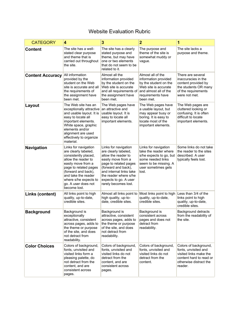
Website Evaluation Rubric CATEGORY Content 4 3 2 1 The site has a wellstated clear purpose and theme that is carried out throughout the site. The site has a clearly stated purpose and theme, but may have one or two elements that do not seem to be related to it. The purpose and theme of the site is somewhat muddy or vague. The site lacks a purpose and theme. Almost all the information provided by the student on the Web site is accurate and all requirements of the assignment have been met. Almost all of the information provided by the student on the Web site is accurate and almost all of the requirements have been met. There are several inaccuracies in the content provided by the students OR many of the requirements were not met. Content Accuracy All information provided by the student on the Web site is accurate and all the requirements of the assignment have been met. Layout The Web site has an exceptionally attractive and usable layout. It is easy to locate all important elements. White space, graphic elements and/or alignment are used effectively to organize material. The Web pages have an attractive and usable layout. It is easy to locate all important elements. The Web pages have a usable layout, but may appear busy or boring. It is easy to locate most of the important elements. The Web pages are cluttered looking or confusing. It is often difficult to locate important elements. Navigation Links for navigation are clearly labeled, consistently placed, allow the reader to easily move from a page to related pages (forward and back), and take the reader where s/he expects to go. A user does not become lost. Links for navigation are clearly labeled, allow the reader to easily move from a page to related pages (forward and back), and internal links take the reader where s/he expects to go. A user rarely becomes lost. Links for navigation take the reader where s/he expects to go, but some needed links seem to be missing. A user sometimes gets lost. Some links do not take the reader to the sites described. A user typically feels lost. Links (content) All links point to high quality, up-to-date, credible sites. Almost all links point to Most links point to high Less than 3/4 of the high quality, up-toquality, up-to-date, links point to high date, credible sites. credible sites. quality, up-to-date, credible sites. Background Background is exceptionally attractive, consistent across pages, adds to the theme or purpose of the site, and does not detract from readability. Background is attractive, consistent across pages, adds to the theme or purpose of the site, and does not detract from readability. Background is consistent across pages and does not detract from readability. Background detracts from the readability of the site. Color Choices Colors of background, fonts, unvisited and visited links form a pleasing palette, do not detract from the content, and are consistent across pages. Colors of background, fonts, unvisited and visited links do not detract from the content, and are consistent across pages. Colors of background, fonts, unvisited and visited links do not detract from the content. Colors of background, fonts, unvisited and visited links make the content hard to read or otherwise distract the reader. Fonts The fonts are consistent, easy to read and point size varies appropriately for headings and text. Use of font styles (italic, bold, underline) is used consistently and improves readability. The fonts are consistent, easy to read and point size varies appropriately for headings and text. The fonts are consistent and point size varies appropriately for headings and text. A wide variety of fonts, styles and point sizes was used. Graphics Graphics are related to the theme/purpose of the site, are thoughtfully cropped, are of high quality and enhance reader interest or understanding. Graphics are related to the theme/purpose of the site, are of good quality and enhance reader interest or understanding. Graphics are related to the theme/purpose of the site, and are of good quality. Graphics seem randomly chosen, are of low quality, OR distract the reader. Images (accessibility) All images, especially those that are used for navigation, have an ALT tag that describes the image and its link so people who are visually impaired can use the Web site well. All images used for navigation have an ALT tag that describes the image and where it links to so people who are visually impaired can use the Web site well. Most images used for The needs of visually navigation have an impaired Internet users ALT tag that describes are ignored. the image and where it links to so people who are visually impaired can use the Web site well. Sounds Music, audio clips and/or sounds are thoughtfully edited and used only where they add to reader understanding of the content or to make the site more accessible to persons with visual handicaps. Music, audio clips and/or sounds are used only where they add to reader understanding of the content or to make the site more accessible to persons with visual handicaps. Music, audio clips and/or sounds are thoughtfully edited and used, but 1 or 2 detracted from the overall site. Music, audio clips and/or sounds were seemingly used randomly OR typically detracted from the overall site. Spelling and Grammar There are no errors in spelling, punctuation or grammar in the final draft of the Web site. There are 1-3 errors in spelling, punctuation or grammar in the final draft of the Web site. There are 4-5 errors in spelling, punctuation or grammar in the final draft of the Web site. There are more than 5 errors in spelling, punctuation or grammar in the final draft of the Web site. Copyright Fair use guidelines are followed with clear, easy-to-locate and accurate citations for all borrowed material. No material is included from Web sites that state that permission is required unless permission has been obtained. Fair use guidelines are followed with clear, easy-to-locate and accurate citations for almost all borrowed material. No material is included from Web sites that state that permission is required unless permission has been obtained. Fair use guidelines are followed with clear, easy-to-locate and accurate citations for most borrowed material. No material is included from Web sites that state that permission is required unless permission has been obtained. Borrowed materials are not properly documented OR material was borrowed without permission from a site that requires permission Rubric Made Using: RubiStar ( http://rubistar.4teachers.org ) by Deborah Kalkman, 2003 To view information about the Privacy Policies and the Terms of Use, please go to the following web address: http://rubistar.4teachers.org/index.php?screen=TermsOfUse
