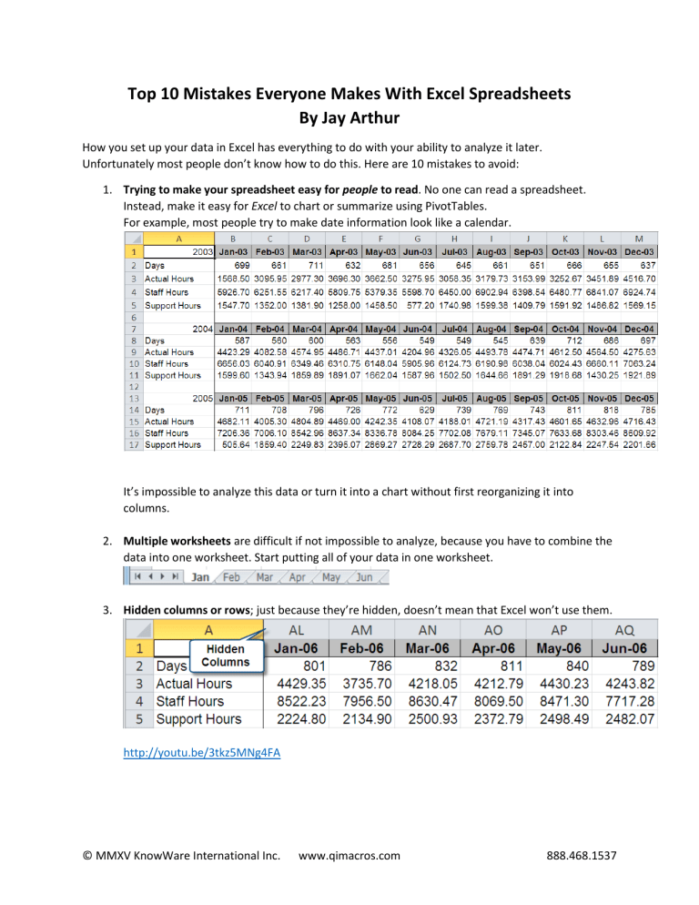
Top 10 Mistakes Everyone Makes With Excel Spreadsheets By Jay Arthur How you set up your data in Excel has everything to do with your ability to analyze it later. Unfortunately most people don’t know how to do this. Here are 10 mistakes to avoid: 1. Trying to make your spreadsheet easy for people to read. No one can read a spreadsheet. Instead, make it easy for Excel to chart or summarize using PivotTables. For example, most people try to make date information look like a calendar. It’s impossible to analyze this data or turn it into a chart without first reorganizing it into columns. 2. Multiple worksheets are difficult if not impossible to analyze, because you have to combine the data into one worksheet. Start putting all of your data in one worksheet. 3. Hidden columns or rows; just because they’re hidden, doesn’t mean that Excel won’t use them. http://youtu.be/3tkz5MNg4FA © MMXV KnowWare International Inc. www.qimacros.com 888.468.1537 4. Blank rows and columns also make it much harder to select, analyze or chart your data. If you select this data and try to create a line chart, you’ll get: How should you organize your data? In columns with time or categories in column A, data in B. 5. Merged cells can make it difficult to analyze your data. You will have to unmerge them to use them. For rows of cells, select the cells and use Format Cells: “Center Across Selection” to achieve the same look and feel. This file also has missing dates which will make it impossible to use PivotTables to summarize it. https://youtu.be/uSgZhHtg0Fc © MMXV KnowWare International Inc. www.qimacros.com 888.468.1537 6. Column headings in multiple cells or no heading; put the heading in one cell and use Wrap Text. No Headings 7. Putting multiple values in one cell; use two cells. Otherwise you will have to split the data to analyze it: https://youtu.be/KInGW9HTdGw Multiple Values: Single Values: © MMXV KnowWare International Inc. www.qimacros.com 888.468.1537 8. Inserting Totals or Averages into the Data. This makes it impossible to chart the data in a useful way. Remove the totals and use PivotTables to summarize the data. 9. Using values when you could use formulas. Let Excel do the calculations: https://youtu.be/h7S7TCaoKZE © MMXV KnowWare International Inc. www.qimacros.com 888.468.1537 10. Manually Summarizing Raw Data You can collect a manual checksheet of defects like this one: Or, you can use an Excel PivotTable to summarize a spreadsheet of the raw data about every event to get the same information. https://youtu.be/7M31ogJ6C0s © MMXV KnowWare International Inc. www.qimacros.com 888.468.1537 Notice that with this type of data, we can summarize by day to get time series data about defects as well as numbers and types of defects by production line. Or with a small change we could get summaries by type of defect: © MMXV KnowWare International Inc. www.qimacros.com 888.468.1537 Stop thinking people will understand your spreadsheet. They can’t or won’t. Turn your data into charts. Use performance charts for time-series data. Use column or Pareto charts for category data: Separate the Signal from the Noise If you get data into a format that’s easy for Excel to chart and Pivot, it will make it much easier to analyze the data and develop action plans for improvement. Trying to make spreadsheets readable by humans is largely a waste of time, because few people can “read” a spreadsheet. To most folks, a spreadsheet looks like noise. Your job is to find the signal in the noise using PivotTables and charts. Download a free 30-day trial of the QI Macros for Excel from www.qimacros.com. © MMXV KnowWare International Inc. www.qimacros.com 888.468.1537


