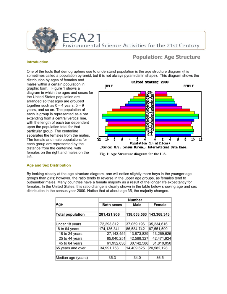
Population: Age Structure Introduction One of the tools that demographers use to understand population is the age structure diagram (it is sometimes called a population pyramid, but it is not always pyramidal in shape). This diagram shows the distribution by ages of females and males within a certain population in graphic form. Figure 1 shows a diagram in which the ages and sexes for the United States population are arranged so that ages are grouped together such as 0 – 4 years, 5 – 9 years, and so on. The population of each is group is represented as a bar extending from a central vertical line, with the length of each bar dependent upon the population total for that particular group. The centerline separates the females from the males. The female and male populations for each group are represented by the distance from the centerline, with females on the right and males on the Fig. 1: Age Structure diagram for the U.S. left. Age and Sex Distribution By looking closely at the age structure diagram, one will notice slightly more boys in the younger age groups than girls; however, the ratio tends to reverse in the upper age groups, as females tend to outnumber males. Many countries have a female majority as a result of the longer life expectancy for females. In the United States, this ratio change is clearly shown in the table below showing age and sex distribution in the census year 2000. Notice that at about age 35, the majority changes. Age Both sexes Number Male Female Total population 281,421,906 Under 18 years 18 to 64 years 18 to 24 years 25 to 44 years 45 to 64 years 65 years and over 72,293,812 37,059,196 35,234,616 174,136,341 86,584,742 87,551,599 27,143,454 13,873,829 13,269,625 85,040,251 42,568,327 42,471,924 61,952,636 30,142,586 31,810,050 34,991,753 14,409,625 20,582,128 Median age (years) 35.3 138,053,563 143,368,343 34.0 36.5 In China, the age and sex distribution is cause for alarm. Efforts there to reduce the birth rate have apparently contributed to a prominent male majority. Since the early 1980’s, a thrust by the government to reduce population growth in the most populous country in the world has resulted in many parents Fig. 2: Age structure diagram for China actively trying to have a male child if they are to have only one child. Cultural traditions there tend to cause parents to see a male child as more beneficial to the family than a female child; therefore, a striking imbalance has resulted between the numbers of males and females. There are concerns that the imbalance could lead to instabilities. Constructing and Interpreting an Age Structure Diagram With age and sex distribution data from a certain population, it is easy to construct an age structure diagram. Once the diagram is constructed, one can clearly see if the population will grow, decline, or experience no noticeable change in its population numbers; for example, if the diagram shows a pyramidal shape, then one can expect a rapid rise in population. If the diagram shows a generally straight up and down shape except for the older age groups, a stable population is thus revealed. If the diagram shows a top-heavy shape, then a decline is forecast for that population. Figure 3 shows the age structure diagrams for Mexico, Iceland, and Japan. The different shapes seen in the diagrams reflect different population characteristics. The diagram for Mexico shows the unmistakable pyramidal shape caused by ever-increasing number of births. Japan’s diagram has the classic shape of a shrinking population. In it, you should note how prereproductive age groups (0 – 14 years) have smaller populations than the reproductive age groups (15 - 44 years). Iceland shows a more stable population. Except for the post-reproductive groups (45+ years), the populations for the age groups extend generally the same lengths. Fig. 3: Age structure diagrams for Mexico, Iceland, and Japan (U.S. Census Bureau) Activity: Constructing an Age Structure Diagram On the activity sheet is an age structure diagram template on which bars can be drawn to represent the population for each age group and sex. Data for constructing the diagram will come from Census Year 2000 data for the American Indian and Alaska Native group. Because emigration and immigration are not major factors influencing the population numbers for this group, one can see the future of the group’s population without substantial migration influences. Click on the following link to gather data for the number of females in each age group for the American Indian and Alaska Native. Be sure you use the column specified for that group: http://www.census.gov/population/cen2000/phc-t9/tab03.pdf Click on the following link to gather data for the number of males in each age group for the American Indian and Alaskan Native. Be sure you use the column specified for that group: http://www.census.gov/population/cen2000/phc-t9/tab02.pdf Using the datasheets linked above, draw bars on the age structure diagram template to represent the populations for each age group of males and females. Three bars have already been drawn to demonstrate how it is to be done. The task can be done with a pencil and straight edge. Be sure to add color to the bars for added clarity and appeal. Once finished with constructing the diagram, answer the questions on the activity sheet. ESA21: Environmental Science Activities Activity Sheet Age Structure Name: 1. Take a look at the shape of the diagram you have constructed. Would you say the diagram reveals a rapidly growing population, a numerically stable population, or a population facing negative growth? Explain how you made your decision. 2. Using the three age structure diagram examples from Mexico, Japan, and Iceland that you observed in the lecture portion of this activity, which one of these 3 countries is most comparable to the age structure diagram you constructed for the American Indian and Alaska Native?


