One-Pager Activity: Commodity Chains & Economic Division of Labor
advertisement
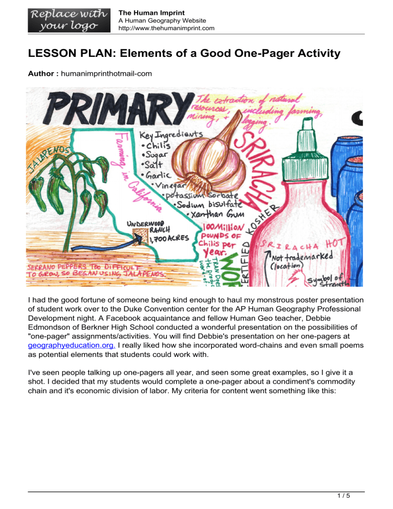
The Human Imprint A Human Geography Website http://www.thehumanimprint.com LESSON PLAN: Elements of a Good One-Pager Activity Author : humanimprinthotmail-com I had the good fortune of someone being kind enough to haul my monstrous poster presentation of student work over to the Duke Convention center for the AP Human Geography Professional Development night. A Facebook acquaintance and fellow Human Geo teacher, Debbie Edmondson of Berkner High School conducted a wonderful presentation on the possibilities of "one-pager" assignments/activities. You will find Debbie's presentation on her one-pagers at geographyeducation.org. I really liked how she incorporated word-chains and even small poems as potential elements that students could work with. I've seen people talking up one-pagers all year, and seen some great examples, so I give it a shot. I decided that my students would complete a one-pager about a condiment's commodity chain and it's economic division of labor. My criteria for content went something like this: 1/5 The Human Imprint A Human Geography Website http://www.thehumanimprint.com I think the finished products turned out pretty well, provided that I gave my students a VERY high bar to work from. :) I made the one below as an example. 2/5 The Human Imprint A Human Geography Website http://www.thehumanimprint.com The possibilities of these are endless, but it was a good way to break up a dull span in our content. Keep reading if you're looking for some tips on teaching the one-pager and getting past the whole..."art," thing. Elements of a Good One-Pager Activity What is a One-Pager: If you look this up on Google, you will see that one-pager documents are meant to provide a high-order overview of a particular concept. They are meant to be imaginative, creative, and encourage experimental methods of conveying abstract thought (that’s Level-4 for you Depth of Knowledge people). But lets call this what it is, it’s illustrating concepts that students cover in your course. With that said, the vast majority of your students will look at good examples and immediately say that they can’t draw. But I’ve found that the best way to bring out the best in students is to provide kickass examples that inspire them. Get in the habit of saving your best examples, it only raises the bar. The biggest challenge for students, aside from illustrating their concepts, is to have them connect, apply, prove, and synthesize the course concepts in a planned, visual design. They will ask if they can do a Powerpoint instead, “NO.” They will ask if they can just write out 3/5 The Human Imprint A Human Geography Website http://www.thehumanimprint.com the definitions, NO.” They will say that they can’t draw and if they can just print it out and paste it on the page, “NO.”-Actually this one is a teacher’s description. But it defeats the point of changing the mode of delivery and making them use another part of their brain that, in my opinion, is now too often abandoned-CREATING. When students finish these, the majority of them are proud of their work and want to take them home for the refrigerator. For the teacher, the introduction and setting expectations of one-pagers are the most important steps. Step 1: Choose a concept of the course where students must view the topic as a process, fulfill a particular number of requested tasks (i.e. “who, what, where, when, why, how, explain”), show cause-effect, or compare-contrast. In reality, one-pagers should not be limited to these, but I’ve found that the majority of students have an easier time laying out their ideas on paper when they must illustrate a process. Step 2: Have a rubric ready to show students where they will earn points. While I never grade on their artistic abilities, I tell them that I give credit for trying a MINIMUM amount of images. In my experience, it is best to have rubric that provides points for a minimum amount of visual elements, (i.e. visual border, 5 images, color, no white space, different fonts). Obviously, it’s up to you how you want to grade this, but making these elements a requirement is what will differentiate between the true illustrated one-pager vs. a paper filled with half-ass stick figures and penciled bullet points. Step 3: Have your kick-ass example projected as student walk in the room. It’s even more impressive if you’ve told them you did it. Step 4: Provide the paper and colored pencils at minimum. I you have the expectation of color, then provide them with the means to do so. I encourage students to take a couple extra sheets of paper to brainstorm ideas and think of a good layout. This is typically easier after they’ve seen a slew of good examples. Step 5: Allow at least one full class period to have them research and brainstorm the layout on their paper. Tell them to get their information down on paper. I tell my students that the meat and potatoes comes before the flan. All the flair and color is only secondary to the information. Check in periodically with students and have them bounce their visual ideas with you. Allow students to trace (my students lock an image on their iPad and put the paper on top). I also allow a 2nd full class period for beginning the finished product-but all classes are different. I find that if I allow them time to actually start the finished product in class, it is more likely that I will receive a finished product on the due date. Words of advice: Remember that illustrating can be extremely frustrating for some students and even having them hold a colored pencil might give them anxiety. If they imagine an awesome image of a person’s face on their finished product and don’t want to start drawing because it will look like a hot-dog, tell them to run with it anyway! Encourage the class to be 4/5 The Human Imprint A Human Geography Website http://www.thehumanimprint.com hilarious in their depictions of reality. After all, Picasso isn’t famous for his realism. As a class, if you collectively own your inabilities to draw, it only makes presentation time more fun. Lastly, tell them that drawing is a matter of simple shapes. This is what artists do. They see circles, triangles, and squares. When you compound them, real objects come alive. Tell them to have fun with it and do the best they can. Good luck trying these out! As stated earlier, feel free to use my example for your classroom. 5/5 Powered by TCPDF (www.tcpdf.org)
