Digital Billboard Design Tips
advertisement
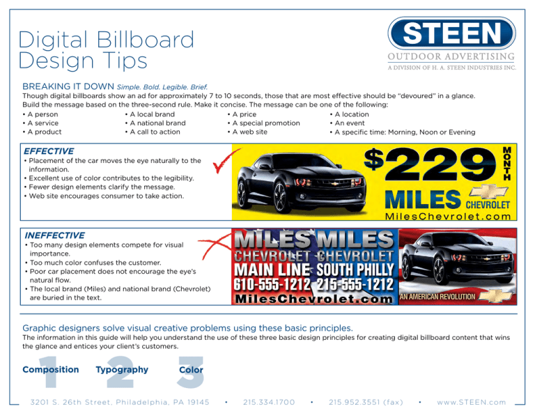
Digital Billboard Design Tips BREAKING IT DOWN Simple. Bold. Legible. Brief. Though digital billboards show an ad for approximately 7 to 10 seconds, those that are most effective should be “devoured” in a glance. Build the message based on the three-second rule. Make it concise. The message can be one of the following: • A person • A local brand • A price • A location • A service • A national brand • A special promotion • An event • A product • A call to action • A web site •A specific time: Morning, Noon or Evening Effective • Placement of the car moves the eye naturally to the information. • Excellent use of color contributes to the legibility. • Fewer design elements clarify the message. • Web site encourages consumer to take action. INEffective • Too many design elements compete for visual importance. • Too much color confuses the customer. • Poor car placement does not encourage the eye’s natural flow. • The local brand (Miles) and national brand (Chevrolet) are buried in the text. Graphic designers solve visual creative problems using these basic principles. The information in this guide will help you understand the use of these three basic design principles for creating digital billboard content that wins the glance and entices your client’s customers. 1 Composition 2 3 Typography Color 3 2 0 1 S . 2 6 t h S t r e e t , P h i l a d e l p h i a , PA 1 9 1 4 5 • 2 1 5 . 3 3 4 .1 7 0 0 • 215.952.3551 (fax) • w w w. S T E E N . c o m Digital Billboard Design Tips DESIGN PRINCIPLE 1: Composition Define Layout Layout is the design principle that determines the finished look of an advertisement. The most important principle for creating effective outdoor content is visual prioritization of the message, or hierarchy of communication. Consumers can’t hear and understand four messages at once; they can’t see and understand four messages at once, either. Define the items (ABC levels) you want to communicate and prioritize each piece in order of importance according to the following information. People read in chunks of information. They scan across, then down, and pick up information in logical sections. The more distinct those sections of information, the faster people interpret the meaning or the purpose of the message. Visual and written information that overlap cause the reader to pause and sort the two apart before understanding the message. Using hierarchy of communication helps speed comprehension and increases retention of the message. A BAC VISUAL PRIORITY VISUAL CLUTTER BC D A B HIERARCHY OF COMMUNICATION: Use the levels as guidelines to first capture the viewer’s attention with a clear, single point of communication. Then give the viewer definition or detail that points back to the first level. Finally, give them the information they need to inspire an emotion, an action, or a purchase. Level A: A photo, logo, service, product image or price: whichever is the most important piece of information. Level B: Supporting information that gives definition or detail to support level A. Level C: Relevant information that tells the customer where, how or who to contact for . the information in levels . A and B. C Traditional vs. Digital Advertising: Some worry they will not be able to get all of their information on one frame or piece of artwork, so they add every possible detail they can think of. This mind set derives from traditional print advertising. 3 2 0 1 S . 2 6 t h S t r e e t , P h i l a d e l p h i a , PA 1 9 1 4 5 • 2 1 5 . 3 3 4 .1 7 0 0 • 215.952.3551 (fax) • w w w. S T E E N . c o m Digital Billboard Design Tips DESIGN PRINCIPLE 2: Typography DISTANCE VS. COMPREHENSION Define Typography Typography is the arrangement and appearance of type on a page. Select easy-to-read typefaces. Large, bold fonts make it easier for your audience to read and comprehend text from different viewing distances. In addition, text using all capital letters is harder to read. Select fonts that are easy to read from different viewing distances, such as large, bold fonts. Use text containing both upper and lowercase characters when you have a long message. Using text with all caps should be limited to short messages. Using a limited amount of text will help viewers’ readability and comprehension. Examples of these variations on text are below. Comprehension of an outdoor advertising design depends not only on the style of type or lettering or on the combinations of color used, but also upon how these elements work together; at a distance. Distance itself is a variable, which must be considered because the audience is in motion. The size of type or lettering, therefore, is an important consideration in outdoor communication. To determine the proper size for specific considerations, we must first consider the demands. A headline must be legible at any reasonable distance from close by to at least 400 feet. As illustrated below, a letter height of 20 inches is recommended. No letters should be less than 12 inches in height if we are to communicate a message effectively at a distance. Letters 4 inches high are included simply to illustrate what happens to letters this high at a distance. 20 INCHES 12 INCHES 4 INCHES 100 FEET 20 INCHES 20 INCHES 12 INCHES 12 INCHES 4 INCHES 300 FEET 4 INCHES 20 INCHES 200 FEET 12 INCHES 4 INCHES 400 FEET 3 2 0 1 S . 2 6 t h S t r e e t , P h i l a d e l p h i a , PA 1 9 1 4 5 • 2 1 5 . 3 3 4 .1 7 0 0 • 215.952.3551 (fax) • w w w. S T E E N . c o m Digital Billboard Design Tips COMMON MISTAKES LEGIBILITY FACTORS For easiest legibility at a distance, experience and research indicate that the width of a letter’s vertical strokes should be about one-fifth its height. Horizontal strokes may be slightly thinner. These proportions apply equally to capital and lower-case letters, and are grouped into four areas: Letterspacing, Perspective, Stacking and Line Spacing Letterspacing: This example demonstrates the importance of a reasonable amount of air between letters. Extremely close spacing can reduce legibility even with a clean, gothic typeface. Notice how crowding can confuse the intention of the copy by causing certain letters to attach visually to adjacent letters, thus “clear morn” could be interpreted as “dear mom.” Perspective: The legibility problem created by tight letterspacing is compounded when copy lines are viewed from an angle, which can occur in outdoor. Condensed typefaces start to resemble picket fences and horizontal strokes tend to appear thicker in relationship to the vertical strokes. I. C rowding too many letters into a space tends to repel the eye and thus defeats the objective of getting type as large as possible. Stacking: This reduces readability and is not recommended for Outdoor designs. With a single horizontal line of copy the eye moves through the message rapidly and without interruption. The stacking of additional lines reduces this facility and increases the time needed to comprehend the message. lf, however, stacking is necessary for layout purposes, give careful consideration to line spacing. 2. T oo great a contrast between thick and thin elements leads to confusion. 3. S trokes which are too fine do not utilize fully the basic shapes and fade into the background, becoming invisible at a distance. 4. Bulky typefaces become blobs at a distance, basic shapes cannot be distinguished and letters are not recognized. Line Spacing: As in the case of letterspacing, adequate air space is necessary for maximum legibility If a copy line is riding “piggyback” on the copy line below it, the interplay of descenders and ascenders creates confusion. 3 2 0 1 S . 2 6 t h S t r e e t , P h i l a d e l p h i a , PA 1 9 1 4 5 • cript and similar styles sacrifice the basic shapes for the decorative 5. S aspect. Individual letters, therefore, cannot be identified. 2 1 5 . 3 3 4 .1 7 0 0 • 215.952.3551 (fax) • w w w. S T E E N . c o m Digital Billboard Design Tips DESIGN PRINCIPLE 3: Color Define Color Take full advantage of your billboard’s color capability by using rich, vibrant colors. Bright, saturated colors (colors with no white in them) work better than pastel or low contrast colors. Certain colors tend to evoke specific emotions or ideas, so choose them carefully to help support products and ideas. See chart and color wheel below. COLOR Need to stay away from two center rings Red Red Orange Yellow Orange Yellow Complement Tint Orange Tint Yellow Orange Hue Shade Yellow Yellow Green Orange Blue Green Red Orange Red Blue Blue Red Violet Violet Violet Tint: Yellow Green Hue + white Green (will lighten the color) Blue Green Blue Hue: Blue Violet The pure color Violet Shade: Red Violet Hue + black (will darken Blackthe color) COLOR EMOTIONS EVOKED EMOTIONS EVOKED Red Red Orange Orange Yellow Orange Yellow Yellow Green Green Blue Green Blue Blue Violet Violet Red Violet Black Stimulating, exciting, provocative, Stimulating, exciting, dynamicprovocative, dynam Domination, aggression, Domination, and action aggression, and action Friendly, vital, playful,Friendly, energizing, vital, inviting playful, energizing, inviting Illumination, wisdom, Illumination, and wealth wisdom, and wealth Sunny, warming, cheerful Sunny, warming, cheerful Sickness, cowardice, discord, Sickness,and cowardice, jealousy discord, and jealou Soothing, nature, refreshing, Soothing, healing, nature, fresh refreshing, healing, fre Emotional healing andEmotional protection healing and protection Cool, quiet, serene, constant Cool, quiet, serene, constant Uniqueness, preciousness, Uniqueness, royalty,preciousness, and sacredness royalty, and sa Creative, regal, spiritual, Creative, mysterious regal, spiritual, mysterious Energetic, happy, sweet, Energetic, romantic, happy, youthful sweet, romantic, youth Strong, classic, elegant, Strong, mysterious classic, elegant, mysterious Use colors from the two outer rings Hue, Value and Distance In addition to conveying emotion, color and black and white values can affect distance factors. Warm hues – reds, oranges and yellows – are perceived as closer to the viewer: In contrast, cool colors of green, blue and violet seem more distant. Similarly darker values in color or black and white seem to be more in the foreground, while lighter values recede. Strongly contrasting combinations of either value or hue seem closer: Legibility is affected more by value contrast than by hue. 3 2 0 1 S . 2 6 t h S t r e e t , P h i l a d e l p h i a , PA 1 9 1 4 5 • 2 1 5 . 3 3 4 .1 7 0 0 • 215.952.3551 (fax) • w w w. S T E E N . c o m Digital Billboard Design Tips USING CONTRASTING COLORS COLOR Select colors that provide good contrast to make your content more appealing and easier to read. Achieve effective contrast by using colors with different values (how bright or dark a color is). Use the chart at the right to guide your design. You can see that yellow is a bright color with a very light-gray value. Purple, on the other hand, is a dark color with a black value. Therefore, using yellow and purple together provides very good contrast. By looking at the chart again, you can see that yellow and green aren’t the best colors to use together because the contrast between the two is so low. Solve this problem by using a darker green that has a darker value to increase contrast and readability. The value range chart on this page shows you how each color (in this example we used red) has a number of values to choose from. This makes contrast easy to achieve. VALUE REMEMBER: VALUE RANGE OF RED LIGHT UNSATURATED COLOR = = Remember the product user must be able to see the artwork, scan for details, and make an assessment of the data. Do not overwhelm them with visual clutter. Choose a color or graphic that supports your essential message. In this case, blue implies cool or cold and orange is inviting and energizing = = DARK SATURATED COLOR COMPARATIVE VISIBILITY OF FULL VALUE COLOR COMBINATIONS These 14 color combinations for lettering were tested using only primary and secondary color of full hue and value. Tests for readability at a distance were conducted on different groups under the sponsorship of the Outdoor Advertising Association of America (OAAA). The results ranked in the sequence shown, with #1 the most legible and #14 as the least legible. Negative letters in 3, 4, 6, 8, 10, 12 and 14 appear to have a broader stroke than their positive counterparts. 3 2 0 1 S . 2 6 t h S t r e e t , P h i l a d e l p h i a , PA 1 9 1 4 5 • 1 2 8 9 2 1 5 . 3 3 4 .1 7 0 0 3 10 • 4 5 11 12 215.952.3551 (fax) • 6 13 w w w. S T E E N . c o m 7 14 Digital Billboard Design Tips BACKGROUNDS AVOID WHITE BACKGROUNDS. With LED technology and the use of emitted light, white or very light colors may repel the eye — not the desired response in advertising. A grave concern in most regulatory environments is offensive use of light or white content. Even though Steen Outdoor Advertising’s digital billboards are fully capable of producing white and pastel colors, it is not recommended. Taking advantage of the color capabilities is thoughtful and in general more pleasing to the eye. If white or pastels must be used, the content should only be scheduled for daytime viewing. BLACK BACKGROUNDS: For digital billboards, black is the absence of color. Black is created with the use of less light. White is the blending of all colors and the use of more light in digital billboards. Using a black or dark background will inevitably increase contrast, therefore strengthening legibility and enhancing the impact of your advertisement. STANDARD COLORS Make your digital content “Pop” with colors that work Below are the digital breakdowns of the RGB (red, green and blue) colors that look the best on a digital billboard. To take advantage of the full-color capabilities that this cutting-edge technology has to offer, choose these colors when creating digital billboard artwork. OTHER COLORS: TRUE COLORS: Red R=255 G=0 B=0 Rhod Red R=224 G=17 B=157 Green R=0 G=255 B=0 Blue R=0 G=0 B=255 Purple Pink R=195 G=0 B=158 Dark Purple R=87 G=6 B=134 Yellow R=254 G=233 B=0 Violet R=75 G=8 B=161 Orange R=255 G= 88 B= 0 Royal Blue R=37 G=38 B=169 Purple R=182 G=52 B=187 Medium Blue R=15 G=77 B=188 Yellow Orange R=255 G=182 B=15 Dark Blue R=0 G=35 B=149 Aqua R=0 G=115 B=207 3 2 0 1 S . 2 6 t h S t r e e t , P h i l a d e l p h i a , PA 1 9 1 4 5 Light Orange R=255 G=161 B=0 Pro Blue R=0 G=136 B=206 • Sunshine R=252 G=217 B=0 Grey Blue R=0 G=101 B=189 Orange R=255 G=121 B=0 Sky Blue R=0 G=122 B=201 2 1 5 . 3 3 4 .1 7 0 0 Coral R=255 G=109 B=66 Red Orange R=255 G=88 B=0 Apple Green R=0 G=175 B=63 • Warm Red R=247 G=64 B=58 Forest Green R=0 G=121 B=52 Grass Green R=88 G=166 B=24 Red R=205 G=32 B=44 Lime Green R=146 G=212 B=0 MediumRed R=198 G=12 B=48 Salmon R=245 G=63 B=91 Canary R=234 G=223 B=0 Gold R=233 G=233 B=0 215.952.3551 (fax) • Pink R=236 G=67 B=112 Dandelion R=228 G=215 B=0 Rose R=202 G=0 B=93 Burnt Umber R=181 G=163 B=0 Ruby Red R=202 G=0 B=93 Dark Gold R=193 G=187 B=0 w w w. S T E E N . c o m
