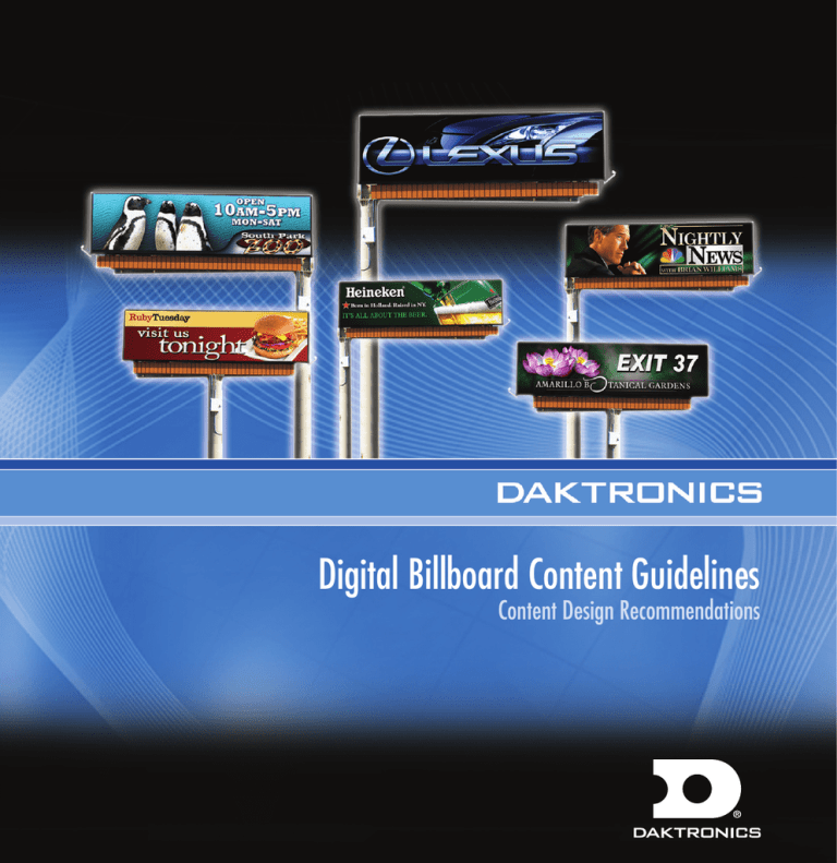
Digital Billboard Content Guidelines
advertisement

Digital Billboard Content Guidelines Content Design Recommendations 1 Digital Billboard Site Content Guidelines Objective To provide effective content (also referred to as digital artwork or digital advertisements) by using good design practices as they relate to digital outdoor displays and/or digital billboards. When you have hundreds of thousands of dollars worth of cutting-edge technology as your very own advertising medium, you don’t want to waste its capabilities. Effective content is absolutely critical for your digital display to bring about the sales lift you expect. We know that the content of the message is very important: it must be relevant to the customer, brief, and to the point. But in addition to good content, the display message must be produced in an attractive and entertaining manner. To achieve our objective, we must understand the following: What is LED digital outdoor and/or digital billboard? A digital billboard display, sometimes referred to as LED digital outdoor advertising or a combination of these words, uses an array of light-emitting diodes (LEDs) to show computer-programmed images and text, which are easily changed and updated using VisiconnSM Display Management Solution Web-based software. What is day parting? In order to achieve maximum advertising flexibility and return on investment, a display should take advantage of day parting. A day-parted schedule advertises time-sensitive promotions at the time they are valid and target specific demographics at the time they will see the billboard. With a properly scheduled Daktronics digital billboard working with VisiconnSM Display Management Solution, the marketing possibilities are endless. What is best for the artwork/content for digital displays? The artwork/content created for LED digital billboards should be approached differently than artwork created for magazine/ newspaper advertisements or television commercials. The content on a digital display must not only be vivid and use contrast properly, it must be brief to be effective. Traditional signage and advertising has one chance to convey all necessary information to customers. A digital billboard, on the other hand, can display multiple messages that appeal and inform customers of products and services. Digital Billboard Content Guidelines Breaking it Down Simple. Bold. Legible. Brief. Though digital billboards show an ad for approximately 7 to 10 seconds, those that are most effective should be “devoured” in three seconds. Build the message based on the three-second rule. Narrow the focus and decide what your message will be. Make it concise. The message can be one of the following: A person A national brand A Web site A service A call to action A location Effective Placement of the car moves the eye naturally to the information. Excellent use of color contributes to the legibility. Fewer design elements clarify the message. Web site encourages consumer to take action. A product A price An event A local brand A special promotion A specific time: Morning, Noon or Evening Ineffective Too many design elements compete for visual importance. Too much color confuses the customer. Poor car placement does not encourage the eye’s natural flow. The local brand (Miles) and national brand (Chevrolet) are buried in the text. Graphic designers solve visual creative problems using these basic principles. The information in this guide will help you understand the use of these three basic design principles for creating digital display content that wins the glance and entices your client’s customers. 1 Composition = Ineffective Design 2 Typography 3 Color 2 3 Digital Billboard Site Content Guidelines Design Principle 1 Composition Define Layout Layout is the design principle that determines the finished look of an advertisement. The most important principle for creating effective outdoor content is visual prioritization of the message, or hierarchy of communication. Consumers can’t hear and understand four messages at once; they can’t see and understand four messages at once, either. Define the items (ABC levels) you want to communicate and prioritize each piece in order of importance according to the following information. People read in chunks of information. They scan across, then down, and pick up information in logical sections. The more distinct those sections of information, the faster people interpret the meaning or the purpose of the message. Visual and written information that overlap cause the reader to pause and sort the two apart before understanding the message. Using hierarchy of communication helps speed comprehension and increases retention of the message. Visual Priority ! Tip Ask your audience to take action, such as “Call Today.” Visual Clutter Digital Billboard Content Guidelines Hierarchy of Communication: Use the levels as guidelines to first capture the viewer’s attention with a clear, single point of communication. Then give the viewer definition or detail that points back to the first level. Finally, give them the information they need to inspire an emotion, an action, or a purchase. Level A: A photo, logo, service, product image or price. Whichever is the most important piece of information. Level B: Supporting information that gives definition or detail to support level A. Level C: Relevant information that tells the customer where, how or who to contact for the information in levels A and B. ! Traditional vs. Digital Advertising Some worry they will not be able to get all of their information on one frame or piece of artwork. So they add every possible detail they can think of. This mindset derives from traditional print advertising. = Ineffective Design 4 5 Digital Billboard Site Content Guidelines Design Principle 2 Typography DEFINE TYPOGRAPHY Typography is the arrangement and appearance of type on a page. READABILITY Select easy-to-read typefaces. Large, bold fonts make it easier for your audience to read and comprehend text from different viewing distances. In addition, text using all capital letters is harder to read. Use text made up of both upper- and lower-case letters. Example: This Text Is Easier to Read from Far Away THIS TEXT IS HARDER TO READ FROM FAR AWAY Selecting effective Fonts Select fonts that are easy to read from different viewing distances, such as large, bold fonts. Remember to use text containing both upper and lower-case characters when you have a long message. Using text with all caps should be limited to short messages. Using a limited amount of text will help viewers’ readability and comprehension. Examples of these variations on text are to the right. ! Regular Text All Cap Text Bold Text Tip When possible, after creating the ad, look at the content on the actual digital billboard display to make sure it’s easy to read. Digital Billboard Content Guidelines Make it a campaign Digital advertising needs to be created differently than traditional print magazine/newspaper advertising because of the unique capabilities of the medium. Print advertising has one chance to convey all necessary information to customers, whereas digital advertising can show several messages in a series of rotations giving advertisers multiple chances to convey the necessary information to customers. rotates through a series of individual clients’ digital advertisement slots. The slot belonging to one advertiser may also have unique digital content showing at each rotation. This provides a better chance to attract the attention of different demographics and promotes campaigns of ads with small amounts of text (i.e. information) instead of a single text heavy advertisement (see ineffective design image below). Daktronics’ VisiconnSM Display Management Solution allows multiple clients to advertise separately on a digital billboard. The web-based software easily updates and automatically Below is a campaign of digital advertisements for a zoo with each ad containing similar design characteristics. The information is broken into five separate ads, making it easier for viewers to comprehend on a digital billboard rotation. Traditional print ad design Digital advertising design Additional Ads in this campaign = Ineffective Design ! Tip When using a colored background, outlining the letters in black and using drop shadows can create interest and increase readability. 6 7 Digital Billboard Site Content Guidelines Design Principle 3 Color Need to stay away from two center rings Color Wheel Define Color Take full advantage of your display’s color capability by using rich, vibrant colors. Bright, saturated colors (colors with no white in them) work better than pastel or lowcontrast colors. Certain colors tend to evoke specific emotions or ideas, so choose them carefully to help support products and ideas. See chart below. The color wheel to the right features a full color range. Yellow Orange Yellow Complement Tint Tint Hue Shade Yellow Green Blue Green Tint: Hue + white (will lighten the color) Blue Hue: The pure color Orange Red Orange Red Red Violet Violet Blue Violet Shade: Hue + black (will darken the color) Use colors from the two outer rings Colors and the emotions they evoke COLOR EMOTIONS EVOKED Red Red Orange Orange Yellow Orange Yellow Yellow Green Green Blue Green Blue Blue Violet Violet Red Violet Black Stimulating, exciting, provocative, dynamic Domination, aggression, and action Friendly, vital, playful, energizing, inviting Illumination, wisdom, and wealth Sunny, warming, cheerful Sickness, cowardice, discord, and jealousy Soothing, nature, refreshing, healing, fresh Emotional healing and protection Cool, quiet, serene, constant Uniqueness, preciousness, royalty, and sacredness Creative, regal, spiritual, mysterious Energetic, happy, sweet, romantic, youthful Strong, classic, elegant, mysterious Digital Billboard Content Guidelines Use Tonal Contrast Using contrast is vital to your design because it helps the viewer distinguish between design elements. For best contrast, use tonal contrast (or value difference) instead of only color difference. Tonal contrast can be measured by using compositing software such as Adobe® Photoshop®. Simply open your advertisement using your preferred compositing software and then convert it to gray scale. You can now easily measure the advertisement’s tonal contrast. An example of this is shown on the right. Measuring Tonal Contrast Color Good Contrast Bad Contrast Gray Scale Bad Contrast The bottom image uses hues of red and green that have the same tonal value (bad contrast). It is difficult to distinguish between background and text. This produces an effect called “vibrating.” After converting content to gray scale with compositing software, the advertisement’s tonal contrast is apparent. ! Examples of good tonal contrast in digital outdoor content. After turning your content to gray scale, is your advertisement still readable? Do all of your elements stand out? If so, your content piece has good tonal contrast. Good Tonal Contrast Good Tonal Contrast 8 9 Digital Billboard Site Content Guidelines Using Contrasting Colors ColorValue Select colors that provide good contrast to make your content more appealing and easier to read. Achieve effective contrast by using colors with different values (how bright or dark a color is). = Use the chart at the right to guide your design. You can see that yellow is a bright color with a very lightgray value. Purple, on the other hand, is a dark color with a black value. Therefore, using yellow and purple together provides very good contrast. = By looking at the chart again, you can see that yellow and green aren’t the best colors to use together because the contrast between the two is so low. Solve this problem by using a darker green that has a darker value to increase contrast and readability. Value Range of Red light unsaturated color = = dark saturated color The value range chart on this page shows you how each color (in this example we used red) has a number of values to choose from. This makes contrast easy to achieve. Good ! contrast like this makes your Content highly viewable. In a Few Seconds Remember the product user must be able to see the artwork, scan for details, and make an assessment of the data. Do not overwhelm them with visual clutter. Tip Choose a color or graphic that supports your essential message. In this case, blue implies cool or cold and orange is inviting and energizing; just what you need in the morning. Digital Billboard Content Guidelines ! White Backgrounds: Avoid white backgrounds. With LED technology, the use of emitted light, white or very light colors may repel the eye—not the desired response in advertising. A grave concern in most regulatory environments is offensive use of light or white content. Even though Daktronics digital displays are fully capable of producing white and pastel colors it is not recommended. Taking advantage of the color capabilities is thoughtful and in general more pleasing to the eye. If white or pastels must be used, the content should only be scheduled for daytime viewing. Black Backgrounds: For digital billboards, black is the absence of color. Black is created with the use of less light. White is the blending of all colors and the use of more light in digital billboards. = Ineffective Design 10 11 Digital Billboard Site Content Guidelines Standard Colors Make your Digital content Pop with colors that work Find information below about the RGB (red, green and blue) colors that look the best on a digital display. Choose these colors when building digital content/artwork/advertisements to take advantage of the full-color capabilities of your cuttingedge Daktronics digital billboard. True Colors: TRUE COLORS TRUE COLORS Red R=255 G=0 B=0 Green R=0 G=255 B=0 Other Colors: Red R=255 G=0 Blue B=0 R=0 OTHER G=0 B=255 Green R=0 G=255 B=0 Yellow R=254 COLORS G=233 B=0 Blue R=0 G=0 B=255 Orange R=255 G=88 B=0 Yellow R=254 G=233 PurpleB=0 Orange R=255 G=88 B=0 Purple R=182 G=52 B=187 R=182 G=52 B=187 OTHER COLORS Yellow Orange R=255 G=182 B=15 Rose R=202 G=0 B=93 Grey Blue R=0 G=101 B=189 Light Orange R=255 G=161 B=0 Ruby Red R=202 G=0 B=93 Sky Blue R=0 G=122 B=201 Yellow Light Orange Orange R=255 R=255 G=182 G=161 Sunshine Orange R=252 B=15 R=255 B=0 G=217 G=121 B=0 B=0 Rose R=202 G=0 Rhod B=93 Red R=224 G=17 B=157 Coral R=255 G=109 Red B=66 R=205 G=32 B=44 Red Warm Red R=205 R=247 G=32 G=64 B=44 B=58 Salmon Medium R=245 Red G=63 R=198 B=91 G=12 B=48 Medium Red R=198 Pink G=12 R=236 B=48 G=67 B=112 Salmon R=245 G=63 B=91 Dark Purple R=87 RoyalG=6 Blue Royal Blue Medium R=37 Blue G=38 R=15 B=169 Dark Blue Aqua G=77 B=140 B=188 R=0 R=0 G=35 G=115 B=149 B=207 Dark Blue R=0 G=35 B=149 Pro Blue R=0 G=136 B=206 Aqua R=0 G=115 B=207 R=37 G=38 B=169 B=140 Violet R=75 G=8 B=161 Medium B=158 Blue R=15 G=77 B=188 Grass Green R=88 G=166 Canary B=24 R=234 G=223 B=0 Lime Green R=146 G=212 Gold B=0 R=233 G=233 B=0 Gold Canary R=234 R=233 G=223 G=233 B=0 Dandelion Burnt B=0 R=228 Umber G=215 R=181 B=0 G=163 B=0 Dandelion R=228 G=215 Dark B=0 Gold R=193 G=187 B=0 Burnt Umber R=181 G=163 B=0 Sunshine Orange Red R=252 R=255 Orange G=217 G=121 R=255 B=0 B=0 Red Coral WarmG=88 Red Orange R=255 R=247 B=0 R=255 G=109 G=64 G=88 B=66 B=58 B=0 Purple Ruby Red Rhod Red Pink R=224 R=202 R=195 G=0 G=17 PurpleB=93 Dark B=157 VioletG=0 Purple R=75 Pink R=87 G=8 R=195 G=0 G=6 B=161 B=158 Grey Blue Sky Blue Apple Green R=0 R=0 R=0 G=101 G=122 AppleB=189 ForestB=201 GrassG=175 Green Green GreenB=63 R=0 R=88 R=0 G=175 G=121 G=166 B=63 B=52 B=24 Forest Green R=0 Lime G=121 GreenB=52 R=146 G=212 B=0 Digital Billboard Content Guidelines Additional Principles Tips and Techniques for Digital Billboard Content Success Start with a red, green, and blue color space, also known as RGB, the standard in digital technology. This is the same mode as your TV or computer. Cyan, magenta, yellow and black, also known as CMYK, unlike RGB, are used for high resolution printing. When creating content for digital signage, images must be created in RGB. Use the following tips to create files that work best for digital signage: Color Mode In Photoshop: To see if your image is CMYK or RGB: Look at the title bar. The color mode is next to the file’s name. The color mode should be RGB/8 bit. Creating a New File: File > New In Color Mode drop-down menu, select RGB. Build content in its native measurement (pixel by pixel not inch by inch) Example: 888 w x 260 h. Save files as JPEGs. 72 ppi is recommended for resolution for this technology. File Size Note: Colors may shift when converting from CMKY to RGB. To convert a flattened image (1-layer), go to Image > Mode > RGB Color. To Check File Size: Under “My Computer,” identify the image you wish to check. Right click on the .jpeg image. Click on “properties.” This will show the properties of the image you created. The file size should be listed in the middle of the panel. The file size should be around 70-150KB. In Illustrator: To see if your image is CMYK or RGB: Look at the title bar. The color mode is next to the file’s name. The color mode should be RGB. In Photoshop: Compressing File Size: Open the file in Adobe Photoshop. Choose “Save As.” Rename your file. Choose .jpg format. A window will come up. Move the slider bar in the center to the left in order to compress the file size. Use the “File Size” instructions, left, to view file size. If it is still too big, repeat the directions above. Converting from CMYK to RGB: If the image has layers, Creating a New File: you will be given the option File > New of flattening your image Select RGB radio button. when converting to RGB. The best practice if you already have a CMYK Converting from CMYK to RGB: image is to finish in that File > Document Color color mode, then convert Mode > RGB Color to RGB and flatten the layers when possible. In Illustrator: Compressing File Size: Open the file in Adobe Illustrator. Choose “Save As.” Rename your file. Choose .eps format. This will compress the file size. 12 13 Digital Billboard Site Content Guidelines IMPORTABLE IMAGE FILES • • • • Choose photos to import that have a smooth gradation (smooth change from one color to another) of color shades and don’t contain much detail. You may need to change the size of an image to fit your display and then crop it so it will look its best. For the most attractive images, use those in raster format (.jpg, .png, .gif, .bmp, and .tif) and set them at 72 ppi. Logos appearing on a black or colored background will be more effective than logos on a white background. Image for digital advertisement Focal Point of the image ! Tip Add interest—show only a portion or the focal point of an image. Examples above. Digital Billboard Content Guidelines Examples of Dynamic Content Dynamic Content is defined as the ability to automatically update data within a creative template utilizing a RSS feed. Interact with audiences by displaying interactive content, such as time and temperature, the artist and song on a featured radio station, hospital ER waiting times, and live feeds. Talk to your Daktronics representative about our dynamic content options. Creative Template Creative template with Data 14 1-888-325-7446 201 Daktronics Drive PO Box 5128 Brookings, SD 57006-5128 tel 888-325-7446 605-692-0200 ext. 57220 fax 605-692-0381 www.daktronics.com/billboard email outdoor@daktronics.com Copyright © 2010 Daktronics DD1513467 Rev 01 062810 www.daktronics.com/billboards


