One-Minute Spotlight
The Crystal Ball Charts: Sensitivity
As you become more proficient at building spreadsheet models, you will want to know how much a
given assumption affects your result. In other words, you want to determine the sensitivity of the
forecast to each assumption. The sensitivity chart gives you with ability to quickly and easily judge
the influence each assumption cell has on a particular forecast cell.
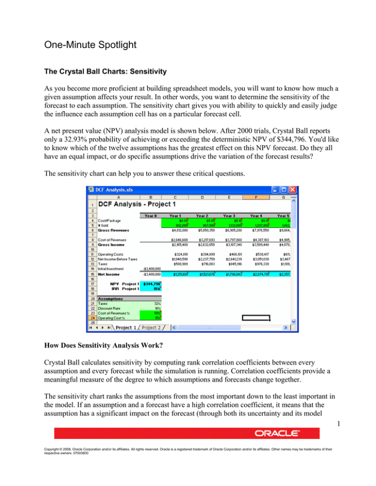
A net present value (NPV) analysis model is shown below. After 2000 trials, Crystal Ball reports
only a 32.93% probability of achieving or exceeding the deterministic NPV of $344,796. You'd like
to know which of the twelve assumptions has the greatest effect on this NPV forecast. Do they all
have an equal impact, or do specific assumptions drive the variation of the forecast results?
The sensitivity chart can help you to answer these critical questions.
How Does Sensitivity Analysis Work?
Crystal Ball calculates sensitivity by computing rank correlation coefficients between every
assumption and every forecast while the simulation is running. Correlation coefficients provide a
meaningful measure of the degree to which assumptions and forecasts change together.
The sensitivity chart ranks the assumptions from the most important down to the least important in
the model. If an assumption and a forecast have a high correlation coefficient, it means that the
assumption has a significant impact on the forecast (through both its uncertainty and its model
1
Copyright © 2008, Oracle Corporation and/or its affiliates. All rights reserved. Oracle is a registered trademark of Oracle Corporation and/or its affiliates. Other names may be trademarks of their
respective owners. 07003600
One-Minute Spotlight
sensitivity). Positive coefficients indicate that an increase in the assumption is associated with an
increase in the forecast. Negative coefficients imply the opposite situation. The larger the absolute
value of the correlation coefficient, the greater the sensitivity.
Creating the Sensitivity Chart
When you run a simulation, you need to make sure that the "Store assumption values for analysis"
setting in Run Preferences (this is the default setting). After the simulation has been stopped, you
can create a sensitivity chart by either selecting the Open Sensitivity Chart option from the Run
menu or by clicking the sensitivity chart toolbar button (outlined in red, below).
Two Ways to View Sensitivity
When you first open the sensitivity chart, the assumptions are listed on the left side, starting with
the assumption with the highest sensitivity. In this case, Cost of Revenues has a sensitivity of
(93)%.
The target forecast that you are analyzing is listed above the chart. You can change the target
forecast in the Sensitivity menu.
2
Copyright © 2008, Oracle Corporation and/or its affiliates. All rights reserved. Oracle is a registered trademark of Oracle Corporation and/or its affiliates. Other names may be trademarks of their
respective owners. 07003600
One-Minute Spotlight
In the View menu (or by right-clicking the chart), you can also switch the view from Rank
Correlation to Contribution to Variance, shown below. In this view, Crystal Ball displays the
sensitivity information as the percent of forecast variance due to each assumption.
Some people prefer this setting because they find that percentage values are easier to interpret and
explain than correlation coefficients. Note that this view still shows opposing bars where the rank
correlation coefficients are negative.
Interpreting the Sensitivity Chart Results
While sensitivity analysis is an important method for determining the key factors that drive the
uncertainty in a forecast, you must combine the results with your knowledge of the structure of the
model.
In this example, the Cost of Revenues assumption has the greatest impact on the NPV. Armed with
this evidence, you can explain that the most uncertainty is associated with Cost of Revenues. This
might mean that the company's top priority should be getting costs lowered. The remaining eight
assumptions (not all shown) have much less of an impact on the NPV.
3
Copyright © 2008, Oracle Corporation and/or its affiliates. All rights reserved. Oracle is a registered trademark of Oracle Corporation and/or its affiliates. Other names may be trademarks of their
respective owners. 07003600
One-Minute Spotlight
Is this the result you expected? One of the benefits of sensitivity analysis is that it can help you to
reassess the validity of your model. If you did not expect to see the results shown above, then you
have the opportunity to recheck the logic of your model and the parameters of your assumptions.
For example, a single, dominant assumption can sometimes indicate a mathematical or
typographical error that has artificially inflated the impact of an assumption.
The Pros and Cons of Sensitivity Analysis
The sensitivity chart feature has several limitations you should be aware of when correlated
assumptions or non-monotonic (nonlinear) relationships are present in your model. These
limitations are detailed in the interpretation chapter of the Crystal Ball User Manual.
In summary, the sensitivity chart feature provides three key benefits:
•
•
•
You can find out which assumptions are influencing your forecasts the most, reducing the
amount of time needed to refine estimates.
You can find out which assumptions are influencing your forecasts the least so you can
ignore or discard them altogether.
As a result, you can construct more realistic spreadsheet models and greatly increase the
accuracy of your results because you will know how all of your assumptions affect your
model.
For more information or to contact us, browse to http://www.oracle.com/crystalball.
4
Copyright © 2008, Oracle Corporation and/or its affiliates. All rights reserved. Oracle is a registered trademark of Oracle Corporation and/or its affiliates. Other names may be trademarks of their
respective owners. 07003600
