Designing Effective PowerPoint Presentations
advertisement

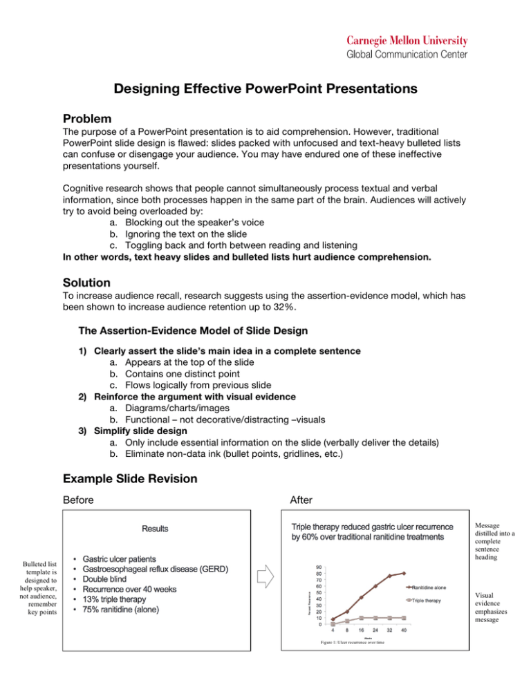
Designing Effective PowerPoint Presentations Problem The purpose of a PowerPoint presentation is to aid comprehension. However, traditional PowerPoint slide design is flawed: slides packed with unfocused and text-heavy bulleted lists can confuse or disengage your audience. You may have endured one of these ineffective presentations yourself. Cognitive research shows that people cannot simultaneously process textual and verbal information, since both processes happen in the same part of the brain. Audiences will actively try to avoid being overloaded by: a. Blocking out the speaker’s voice b. Ignoring the text on the slide c. Toggling back and forth between reading and listening In other words, text heavy slides and bulleted lists hurt audience comprehension. Solution To increase audience recall, research suggests using the assertion-evidence model, which has been shown to increase audience retention up to 32%. The Assertion-Evidence Model of Slide Design 1) Clearly assert the slide’s main idea in a complete sentence a. Appears at the top of the slide b. Contains one distinct point c. Flows logically from previous slide 2) Reinforce the argument with visual evidence a. Diagrams/charts/images b. Functional – not decorative/distracting –visuals 3) Simplify slide design a. Only include essential information on the slide (verbally deliver the details) b. Eliminate non-data ink (bullet points, gridlines, etc.) Example Slide Revision Before Bulleted list template is designed to help speaker, not audience, remember key points After Message distilled into a complete sentence heading Visual evidence emphasizes message S Figure 1: Ulcer recurrence over time Example Slide Revisions Visual concepts improve audience recall up to 32% Table 1: Results of implementation of fog warning and education system Slide headings should contain a message, not a topic Easily interpreted visuals allow audiences to confirm, rather than discover : Methylmethanamine Make Text-heavy Slides “Visual” Text-heavy slide? Question whether you actually need this slide. Details can always be delivered verbally! Option 1 Option 2 “Build” a list, verbally discussing each point before cuing the next point to appear Show conceptual relationships between ideas (SmartArt is useful) When revising a text-heavy slide, pick an option that is best suited for your purposes. Frequently Asked Questions (and Objections) Why does it have to be a complete sentence? Take a look at a newspaper. Every single headline is a complete sentence because people process information in sentences. Which would you rather see: “Results of World cup final” or “Brazil wins World cup”? Your slides should tell the “news” of your project; structure them like news stories. This design seems like it will take longer. It will – at first. But when you’ve spent so long on your research, isn’t it worth the extra effort to communicate that work in the most effective way possible? Start by revising 2-3 key slides. This seems like it will make my presentation longer. Actually, this strategy tends to make your presentation shorter because you focus more on the essential information (and thus reduce extraneous details). I like this idea, but I don’t know if this is conventional in my field. How often has someone said: “Your ideas are really good, but your presentation was just too easy to follow”? A more common comment is: “Your material seems good, but I had trouble understanding it.” If your presentation is effective, people will be focused on the ideas. If you are concerned about following norms, just apply these principles as far as your field will allow. These principles are tools – not rules. Play with them; adapt them to your situation. Alley et al. “How the Design of Headlines in Presentation Slides Affects Audience Retention.” Technical Communication, 53:4 (2006). “Pilot Testing of a New Design for Presentation Slides to Teach Science and Engineering.” 35th ASEE/IEEE Frontiers in Education Conference. Oct,19 – 22, 2005, Indianapolis, IN.


