NCSS Statistical Software
NCSS.com
Chapter 142
Pie Charts
Introduction
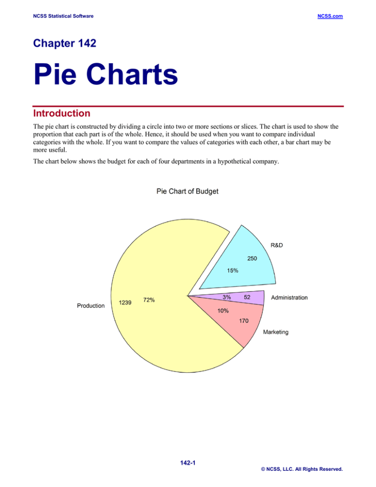
The pie chart is constructed by dividing a circle into two or more sections or slices. The chart is used to show the
proportion that each part is of the whole. Hence, it should be used when you want to compare individual
categories with the whole. If you want to compare the values of categories with each other, a bar chart may be
more useful.
The chart below shows the budget for each of four departments in a hypothetical company.
142-1
© NCSS, LLC. All Rights Reserved.
NCSS Statistical Software
NCSS.com
Pie Charts
Pie Chart Variations
The following pie charts were produced from the same dataset as the pie chart shown above.
Data Structure
Data values must be positive and numeric. Non-positive values are given their absolute value. The data are
entered as columns. An option labeling column may be used for slice labels. An example of such data is shown in
the Budget dataset.
Budget dataset
Department
Marketing
Production
R&D
Administration
Budget
170
1239
250
52
Procedure Options
This section describes the options available in this procedure.
Variables Tab
This panel specifies the variables that will be used to produce the pie chart.
142-2
© NCSS, LLC. All Rights Reserved.
NCSS Statistical Software
NCSS.com
Pie Charts
Data
Data Variables
Select the columns containing the data that is used to produce the slices. A separate pie chart is produced for each
Data Variable.
Label Variable
Specify an optional variable containing the labels for individual slices.
Variable Names
This option specifies whether the column names or column labels are used on the chart.
Pie Chart Format
Format
Click the format button to change the plot settings (see Pie Chart Window Options below).
Edit During Run
Checking this option will cause the plot format window to appear when the procedure is run. This allows you to
modify the format of the graph with the actual data.
Pie Chart Window Options
This section describes the specific options available on the Pie Chart window, which is displayed when a Pie
Chart Format button is clicked. Common options, such as axes, labels, legends, and titles are documented in the
Graphics Components chapter.
Slices Tab
Slice Fill Direction
This option is used to specify whether the slices are ordered clockwise from the reference angle or
counterclockwise from the reference angle. The default reference angle is 90 degrees (straight up).
142-3
© NCSS, LLC. All Rights Reserved.
NCSS Statistical Software
NCSS.com
Pie Charts
Slice Fills and Borders
The slice fills can be any of the standard fills, including gradient fills. The slice borders use the standard options.
Either the slice fills or the slice borders can be excluded if desired.
Slice Offset and Size
The slice offset allows you to emphasize a slice by causing it to “explode” away from the pie.
142-4
© NCSS, LLC. All Rights Reserved.
NCSS Statistical Software
NCSS.com
Pie Charts
The slice size allows you to emphasize a slice by causing it to be larger than the other pie slices.
Reference Angle
This is the angle from which the first slice starts. This value can be used to rotate the pie chart. The direction of
the slices from this angle is chosen under Slice Fill Direction.
142-5
© NCSS, LLC. All Rights Reserved.
NCSS Statistical Software
NCSS.com
Pie Charts
Labels Tab
Slice Labels
Available labels for each slice are the slice label, the slice value, and the slice percent. Each of these labels can be
moved in or out individually or collectively, based on the given radius. The angle of the text for each label can be
set to horizontal, the direction of the center of the slice, or a custom angle. Individual labels may also be shifted in
any direction.
142-6
© NCSS, LLC. All Rights Reserved.
NCSS Statistical Software
NCSS.com
Pie Charts
Lines Tab
Label Connecting Lines
A line may be drawn to each label from the corresponding slice. These lines can start from the interior of the slice
or the edge of the slice, and may be drawn to either the slice label, the slice value, or the slice percent.
Example 1 – Creating a Pie Chart
This section presents an example of how to create a pie chart of the data stored on the Budget dataset.
You may follow along here by making the appropriate entries or load the completed template Example 1 by
clicking on Open Example Template from the File menu of the Pie Charts window.
1
Open the Budget dataset.
•
From the File menu of the NCSS Data window, select Open Example Data.
•
Click on the file Budget.NCSS.
•
Click Open.
2
Open the Pie Charts window.
•
Using the Graphics menu or the Procedure Navigator, find and select the Pie Charts procedure.
•
On the menus, select File, then New Template. This will fill the procedure with the default template.
3
Specify the variables.
•
On the Pie Charts window, select the Variables tab.
•
Double-click in the Data Variables text box. This will bring up the variable selection window.
•
Select Budget from the list of variables and then click Ok. “Budget” will appear in the Data Variables
box.
•
Double-click in the Label Variable text box. This will bring up the variable selection window.
•
Select Department from the list of variables and then click Ok. “Department” will appear in the Label
Variable box.
142-7
© NCSS, LLC. All Rights Reserved.
NCSS Statistical Software
NCSS.com
Pie Charts
4
Select the slice colors.
•
On the Pie Charts window, press the Pie Chart Format button.
•
Click the Slice Fill Format button.
•
Select the desired colors for fills 1 through 4.
•
Click OK. Click OK again.
5
Run the procedure.
•
From the Run menu, select Run Procedure. Alternatively, just click the green Run button.
Pie Chart Output
142-8
© NCSS, LLC. All Rights Reserved.
