CHAPTER
We Perceive What We
Expect
1
Our perception of the world around us is not a true depiction of what is actually
there. We perceive, to a large extent, what we expect to perceive. Our expectations—
and therefore our perceptions—are biased by three factors:
L
L
L
the past: our experience
the present: the current context
the future: our goals
PERCEPTION BIASED BY EXPERIENCE
Imagine that you own a large insurance company. You are meeting with a real estate
manager, discussing plans for a new campus of company buildings. The campus consists of a row of five buildings, the last two with T-shaped courtyards providing light
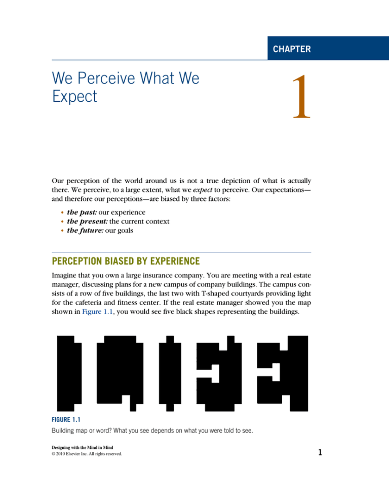
for the cafeteria and fitness center. If the real estate manager showed you the map
shown in Figure 1.1, you would see five black shapes representing the buildings.
FIGURE 1.1
Building map or word? What you see depends on what you were told to see.
Designing with the Mind in Mind
© 2010 Elsevier Inc. All rights reserved.
1
2 CHAPTER 1 We Perceive What We Expect
Now imagine that instead of a real estate manager, you are meeting with an
advertising manager. You are discussing a new billboard ad to be placed in certain
markets around the country. The advertising manager shows you the same image,
but in this scenario the image is a sketch of the ad, consisting of a single word. In
this scenario, you see a word, clearly and unambiguously.
When your perceptual system has been primed to see building shapes, you see
building shapes, and the white areas between the buildings barely register in your
perception. When your perceptual system has been primed to see text, you see text,
and the black areas between the letters barely register.
A relatively famous example of how priming the mind can affect perception is a
sketch, supposedly by R. C. James,1 that initially looks to most people like a random
splattering of ink (see Fig. 1.2). Before reading further, look at the sketch.
FIGURE 1.2
Image showing the effect of mental priming of the visual system. What do you see?
Only after you are told that it is a Dalmatian dog sniffing the ground near a tree
can your visual system organize the image into a coherent picture. Moreover, once
you’ve “seen” the dog, it is hard to go back to seeing the image as a random collection of spots.
1
Published in Marr D. (1982) Vision. W. H. Freeman, New York, NY, p. 101, Figure 3-1.
Perception biased by experience 3
FIGURE 1.3
The “Next” button is perceived to be in a consistent location, even when it isn’t.
The examples above are visual. Experience can also bias other types of perception, such as sentence comprehension. For example, the headline “New Vaccine
Contains Rabies” would probably be understood differently by people who had
recently heard stories about contaminated vaccines than by people who had
recently heard stories about successful uses of vaccines to fight diseases.
Users of computer software and Web sites often click buttons or links without
looking carefully at them. Their perception of the display is based more on what
4 CHAPTER 1 We Perceive What We Expect
their past experience leads them to expect than on what is actually on the screen.
This sometimes confounds software designers, who expect users to see what is on
the screen. But that isn’t how perception works.
For example, if the positions of the “Next” and “Back” buttons on the last page
of a multipage dialog box2 switched, many people would not immediately notice
the switch (see Fig. 1.3). Their visual system would have been lulled into inattention by the consistent placement of the buttons on the prior several pages. Even
after unintentionally going backward a few times, they might continue to perceive
the buttons in their standard locations. This is why “place controls consistently” is a
common user interface design guideline.
Similarly, if we are trying to find something, but it is in a different place or looks
different from usual, we might miss it even though it is in plain view because experience tunes us to look for expected features in expected locations. For example, if
the “Submit” button on one form in a Web site is shaped differently or is a different
color from those on other forms on the site, users might not find it. This expectation-induced blindness is discussed further later in this chapter, in the section on
how our goals affect perception.
PERCEPTION BIASED BY CURRENT CONTEXT
When we try to understand how our visual perception works, it is tempting to
think of it as a bottom-up process, combining basic features such as edges, lines,
angles, curves, and patterns into figures and ultimately into meaningful objects. To
take reading as an example, you might assume that our visual system first recognizes shapes as letter and then combines letters into words, words into sentences,
and so on.
But visual perception—reading in particular—is not strictly a bottom-up process.
It includes top-down influences too. For example, the word in which a character
appears may affect how we identify the character (see Fig. 1.4).
Similarly, our overall comprehension of a sentence or of a paragraph can even
influence what words we see in it. For example, the same letter sequence can be
FIGURE 1.4
The same character is perceived as H or A depending on the surrounding letters.
2
Multi step dialog boxes are called “wizards” in user interface jargon.
Perception biased by goals 5
Fold napkins. Polish silverware. Wash dishes.
French napkins. Polish silverware. German dishes.
FIGURE 1.5
The same phrase is perceived differently depending on the list it appears in.
read as different words depending on the meaning of the surrounding paragraph
(see Fig. 1.5).
This biasing of perception by the surrounding context works between different
senses too. Perceptions in any of our five senses may affect simultaneous perceptions in any of our other senses. For example:
L
L
What we see can be biased by what we are hearing, and vice versa
What we feel with our tactile sense can be biased by what we are hearing, seeing, or smelling
Later chapters explain how visual perception, reading, and recognition function in the
human brain. For now, I will simply say that the pattern of neural activity that corresponds to recognizing a letter, a word, a face, or any object includes input from neural
activity stimulated by the context. This context includes other nearby perceived objects
and events, and even reactivated memories of previously perceived objects and events.
Context biases perception not only in people but also in lower animals. A friend
of mine often brought her dog with her in her car when running errands. One day,
as she drove into her driveway, a cat was in the front yard. The dog saw it and began
barking. My friend opened the car door and the dog jumped out and ran after the
cat, which turned and jumped through a bush to escape. The dog dove into the
bush but missed the cat. The dog remained agitated for some time afterward.
Thereafter, for as long as my friend lived in that house, whenever she arrived at
home with her dog in the car, he would get excited, bark, jump out of the car as
soon as the door was opened, dash across the yard, and leap into the bush. There
was no cat, but that didn’t matter. Returning home in the car was enough to make
the dog see one—perhaps even smell one. However, walking home, as the dog did
after being taken for his daily walk, did not evoke the “cat mirage.”
PERCEPTION BIASED BY GOALS
In addition to being biased by our past experience and the present context, our
perception is influenced by our goals and plans for the future. Specifically, our goals
filter our perceptions: things unrelated to our goals tend to be filtered out preconsciously, never registering in our conscious minds.
For example, when people navigate through software or a Web site, seeking information or a specific function, they don’t read carefully. They scan screens quickly
6 CHAPTER 1 We Perceive What We Expect
and superficially for items that seem related to their goal. They don’t simply ignore
items unrelated to their goals; they often don’t even notice them.
To see this, flip briefly to the next page and look in the toolbox (Fig. 1.6) for scissors, and then immediately flip back to this page. Try it now.
Did you spot the scissors? Now, without looking back at the toolbox, can you
say whether there is a screwdriver in the toolbox too?
Our goals filter our perceptions in other perceptual senses as well as in vision.
A familiar example is the “cocktail party” effect. If you are conversing with someone
at a crowded party, you can focus your attention to hear mainly what he or she is
saying even though many other people are talking near you. The more interested you
are in the conversation, the more strongly your brain filters out surrounding chatter.
If you are bored by what your conversational partner is saying, you will probably
hear much more of the conversations around you.
The effect was first documented in studies of air-traffic controllers, who were
able to carry on a conversation with the pilots of their assigned aircraft even though
many different conversations were occurring simultaneously on the same radio
frequency, coming out of the same speaker in the control room (Arons, 1992).
Research suggests that our ability to focus on one conversation among several simultaneous ones depends not only on our interest level in the conversation but also on
objective factors such as the similarity of voices in the cacophony, the amount of
general “noise” (e.g., clattering dishes or loud music), and the predictability of what
your conversational partner is saying (Arons, 1992).
This filtering of perception by our goals is particularly true for adults, who tend
to be more focused on goals than children are. Children are more stimulus driven:
their perception is less filtered by their goals. This characterisitic makes them more
distractible than adults, but it also makes them less biased as observers.
A parlor game demonstrates this age difference in perceptual filtering. It is similar to the “look in the toolbox” exercise. Most households have a catch-all drawer
for kitchen implements or tools. From your living room, send a visitor to the room
where the catch-all drawer is, with instructions to fetch you a specific tool, such as
measuring spoons or a pipe wrench. When the person returns with the tool, ask
whether another specific tool was in the drawer. Most adults will not know what
else was in the drawer. Children—if they can complete the task without being distracted by all the cool stuff in the drawer—will often be able to tell you more about
what else was there.
Perceptual filtering can also be seen in how people navigate Web sites. Suppose
I put you on the home page of New Zealand’s University of Canterbury (see Fig. 1.7)
and asked you to print out a map of the campus showing the computer science
department. You would scan the page and probably quickly click one of the links
that share words with the goal that I gave you: Departments (top left), Departments
and Colleges (middle left), or Campus Maps (bottom right). If you’re a “search”
person, you might instead go right to the Search box (middle right), type words
related to the goal, and click “Go.”
Perception biased by goals 7
FIGURE 1.6
Toolbox: Are there scissors here?
FIGURE 1.7
University of Canterbury home page: Navigating Web sites includes perceptual filtering.
8 CHAPTER 1 We Perceive What We Expect
Whether you browse or search, it is likely that you would leave the home page
without noticing that you were randomly chosen to win $100 (bottom left). Why?
Because that was not related to your goal.
What is the mechanism by which our current goals bias our perception? There
are two:
L
L
Influencing where we look. Perception is active, not passive. We constantly
move our eyes, ears, hands, and so on, so as to sample exactly the things in our
environment that are most relevant to what we are doing or about to do (Ware,
2008). If we are looking on a Web site for a campus map, our eyes and pointercontrolling hand are attracted to anything that might lead us to that goal. We
more or less ignore anything unrelated to our goal.
Sensitizing our perceptual system to certain features. When we are looking
for something, our brain can prime our perception to be especially sensitive to features of what we are looking for (Ware, 2008). For example, when we are looking
for a red car in a large parking lot, red cars will seem to pop out as we scan the lot,
and cars of other colors will barely register in our consciousness, even though we
do in some sense “see” them. Similarly, when we are trying to find our spouse in
a dark, crowded room, our brain “programs” our auditory system to be especially
sensitive to the combination of frequencies that make up his or her voice.
DESIGN IMPLICATIONS
All these sources of perceptual bias of course have implications for user interface
design. Here are three.
Avoid ambiguity
Avoid ambiguous information displays, and test your design to verify that all users
interpret the display in the same way. Where ambiguity is unavoidable, either rely
on standards or conventions to resolve it, or prime users to resolve the ambiguity in
the intended way.
For example, computer displays often shade buttons and text fields to make them
look raised in relation to the background surface (see Fig. 1.8). This appearance
Search
FIGURE 1.8
Buttons on computer screens are often shaded to make them look three dimensional, but the
convention only works if the simulated light source is assumed to be on the upper left.
Design implications 9
relies on a convention, familiar to most experienced computer users, that the light
source is at the top left of the screen. If an object were depicted as lit by a light
source in a different location, users would not see the object as raised.
Be consistent
Place information and controls in consistent locations. Controls and data displays that
serve the same function on different pages should be placed in the same position on
each page on which they appear. They should also have the same color, text fonts,
shading, and so on. This consistency allows users to spot and recognize them quickly.
Understand the goals
Users come to a system with goals they want to achieve. Designers should understand those goals. Realize that users’ goals may vary, and that their goals strongly
influence what they perceive. Ensure that at every point in an interaction, the information users need is available, prominent, and maps clearly to a possible user goal,
so users will notice and use the information.
