Math 75, Draw Scatter Plots and Best
advertisement
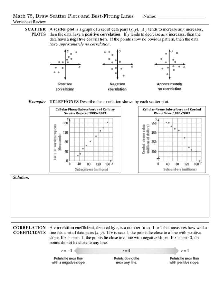
Math 75, Draw Scatter Plots and Best-Fitting Lines Name: ______________________ Worksheet Review SCATTER A scatter plot is a graph of a set of data pairs (x, y). If y tends to increase as x increases, PLOTS then the data have a positive correlation. If y tends to decrease as x increases, then the data have a negative correlation. If the points show no obvious pattern, then the data have approximately no correlation. Example: TELEPHONES Describe the correlation shown by each scatter plot. Cellular Phone Subscribers and Cellular Service Regions, 1995–2003 Cellular Phone Subscribers and Corded Phone Sales, 1995–2003 Solution: CORRELATION A correlation coefficient, denoted by r, is a number from -1 to 1 that measures how well a COEFFICIENTS line fits a set of data pairs (x, y). If r is near 1, the points lie close to a line with positive slope. If r is near -1, the points lie close to a line with negative slope. If r is near 0, the points do not lie close to any line. Example: Tell whether the correlation coefficient for the data is closest to -1, -0.5, 0, 0.5, or 1. Solution: Practice: For each scatter plot, (a) tell whether the data have a positive correlation, a negative correlation, or approximately no correlation, and (b) tell whether the correlation coefficient is closest to -1, -0.5, 0, 0.5, or 1. BEST- If the correlation coefficient for a set of data is near ±1, the data can be reasonably modeled by FITTING a line. The best-fitting line is the line that lies as close as possible to all the data points. You LINES can approximate a best-fitting line by graphing. Approximating a Best-Fitting Line STEP 1 Draw a scatter plot of the data. STEP 2 Sketch the line that appears to follow most closely the trend given by the data points. There should be about as many points above the line as below it. STEP 3 Choose two points on the line, and estimate the coordinates of each point. These points do not have to be original data points. STEP 4 Write an equation of the line that passes through the two points from Step 3. This equation is a model for the data. Example: The table shows the number y (in thousands) of alternative-fueled vehicles in use in the United States x years after 1997. Approximate the best-fitting line for the data. Solution: x 0 1 2 3 4 5 6 7 y 280 295 322 395 425 471 511 548 Find the linear model for the data: 550 500 450 400 350 300 0 1 2 3 4 5 6 7 Example Use the equation of the line of fit from the above example to predict the number of alternativeExtension: fueled vehicles in use in the United States in 2010. Solution: Math 75 Name: ______________________ Problem Set: Draw Scatter Plots and Best-Fitting Lines 1. A line that lies as close as possible to a set of data points (x, y) is called the __________________________________________ for the data points. 2. Describe how to tell whether a set of data points shows a positive correlation, a negative correlation, or approximately no correlation. Tell whether the data have a positive correlation, a negative correlation, or approximately no correlation. 3. 4. 5. Tell whether the correlation coefficient for the data is closest to -1, -0.5, 0, 0.5, or 1. 6. 7. 8. In Exercises 9–14, (a) find the linear model, (b) record the correlation coefficient, and (c) estimate y when x = 20. 9. 10. 11. 12. 13. 14. 15. MULTIPLE CHOICE Which equation best models the data in the scatter plot? 16. ERROR ANALYSIS The graph shows one student’s approximation of the best-fitting line for the data in the scatter plot. Describe and correct the error in the student’s work. 17. MULTIPLE CHOICE A set of data has correlation coefficient r. For which value of r would the data points lie closest to a line? 18. The data pairs (x, y) give U.S. average annual public college tuition y (in dollars) x years after 1997. Find the best-fitting line for the data using Minitab. (0, 2271), (1, 2360), (2, 2430), (3, 2506), (4, 2562), (5, 2727), (6, 2928)
