Multi-Media Rubric 4 3 2
advertisement

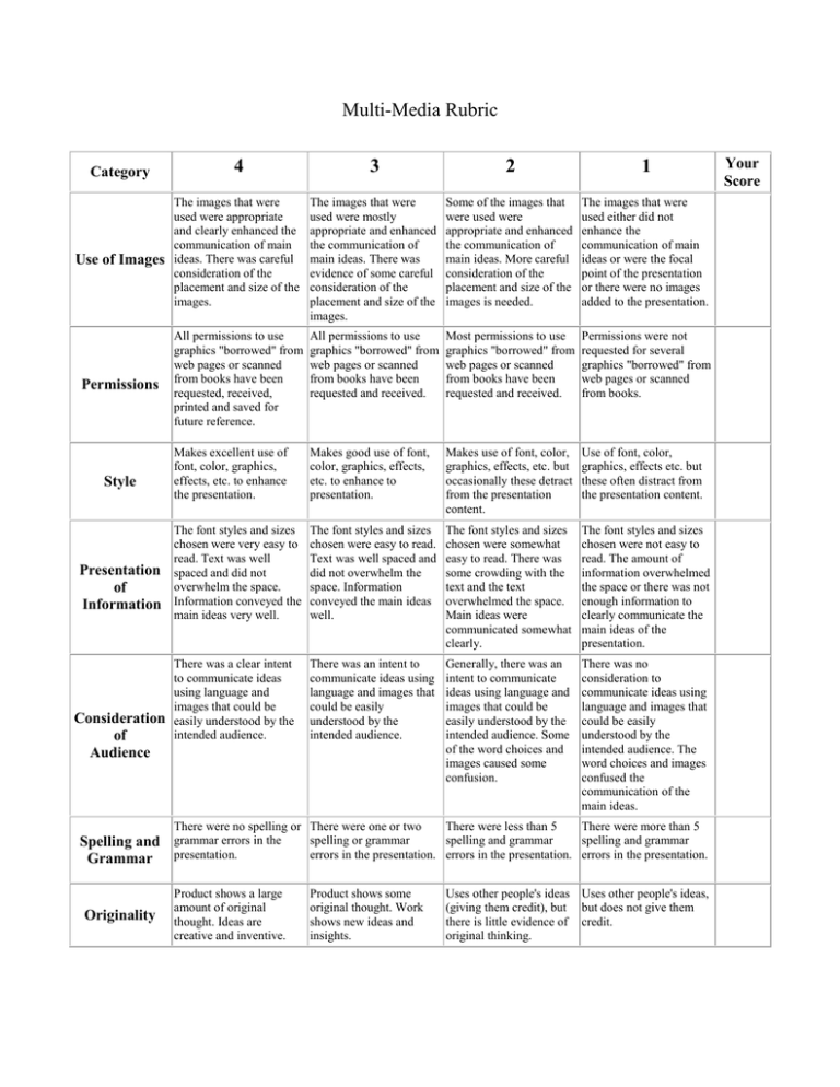
Multi-Media Rubric Category Use of Images Permissions Style Presentation of Information Consideration of Audience 4 3 2 1 The images that were used were appropriate and clearly enhanced the communication of main ideas. There was careful consideration of the placement and size of the images. The images that were used were mostly appropriate and enhanced the communication of main ideas. There was evidence of some careful consideration of the placement and size of the images. Some of the images that were used were appropriate and enhanced the communication of main ideas. More careful consideration of the placement and size of the images is needed. The images that were used either did not enhance the communication of main ideas or were the focal point of the presentation or there were no images added to the presentation. All permissions to use graphics "borrowed" from web pages or scanned from books have been requested, received, printed and saved for future reference. All permissions to use graphics "borrowed" from web pages or scanned from books have been requested and received. Most permissions to use graphics "borrowed" from web pages or scanned from books have been requested and received. Permissions were not requested for several graphics "borrowed" from web pages or scanned from books. Makes excellent use of font, color, graphics, effects, etc. to enhance the presentation. Makes good use of font, color, graphics, effects, etc. to enhance to presentation. Makes use of font, color, graphics, effects, etc. but occasionally these detract from the presentation content. Use of font, color, graphics, effects etc. but these often distract from the presentation content. The font styles and sizes chosen were very easy to read. Text was well spaced and did not overwhelm the space. Information conveyed the main ideas very well. The font styles and sizes chosen were easy to read. Text was well spaced and did not overwhelm the space. Information conveyed the main ideas well. The font styles and sizes chosen were somewhat easy to read. There was some crowding with the text and the text overwhelmed the space. Main ideas were communicated somewhat clearly. The font styles and sizes chosen were not easy to read. The amount of information overwhelmed the space or there was not enough information to clearly communicate the main ideas of the presentation. There was a clear intent to communicate ideas using language and images that could be easily understood by the intended audience. There was an intent to communicate ideas using language and images that could be easily understood by the intended audience. Generally, there was an intent to communicate ideas using language and images that could be easily understood by the intended audience. Some of the word choices and images caused some confusion. There was no consideration to communicate ideas using language and images that could be easily understood by the intended audience. The word choices and images confused the communication of the main ideas. There were no spelling or There were one or two There were less than 5 There were more than 5 spelling or grammar spelling and grammar spelling and grammar errors in the presentation. errors in the presentation. errors in the presentation. Spelling and grammar errors in the Grammar presentation. Originality Product shows a large amount of original thought. Ideas are creative and inventive. Product shows some original thought. Work shows new ideas and insights. Uses other people's ideas Uses other people's ideas, (giving them credit), but but does not give them there is little evidence of credit. original thinking. Your Score


