Guide to writing for the web: Producing effective content Contents
advertisement
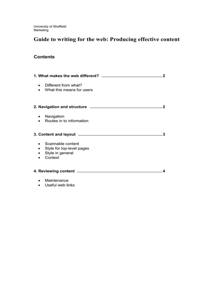
University of Sheffield Marketing Guide to writing for the web: Producing effective content Contents 1. What makes the web different? .................................................... 2 Different from what? What this means for users 2. Navigation and structure .............................................................. 2 Navigation Routes in to information 3. Content and layout ........................................................................ 3 Scannable content Style for top-level pages Style in general Context 4. Reviewing content ......................................................................... 4 Maintenance Useful web links 1. What makes the web different? Different from what? The web is a publishing medium, but it is significantly different from broadcast and print media. It is most often viewed on a TV-like screen and can have news/entertainment roles, so it is often subconsciously linked with radio or TV, but there are important differences. Interactivity – the web is much more interactive than TV or radio, you don’t just sit back and wait for the next website to come along, you have to find it yourself. This also means you are not bound by someone else’s schedule, so there is much greater freedom for the user It is not as interactive, or as familiar as a book or magazine. It doesn’t always have a linear journey, with a contents table, preface, beginning, middle and end. The user has to search Readability – reading from a computer screen is tiring on your eyes, and much slower than reading from print. Technology – users have varying technology, with varying capabilities. They may be using a slow dial-up connection to the internet, or have older versions of software, so you cannot always determine the user experience. What this means for users As a result of these factors, users tend to: Scan pages for information Have a specific objective in mind Expect results quickly New users are unlikely to learn ‘your way’ – if they cannot easily find what they are looking for, they will go somewhere else. 2. Navigation and structure There is a temptation to use the structure of your organisation (and what is important within it) to determine the layout and priorities of a website. The purpose of any site is to serve the users but it’s worth being aware that this can be clouded by other objectives. Navigation It helps users greatly if navigation: Uses a standard layout of global, local and supplementary navigation locations. The CMS does this for you. Goes some way to answering three basic questions: Where am I? Where can I go? Where have I been? Gives some idea of the amount of information contained within the site Avoids overloading the user with choices (Human computer interaction studies have shown that more than seven or eight choices begins to confuse the user) Department of Marketing, Writing for the Web 2 Routes into information It is advisable to distinguish between top-level pages, and lower-level content pages – they serve different purposes so will benefit from different layouts: Keep top-level pages short – they are signposts to information Longer pages at a lower-level - as the user reaches their intended destination, it is more appropriate to offer far more information on one page, for example, a lengthy academic document. Users will find a site far easier to navigate if there is consistency in navigation and structure. If they can predict what will happen when they click on a link, they are reassured and don’t feel the need to ‘learn’ how to use the site. 3. Content and layout Scannable content As previously mentioned, reading from the web is a slow and quite tiring process. With this in mind, it is helpful to make your top-level pages (your routes in to information) easy to scan, to enable the user to pick out information/choices at a glance. You can do this by using: Regular headings and sub-headings Bulleted lists Descriptive links (ie. wording that tells the user where they are being taken, rather than a web address link, eg. www.shef.ac.uk ) Best practice would be to use summary pages that lead in to your more detailed information. This will allow a user to decide whether the information will meet their objectives. Descriptive links are particularly helpful if there are many links on a page. Scanning a page full of ‘click here’ links will take considerably longer and make it that much more difficult for the user to make an informed choice. Style for top-level pages To help the user find information quickly, we recommend that for top-level pages you: Use Plain English Write short paragraphs Write short sentences Be concise ‘Summarise’ first Try to use language that avoids technical jargon or colloquialisms that may not be easily understood by a wider audience. Keeping paragraphs and sentences short and concise will help the user to scan information. Beginning with a summary of what is on offer helps the user decide early on whether the information that will follow is relevant to them. Department of Marketing, Writing for the Web 3 Style in general The following general guidelines are useful across all pages: Avoid inline links – these are links that appear in the middle of a sentence. On a site such as ours, which tends to be quite text-heavy, inline links can be distracting and make text difficult to read Be direct – try to use direct language to create a personal and engaging user experience. For example, rather than “What makes Sheffield attractive to a student?”, you might say, “Why should you study at Sheffield?”. Try to use the 1st and 2nd person (“we” instead of “the University”, and “you” instead of “the student”). Be objective – beware of over-selling or over-stating your case. Staying factual is more likely to engender a sense of trust in your content. In general, it is best to avoid italics (it is difficult to read on-screen), underlining (users may think it is a link), upper case (slower to read and signifies ‘shouting’), coloured text (issues for colour blind) The publications department has produced an editorial style guide to assist in creating consistent language across the University. This can be found, and downloaded (in PDF and Word format), at www.shef.ac.uk/marcoms. Context A website’s lack of physical form means that establishing the context of information on a page takes on extra importance. Search engine results (eg. Google) are a common route into websites and could lead users directly to almost any page, so it is important that the page makes sense out of context. Making sure the page has a meaningful title and a date stamp (you can do this in CMS simply by checking a box) will help users to work out where they are, identify what they are looking at, and will reassure them that the content is up-todate. 4. Reviewing web content It is important to review and develop your content in order to continuously provide your users with relevant and up-to-date information, in a format that makes sense to them. Try to engage in research and review activities, both before and after your content is published. You can do this with: User testing Feedback Competitor analysis The Department of Marketing and Communications conducts user testing, but it is a useful exercise for all departments in terms of refining and developing content. Department of Marketing, Writing for the Web 4 Maintenance The web is such a fast-moving and immediate environment that your content will benefit from being monitored. You can help ensure your site is up-to-date by: Checking links to external sites – links can break, pages can be moved and web addresses can change. It is a useful exercise to check this from time to time. Making a note of, or avoiding time-sensitive content – if a user is presented with an out-of-date page, it will affect the confidence they have in the rest of your site. Avoiding duplication – try not to offer the same information in a variety of places. It will make more work for you. It is better to have one page of information, which is linked to from a number of pages. Checking facts – for the same reason as time-sensitive content. Some useful web links: Plain English Campaign www.plainenglish.co.uk/plainenglishguide.co.uk A guide to writing in plain English. Yale University www.webstyleguide.com The Yale Style Guide Nathan Wallace http://www.e-gineer.com/articles/web-writing-for-many-interest-levels.phtml Web writing for many interest levels Methods for Designing Usable Websites http://usability.gov Email: webmarketing@sheffield.ac.uk Department of Marketing, Writing for the Web 5
