Using Excel to plot error bars.
advertisement
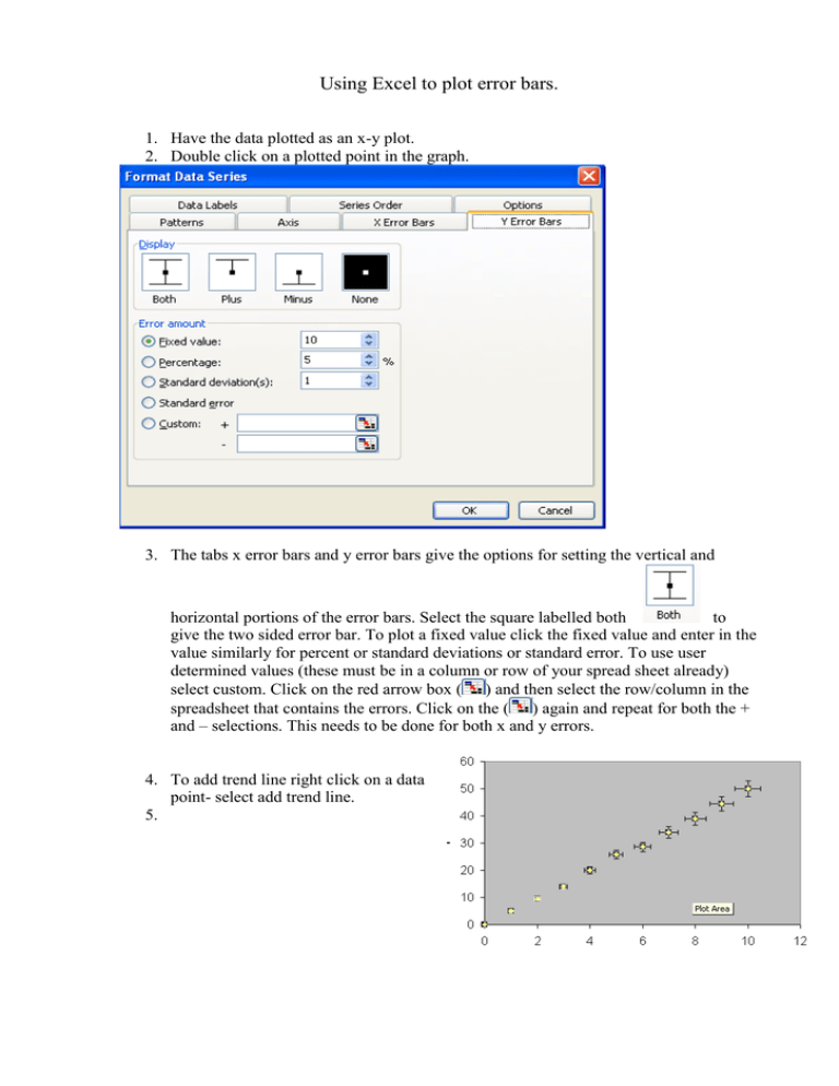
Using Excel to plot error bars. 1. Have the data plotted as an x-y plot. 2. Double click on a plotted point in the graph. 3. The tabs x error bars and y error bars give the options for setting the vertical and horizontal portions of the error bars. Select the square labelled both to give the two sided error bar. To plot a fixed value click the fixed value and enter in the value similarly for percent or standard deviations or standard error. To use user determined values (these must be in a column or row of your spread sheet already) select custom. Click on the red arrow box ( ) and then select the row/column in the spreadsheet that contains the errors. Click on the ( ) again and repeat for both the + and – selections. This needs to be done for both x and y errors. 4. To add trend line right click on a data point- select add trend line. 5. 5. Select options 6. Select display equation and you have the option of forcing the intercept if appropriate as well as displaying rsquared etc. The trend line is a least squares best linear fit line. Go ok. 7. To add error line, enter two points in the spread sheet one to be at the beginning of your error line and one to be at the end. These are initial guesses and as long as they are far enough from the other data so you can see them on the graph you will be ok. Right click on a white part of your plot to get the menu. Select source data. 8. 8. Choose the series tab. Under the series box select add series. 9. In the name box call it error line. Using the ( ) boxes next to the x values and the y values select the x coordinates and the y coordinates of the end points for you error line. (see step 3 to remember how to select ). Click ok. Your two points should be on the graph in a different colour. Right click on one of these points and add trend line with equation as in step 6. Go ok. Now as you alter the error point values in the spread sheet the line on the graph changes to reflect this so to does the equation. Manually alter until the error line is acceptable.
