Maps of the African Disapora Example 1
advertisement
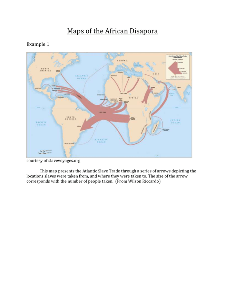
Maps of the African Disapora Example 1 courtesy of slavevoyages.org This map presents the Atlantic Slave Trade through a series of arrows depicting the locations slaves were taken from, and where they were taken to. The size of the arrow corresponds with the number of people taken. (From Wilson Riccardo) Example 2 http://www.slavevoyages.org/tast/assessment/intro-maps.faces Visualizing Statistics This map illustrates the major regions where captives disembarked from over the course of the years of the Trans-Atlantic slave trade. Thanks to the helpful key on the bottom right hand corner of the image, one can determine that the regions where the most captives departed from display larger maroon circles. This map exhibits how a map can be used to show statistics through a method of comprehensive visualization. Maps are a great source for all types of learners because they can bring statistics to life. Maps are also useful because they are something that many people feel comfortable with because they are used for so many types of information in our daily lives. (From Kristina Niedermayer)


