Critical Cloud Project
advertisement
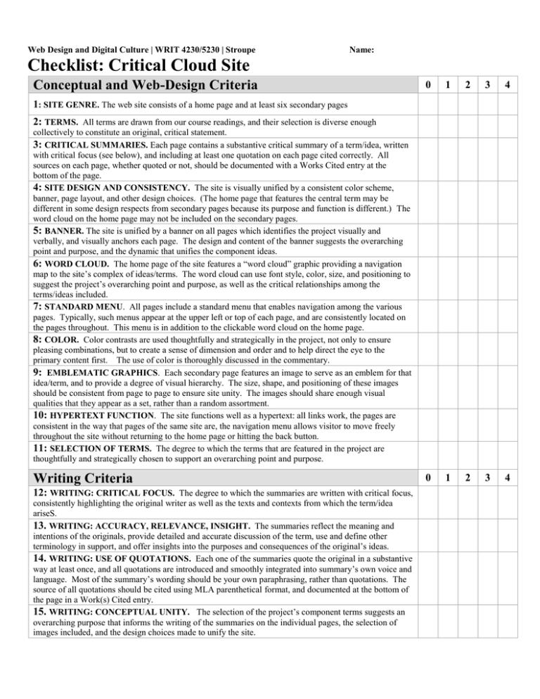
Web Design and Digital Culture | WRIT 4230/5230 | Stroupe Name: Checklist: Critical Cloud Site Conceptual and Web-Design Criteria 0 1 2 3 4 0 1 2 3 4 1: SITE GENRE. The web site consists of a home page and at least six secondary pages 2: TERMS. All terms are drawn from our course readings, and their selection is diverse enough collectively to constitute an original, critical statement. 3: CRITICAL SUMMARIES. Each page contains a substantive critical summary of a term/idea, written with critical focus (see below), and including at least one quotation on each page cited correctly. All sources on each page, whether quoted or not, should be documented with a Works Cited entry at the bottom of the page. 4: SITE DESIGN AND CONSISTENCY. The site is visually unified by a consistent color scheme, banner, page layout, and other design choices. (The home page that features the central term may be different in some design respects from secondary pages because its purpose and function is different.) The word cloud on the home page may not be included on the secondary pages. 5: BANNER. The site is unified by a banner on all pages which identifies the project visually and verbally, and visually anchors each page. The design and content of the banner suggests the overarching point and purpose, and the dynamic that unifies the component ideas. 6: WORD CLOUD. The home page of the site features a “word cloud” graphic providing a navigation map to the site’s complex of ideas/terms. The word cloud can use font style, color, size, and positioning to suggest the project’s overarching point and purpose, as well as the critical relationships among the terms/ideas included. 7: STANDARD MENU. All pages include a standard menu that enables navigation among the various pages. Typically, such menus appear at the upper left or top of each page, and are consistently located on the pages throughout. This menu is in addition to the clickable word cloud on the home page. 8: COLOR. Color contrasts are used thoughtfully and strategically in the project, not only to ensure pleasing combinations, but to create a sense of dimension and order and to help direct the eye to the primary content first. The use of color is thoroughly discussed in the commentary. 9: EMBLEMATIC GRAPHICS. Each secondary page features an image to serve as an emblem for that idea/term, and to provide a degree of visual hierarchy. The size, shape, and positioning of these images should be consistent from page to page to ensure site unity. The images should share enough visual qualities that they appear as a set, rather than a random assortment. 10: HYPERTEXT FUNCTION. The site functions well as a hypertext: all links work, the pages are consistent in the way that pages of the same site are, the navigation menu allows visitor to move freely throughout the site without returning to the home page or hitting the back button. 11: SELECTION OF TERMS. The degree to which the terms that are featured in the project are thoughtfully and strategically chosen to support an overarching point and purpose. Writing Criteria 12: WRITING: CRITICAL FOCUS. The degree to which the summaries are written with critical focus, consistently highlighting the original writer as well as the texts and contexts from which the term/idea ariseS. 13. WRITING: ACCURACY, RELEVANCE, INSIGHT. The summaries reflect the meaning and intentions of the originals, provide detailed and accurate discussion of the term, use and define other terminology in support, and offer insights into the purposes and consequences of the original’s ideas. 14. WRITING: USE OF QUOTATIONS. Each one of the summaries quote the original in a substantive way at least once, and all quotations are introduced and smoothly integrated into summary’s own voice and language. Most of the summary’s wording should be your own paraphrasing, rather than quotations. The source of all quotations should be cited using MLA parenthetical format, and documented at the bottom of the page in a Work(s) Cited entry. 15. WRITING: CONCEPTUAL UNITY. The selection of the project’s component terms suggests an overarching purpose that informs the writing of the summaries on the individual pages, the selection of images included, and the design choices made to unify the site. 16. WRITING: CITATION AND DOCUMENTATION (MLA). That all references to print or online sources are documented in “Work(s) Cited” entries at the bottom of each page, and that quotations are cited in the text using parenthetical citation format. All documentation and citations should be consistent with MLA style formatting guidelines. Commentary Criteria 0 1 17: COMMENTARY. The project is thoughtfully analyzed in a formal, well-written, grammatically correct commentary of at least 500 words (about 2 double-spaced pages), speaking to the criteria above 18: COMMENTARY: THESIS. The commentary elaborates the thesis of the project: that is, it explains how the selection and development of the secondary terms constitutes an overarching purpose, argument, and insight concerning the central term. The commentary should attempt explicitly to state this thesis in a sentence or two, and then to discuss how the choice of terms, the home-page word cloud, the site’s design choices, and the summaries themselves suggest this thesis. 19: COMMENTARY: COLOR. The commentary specifically and coherently explains the site’s color scheme using vocabulary and principles drawn from the Poynter Color Tutorial and the Color Scheme Designer web site. 20: COMMENTARY: ESSENTIAL CONTRASTS TO WRITING AN ESSAY. At least one paragraph of the commentary is devoted to identifying and considering issues raised by the differences between linear writing for print (such as an analytical essay you might right for a class) and “content design” for online hypertext (such as this project). What are the challenges and/or advantages of using hypertext, rather than a print essay, to discover and convey meaning? 21: COMMENTARY: REFERENCES. All outside references in the commentary--including online ones--are correctly cited using MLA-style in-text citation format and bibliographic documentation at the end of the commentary 4. Exemplary results in this category. This project would serve as a publishable model for what this assignment, and this class, is intended to teach. 3. Excellent results that provide a worthy example for other students in the class. 2. Good, solid work in this category with further opportunities for development 1. Effort is evident here, though results are not sufficiently realized. 0. Results not evident or explicit, or very marginal. 2 3 4
