– 2008 Scholarship Design Examples of Candidate Work
advertisement

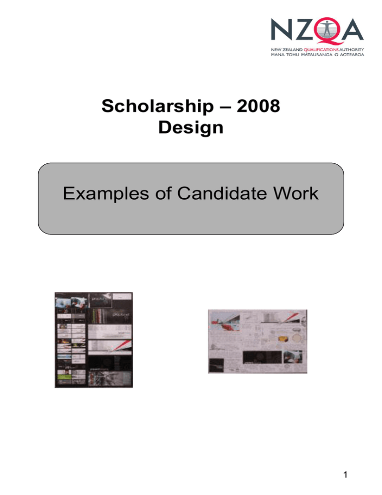
Scholarship – 2008 Design Examples of Candidate Work 1 Scholarship This candidate set themselves a sound brief that was able to be used extensively to explore a large number of engaging and resourceful avenues of inquiry. The situation is Proplanet, a NZ-based organisation whose aim is to raise awareness of our precious greenery, of native and endangered plants. The briefs include logo design, a set of posters, banners, a stationery set, and a booklet for a promotional campaign. The candidate employs throughout their submission a huge range of type. The strength lies in the way that type becomes motif, a spatial device, and operates as pictorial, associative and metaphorical element/s, eg. the typographical play with trees. This is a rich investigation that is driven through image making. There is a real sense of control on the part of the candidate in the management of formal qualities and use of line, all of which are treated with an elegance and simplicity. The integration of font and image is well considered, with the production of logos that are able to operate in a number of contexts. Introduced images reflect the action of formal qualities and vice versa. The candidate has utilised some stock photos, taking ownership of them by manipulating and altering aspects, such as colour, positive/ negative space, etc. Design language drives this board by interpreting both image and text equivalently. The workbook presents thorough analysis and establishes links to contemporary practice that are well understood. The workbook is used to successfully unpick the brief/s and define subsequent terrain for concept development and exploration. The candidate makes strong connections to artistic reference, but always looks to how they can use them intelligently and beyond the known understandings of the model. This is an honest submission that is both sensitive and bold, and which is always in command of its territory. 2 3 4 5 6 7 8 Outstanding Scholarship This is a confident submission that explores an open-ended and well-structured brief; it is an emotive, sensitive and intelligent response to the topic. The situation is ‘Confide’, a new health organisation – target audience are mid teens to mid-20s – focusing on mental health issues; the brief involves developing a range of promotional graphics. Right from the outset the candidate is purposeful in their choices; the first being to draw by hand as the main aesthetic, and as a way of reaching target audience. This strategy is employed through a series of complex and intelligent images; and moves from hand drawing into contemporary graphics without losing the autographic. Illustration is used to animate ideas, ie the television is animated with the hand coming out of it, the phone reaches out, etc – this is all treated in a playful yet meaningful manner. The candidate moves past literalism through an illustration modality. There is a real sensitivity to the topic, which is captured in the continual attention to detail, restraint and control, and appropriate media to concept relationships. It is clear that the candidate understands formal qualities of design – he or she has such a voice because of the way that they employ specific conventions; limited colour palette, framing of formal qualities coupled with informal, playful composition, type as image. There is intelligent play with figure ground relationships, consideration of spatial ins and outs, foreground background relationships. The layout is strong and enables the viewer to move across the three boards freely. The same type of aptitude follows through into the workbook, which also contains an open-ended tone. This is a real asset in the unfolding of this investigation – the key aspect being that the candidate chose an aesthetic, unpicked it in order to transport their thinking, and did so with both originality and a high level of reinvention. 9 10 11 12 13 14 15
