Oceanic Circulation
advertisement

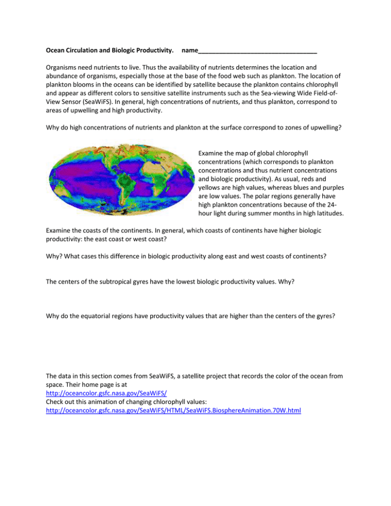
Ocean Circulation and Biologic Productivity. name__________________________________ Organisms need nutrients to live. Thus the availability of nutrients determines the location and abundance of organisms, especially those at the base of the food web such as plankton. The location of plankton blooms in the oceans can be identified by satellite because the plankton contains chlorophyll and appear as different colors to sensitive satellite instruments such as the Sea-viewing Wide Field-ofView Sensor (SeaWiFS). In general, high concentrations of nutrients, and thus plankton, correspond to areas of upwelling and high productivity. Why do high concentrations of nutrients and plankton at the surface correspond to zones of upwelling? Examine the map of global chlorophyll concentrations (which corresponds to plankton concentrations and thus nutrient concentrations and biologic productivity). As usual, reds and yellows are high values, whereas blues and purples are low values. The polar regions generally have high plankton concentrations because of the 24hour light during summer months in high latitudes. Examine the coasts of the continents. In general, which coasts of continents have higher biologic productivity: the east coast or west coast? Why? What cases this difference in biologic productivity along east and west coasts of continents? The centers of the subtropical gyres have the lowest biologic productivity values. Why? Why do the equatorial regions have productivity values that are higher than the centers of the gyres? The data in this section comes from SeaWiFS, a satellite project that records the color of the ocean from space. Their home page is at http://oceancolor.gsfc.nasa.gov/SeaWiFS/ Check out this animation of changing chlorophyll values: http://oceancolor.gsfc.nasa.gov/SeaWiFS/HTML/SeaWiFS.BiosphereAnimation.70W.html El Niño El Niño is defined as the warming of the eastern equatorial Pacific. Under typical conditions, the waters off the west coast of equatorial South America is relatively cool (fig to left), high pressure dominates in the eastern equatorial Pacific, low pressure dominates in the western equatorial Pacific (see figs at beginning of exercise), and the trade winds blow strongly to the west. During El Niño conditions (fig to right) the eastern equatorial Pacific is abnormally warm, the low pressure system moves eastward, and the trade winds weaken. Everything you could ever want to know about El Nino/La Nina is here: http://www.elnino.noaa.gov/lanina.html Current SSTs are here: http://www.osdpd.noaa.gov/data/sst/contour/global50.ice.gif Current SST anomalies are at http://www.osdpd.noaa.gov/ml/ocean/sst/anomaly.html Are we currently in an El Nino, La Nina, or La Nada? How do you know? What is it that you see on these maps that enables you to tell? Whereas the previous figures showed actual sea surface temperatures (SST), these figures show sealevel height anomalies, from which SST anomalies may be inferred. Anomalies are the difference between the observed sea-level height or temperature and the normal (average) sea-level height or temperature. The white areas indicate sea level 13-30 cm (5-10 inches) above normal. These figures show the development of the 1997-98 El Niño, which is one of the strongest on record. Why would warmer water produce a sea-level height anomaly? Considering the above figures, are there any signs of an El Niño event in the sea-level height anomalies of March 1997? As the El Niño event developed in October of 1997, what happened to the sea-level height anomalies in the western Equatorial Pacific? Historical Records in Monterey Bay The diagram below right is for Monterey Bay. It shows temperature and salinity profiles contoured against time from a mid- Monterey Bay location. Please draw and label arrows that show upwelling events on these diagrams. Does upwelling bring higher salinity or lower salinity water to the surface? How do you know? Please label the 1997-98 El Niño event on the Monterey Bay record. How do you recognize it? Please label the 1991-92 El Niño event on the Monterey Bay record. Origin of Water Masses in Monterey Bay (Look at the image on the previous page.) Why is deep Monterey Bay water saltier than surface Monterey Bay water? There are at least two possibilities: 1) Evaporation during the summer creates salty water at the surface that then sinks. 2) The southerly flowing California Current introduces low salinity over the higher salinity water. Which one of these possibilities is more likely to be correct? Please explain why, using the hypothesis testing method of the scientific method. Variation in Nutrients and Biologic Productivity in Monterey Bay Use the image on the previous page to help you with these questions. What time of year would you predict the nutrient levels, such as phosphate and nitrate to be the greatest in Monterey Bay? Why? Please click here to check your answer: http://www.mbari.org/bog/projects/centralcal/summary/images/m1_nuts_ts_contour.jpg Was your prediction right? What did you see that enabled you to answer why or why not? What time of year would you predict the biologic productivity--as measured by Chlorophyll levels--to be the greatest? Why? Please click here to check your answer: http://www.mbari.org/bog/Projects/CentralCal/summary/images/maj_bio_ts_contour.jpg Was your prediction right? Why or why not? All this Monterey Bay data comes from Francisco Chavez’ Biological Ocean Group at MBARI: http://www.mbari.org/bog/ He has compiled lots of time series data of Monterey Bay chemistry: http://www.mbari.org/bog/projects/centralcal/summary/ts_summary.htm A location map of his permanently moored CTD stations is at: http://www.mbari.org/bog/roadmap/major_stations.htm


