How to enter data into Excel and graph it
advertisement

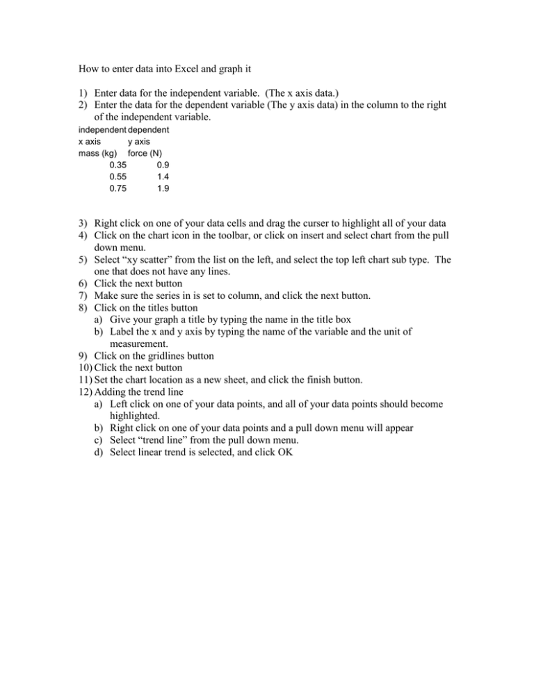
How to enter data into Excel and graph it 1) Enter data for the independent variable. (The x axis data.) 2) Enter the data for the dependent variable (The y axis data) in the column to the right of the independent variable. independent dependent x axis y axis mass (kg) force (N) 0.35 0.9 0.55 1.4 0.75 1.9 3) Right click on one of your data cells and drag the curser to highlight all of your data 4) Click on the chart icon in the toolbar, or click on insert and select chart from the pull down menu. 5) Select “xy scatter” from the list on the left, and select the top left chart sub type. The one that does not have any lines. 6) Click the next button 7) Make sure the series in is set to column, and click the next button. 8) Click on the titles button a) Give your graph a title by typing the name in the title box b) Label the x and y axis by typing the name of the variable and the unit of measurement. 9) Click on the gridlines button 10) Click the next button 11) Set the chart location as a new sheet, and click the finish button. 12) Adding the trend line a) Left click on one of your data points, and all of your data points should become highlighted. b) Right click on one of your data points and a pull down menu will appear c) Select “trend line” from the pull down menu. d) Select linear trend is selected, and click OK
