From: AAAI Technical Report FS-99-04. Compilation copyright © 1999, AAAI (www.aaai.org). All rights reserved.
The Psychology of Layout:
Consequences of the Visual Structure of Documents
Patricia Wright
Schoolof Psychology
CardiffUniversity
Cardiff, WalesCF103YG,UK
WrightP1 @cardiff.ac.uk
Abstract
Usingexamplesof implementedlayout decisions, and from
performance-based
research on the effects that layout has on
readers this paper proposessevenreasonswhythe layout of
documentsis important. Thesereasons range from economic
to psychological.Theimportanceof specific layout features
will often differ for those generating documentsfrom an
informationresourceandfor thoseseekingto captureexisting
documents.Manylayout problemsarise whendocumentsare
transferred across media(e.g. print to computermonitorto
Personal Digital Assistant). The present discussion
emphasisesthe value of maintaininga functional equivalence
of layout features (e.g. visual grouping) rather than
preservingformalidentity (e.g. spacing). Aprerequisite for
doing this is an understanding of howlayout features
influencereadingactivities. It is suggested
that althoughthere
are gaps in our knowledgeof readers’ search and decisionmakingprocessesit wouldneverthelessbe possibleto devise
a simulatedreader that respondedto layout features, such as
the relation betweentext and graphics, in the waythat most
readers will. This wouldbe a useful tool for maintaining
functional equivalence whendocumentsare movedacross
media.
e.g. from print to desktop screen to handheld computer,
while preserving documentusability. It will be shown
that this often involves transforming layout features in
principled ways.
1. Identification
Conventions have arisen such that documents have
customary layouts.
These conventions are not
necessarily arbitrary. A timetable has a layout that is
visually different from that of a letter for several very
good reasons relating both to the structure of the
information content and the way the documentwill be
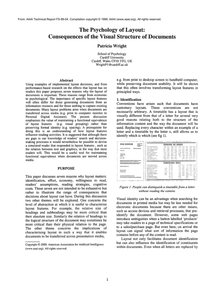
used. Replacing every character within an exampleof a
letter and a timetable by the letter x, still allows us to
identify whichis which(see fig 1).
xxxxxxxxx
~:7. i i
x:,eooe~
xxxxxxx
PURPOSE
~2g"
:.:. ~.;2:~:~:2;221
;2:;:;2;
This paper discusses seven reasons whylayout matters:
identification, effort, economy,willingness to read,
readers’ assumptions, reading strategies, cognitive
costs. Theseseven are not intended to be exhaustive but
rather to illustrate the range of consequences that
decisions about layout can have. Duringthis discussion
two other themes will be explored. One concerns the
level of abstraction at whichit is useful to characterise
layout features. For example, the relative size of
headings and subheadings may be more critical than
their absolute size. Similarly the relation of headingsto
the logical structure of the documentmaysometimesbe
morecritical than their physical relation to the page.
The other theme concerns the implications
of
characterising layout in such a way that it enables
documentsto be transferred across presentation media,
Copyright
©2000.American
Association
for ArtificialIntelligence
(www.aaai.org).
Allrightsreserved.
Figure1 Peoplecandistinguish a timetablefroma letter
withoutreadingthe content.
Visual identity can be an advantage whensearching for
documentsin printed media but maybe less needed for
electronic documents because there are other means,
such as access devices and retrieval processes, that preidentify the document. However, some web pages
introduce ambiguities whena button labelled ’products’
maytake readers to a pageof technical specifications or
to a sales/purchase page. But even here, on arrival the
layout can signal what sort of information the page
contains before any of the content is read.
Layout not only facilitates documentidentification
but can also influence the identification of constituents
within documents.Even whenall letters are replaced by
X there wouldbe no ambiguity in distinguishing a page
starting a new chapter from an index page. The
existence of footnotes and marginalia are evident as
soon as the reader accesses a printed page, and their
existence says several things about the document- e.g.
it is multilayeredand non-linear.
Not only within the document but even within a
page, the layout provides cues that signal relationships
amongthe elements. Headingsthat are centred or to one
side, have a rhetorical significance. Illustrations and
their captions have conventional relationships both in
space (proximity) and in font style (distinguished from
the bodytext. Fromthe layout alone readers knowa lot
about the document before they start to read. Hence
phrases such as "the small print" have entered the
language and explicitly mark a relation between the
visual appearanceof a text and its likely content.
Whilethe existence of identifying visual features is
an indisputable part of manytexts, the question arises as
to whether these need to be preserved whena document
movesacross presentation media. For example, the way
footnotes are handled in a printed mediummay no
longer be appropriate when other options become
available in other media - e.g. pop-up windowsor hot
links to other parts of the text. Clearly the status of the
footnote needs to be captured as such, but the specifics
of its visual implementation may be highly context
dependent. Critical contextual parameters include the
display resources (screen size, colour, resolution, etc)
and the uses to which the document will be put.
Documentsused for reference may require that many
layout features support access to specific sections
within the document;in contrast application forms may
need to generate a sequential flow that takes readers
through all and only the relevant sections. The same
repertoire of layout devices may be used in both
documents, but because they are being used for
different purposes they will be combinedin different
ways.
Understanding the purpose of a document and the
way people will use it becomescrucial whendocuments
need to be re-displayed on systems having different
constraints. Considerthe timetable shownin figure 2. If
screen resolution does not permit maintaining the
typographic distinction betweenhours and minutes then
this will have consequences for the spacing needed
between columns. This space will need to become
greater to compensate for the lost typographic
distinction. If screen size does not permit the whole
table to be shownsimultaneously then lateral scrolling
will not workfor readers unless the row headers remain
visible. Similarly if the table is deconstructed and the
Saturday times presented separately, the row headings
will need to be repeated or the information becomes
unusable.
07,~ 07~C, 07ff_, 07~ 07o~ 07 0.3 07,3o ,
07_’~3 07~ 07~’_, 07~ 073-: 07_~-, 073,’.,
08 C~= 080-" 08,’-<, 08 ~ 08r_,._’.. 08 ;’]-, 08 ~C, :
08:_~.--"08 .~ 08 30 08 3~?= ,08 3"3- 08 3~. 08 30
09 C~ 09t_-~.~09 05 00 ~0 09 :?,_-: 09 OC, 00 O0
09 33 092;-’, 09 ~¢ 09 ~,’., 09 3,3 09 3=3 09 30
10,;~ 10E<, 10~?, 10 9,5 10-.3~= 10 0,3 10,_’~9
10~
1033 1033 10~0 103,_-- 1030 1030
110-’3 11,2.? 11r,-,
11 03 11 o~ 11,_-==? 11 3o 113"5 115c,
11 3._’= t130 11 3o
Figure2 Displayfeatures maybe lost movingacross media.
These issues about being able to present the
relationships signalled by layout in alternative ways, in
response to contextual constraints, applies not only to
documents being generated ab initio but also those
being assembled or transferred from an information
resource. Although items within the resource may be
tagged to denote their organisational function within the
document (e.g. header, footnote, list) the visual
implementation can be achieved in many ways in
general, although usually only in a subset of waysfor a
given presentation device.
2 Effort
Layout matters because it influences the effort that
readers must make to use the information.
The
alternative layouts adopted for listing television
programs will be a familiar example. A run-on, mock
paragraph style is sometimes used because it saves
space, but this format can make it muchharder for
readers to answer questions such as, "Is there a nine
o’clock news?". Vertical listings of programs, with
separate columns for times and program titles, helps
people whoare searching for information. Similarly a
periodic horizontal alignment across channels helps
readers answer questions such as, "What’s on now?".
The interplay between layout and usability is well
illustrated by the information boards displayed by large
organisations in hallways and at elevators. Often the
destinations are grouped by location. Here custom and
convention do not help users. Fewpeople consulting the
board will ask "Whatis on level 3?" and so benefit from
that grouping. Most will ask "Where is the Z
department?" and would have found an alphabetic or
thematic organisation muchmore helpful.
Whenelectronic documents are captured from
printed originals, those creating the electronic version
mayfeel it is not their responsibility to improvethe
document’susability. Nevertheless without an adequate
sensitivity to the importanceof layout features, they
mayinadvertently makeit more difficult for people to
use the document.There is no shortage of evidence that
the importanceof layout and its impact on usability are
often overlooked. I have collected examples of
correspondencethat includes a return address, whichis
information provided so that it can be used.
Nevertheless some organisations require readers to
integrate information from header (companyname) and
footer (location) and then makeappropriate insertion
the recipienrs name and their section within the
company. Whencross-cultural
factors add to the
diversity with whichthis informationis be laid out, the
overseas reader can be left with a non-trivial puzzle.
Sometimesthe effort caused by unhelpful layout is
obvious, but this is not always so. Research has shown
that even layouts which are formally equivalent (e.g. in
having corresponding
layers of headings and
subheadings) may differ in their psychological
consequences. One example of this comes from work on
tables. A 4x4 matrix could be laid out so that the four
row headings were nested under each of the column
headings (see figure 3). Whenpeople used these tables
to look up information they were more than twice as
likely to makea mistake with the matrix comparedwith
the nested tree structure (Wright1977).
%
5O
1
2
3
4
ABCD
XXXX
XXXX;
XXXX~
XXXX;
40
30
A
B
C
D
1234 t234 1234 1234
XXXX XXXX XXXX XXXX
20
10
0
%peoplemaking
mistakeswhenusingthe tables
Figure3 Tablelayoutinfluencedthe likelihoodof mistakes.
The explanation of this difference appears to lie in
what we would today call distributed
cognition
(Hutchins 1995). The series of nested columnheadings
allows readers to make sequential progress without
needing to rememberor return to earlier decisions. In
contrast, for the matrix readers must rememberwhich
columnis the relevant one while deciding which is the
relevant row, and then these two decisions must be
perceptually co-ordinated to locate the cell. The formal,
logical equivalence corresponds to the number of
decisions that readers must make in each case. The
psychological non-equivalence comes from the support
that the layout gives in only one case for the detailed
cognitiveactivities inherent in using the table.
3 Economy
A very different reason whylayout is importantis that it
often has economic consequences. Whenconsidering
the two table layouts just discussed it was mentioned
that the 4x4 matrix required far less space than the
nested headings. Often usability is only one of several
factors to be taken into account when making layout
decisions.
Saving space does not always mean
sacrificing usability. Even information such as the
names and addresses listed in a telephone book can be
effectively
re-designed.
In the UK British
Telecommunicationsestimated that they made savings
of £2 million per year from a sophisticated re-design
that capitalised upon the redundancy in repeated
surnamesto create a listing that was easier to search as
well as saving paper.
Costs can unwittingly become a factor when
documentsmoveacross presentation media. A ten page
document on the web, where it is displayed as two
columns of text, maybecome20 pages when printed if
each column gets printed on a different page. When
authors assume that readers will see the columns
juxtaposed,e.g. so that text can refer to an illustration,
this glitch in the transfer across media can impair the
document’susability.
Given the evidence that layout has consequences
that matter, there is a need to know the layout
parameters that should be taken into account in
particular circumstances. Althougha little later I will
show that the level of abstraction at which layout
parameters are characterised can be crucial, for the
present it will be helpful to start with a simpletripartite
division into three categories of layout features: location
on the page, space relative to other elements and
typography. There are manyspecific elements within
each of these categories (Black 1990, p20 lists 52
document elements) but these three clusters are
important because each is knownto influence people’s
willingness to read documents. It obviously becomesa
false economyif the layout is changedfor cost-cutting
reasons but the potential readership vanishes.
4 Willingness to read
Manyof us will have had the experience of arriving at a
web page where the legibility of the text was so poor
that we becamereluctant readers, and perhaps pursued
fewer links than might otherwise have been the case. An
example of howtypography can change the appearance,
tone and invitingness of something as simple as an
alphabetic list is shownin figure 4. Althoughthe two
listings differ in whetherthe sequenceruns vertically or
horizontally, this is not the source of the difference in
their impact on readers. Theydiffer aesthetically, and
do so in a way that challenges how they should be
redesigned to accommodate a smaller screen. The
vertical list, with its minimalist typographic cueing,
could be scrolled or segmented in various ways with
little change to its usability. But if there is space to
display only half the horizontal sequence, should the
overall shape of the arranged tiles be preserved? Is this
one of the visual features of this display that makesit so
attractive?
A
B
C
D
E
F
G
H
~1
-U
K
L
M
N
O
P
Q
R
......
being distributed to college freshmen encouraging them
to volunteer as participants in psychologyexperiments.
Both versions have identical content and an identical
logical structure as reflected in the relation between
headings and bodytext. But the card on the left shares
the layout conventionsof manyof the official university
documentsthat freshmen will receive whereas the card
on the right seeks, throughlayout, to proclaimthat it is
different from an official notice. It uses space, borders,
typographic variation and a non-linear flow to attract
readers.
S-
T
i
U~
V
W:
X
Y
Z
Figure 5 Layout changes the tone of documents.
Figure 4 Layout decisions have an aesthetic
dimension.
In figure 4 the typographychosenfor the fonts is itself a
critical factor and there is evidence that changingfonts
can influence readers’ interpretation of a text. For
example, McAteer (1989) gave people sentences such
as "It was a hot day", varied the typography of
"hot’and asked for estimates of the temperature. People
gave higher temperature ratings whenhot was written in
capital letters.
Conventions have evolved within
narrative text concerning the use of typographic style
(e.g. bold for emphasis, italic for foreign words) but
many technical documents require new and richer
categories to distinguish what the display is saying from
what the user should type, or from the author’s
commentsto readers. Preserving such distinctions can
be vital when documents move across presentation
media, but this may need to be implemented by
different meansto overcomedisplay constraints.
Whenthe purpose of a documentis to attract readers
then the use of space becomes crucial. Figure 5
illustrates two possible layouts for a postcard that was
4
The genre of the card on the right falls between
poster and magazine. Its lack of convention and
resistance to easy categorisation as a knownkind of
documentwas an important factor underlying the design
decisions. Knowing
howto capture these layout features
so that they survive transformations, e.g. to a webpage,
is an important challenge that cannot be side-stepped
once it is realised that documentsare not just textual
content but that their visual layout has important
consequences.
Someof the preceding examples have appealed to
reader’s intuitions for support but lack empirical
evidence that layout has the effects claimed. Not so for
the relation betweentext and graphics. Longago it was
shown that readers would not necessarily look at a
diagramin a technical report even though it was on the
same page as the author’s reference to it, and even
though it contained information that was not available
elsewhere in the text (Whalley and Flemming, 1975).
That this was caused by layout rather than by student
aversion to this sort of illustration, a circuit diagram,
was shownby redesigning the page so that the diagram
occurred immediatelyafter it wasreferred to in the text
(see figure 6). Morerecently similar findings have been
obtained with interactive documentswhere the way in
which illustrations were integrated with and accessed
from the text was found to influence whether readers
bothered to look at them, and howwell they understood
the text (Wright, Hull, and Black 1990; Wright,
Milroy, and Lickorish 1999).
lule:~
¯ Reftofig, ,,.-, ..........
XXXXXXXXXXXXXXXXXXXXX~XXX
X XXXXXXXXXXXXXXXXXXXXXXXX
XXXXX](XXXXXXXXXXXXXXXXX
XX
XXXXXXXXXXXXXXXXXXXXXXXXX
XXXXXXXXXXXXXXXX~XXXX~XXX
X XXXXXXXXXXXXXX)O(XXXXXXXX
XXXXXXX
XXXXXXX
XXXXXXX
XXXXXXX
XXXXXXX
XXXXXXX
XXXXXXX
XXXXXXX
XXXXXXX
X~XXXXX
XXXXXXX
XXXXXXX
XXXXXXX
XXXXXXX
XXXXXXX
XXXXXXX
XXXXXXX
XXXXXXX
XXXXXXX
XXXXXXX
XXXXXXX
XXXXXXX
XXXXXXX
XXXXXXX
XXXXXXX
XXXX~XX
XX~XXXX
XXXXXXX
XX~XXXX
X~XXXX
XXXXXXX
XXXXXXX
XXXXXXX
XXXXXXX
XXXXXXX
XXXXXXX
XXXXXXX
XXXXXXX
XXXXXXX
Figure 6 Diagramviewed more often in layout on right.
Consideringthe relation betweenillustrations andtext
enables us to return to the distinction betweenformal
and functional equivalence. In figure 7, all the
alternative page layouts would seem to be formally
different. Theydiffer in the number
of text columnsand
in the spatial relation betweentext and illustration.
Nevertheless there maybe no functional differences
amongthree of these which for most reading purposes
maybe equally usable. Only whenthe illustration
occurs mid page across two columnsof text does some
ambiguity arise as to the flow of the text. So this
exampleagainraises the issue of the level of abstraction
at whichit is useful to representlayoutfeatures. It also
highlights the needto be able to specify the contextsin
whichalternative layouts havea functional equivalence.
Giventhe precedingdiscussion it seemsunlikely that a
useful model of layout can avoid being context
sensitive. Universaltruths exist at the level of design
goals (e.g. makeit legible) not at the level
implementation(e.g. use 12 point TimesNewRoman).
It is worthnoting that the creation of algorithmsfor
capturing layout can be handicappedby the absence of
conventions for the wayelements within documentsare
presented. Sequencesof graphics are read fromleft to
right in somecultures, but right to left in others. When
a
graphic sequenceis shownas a block, e.g. 2x2 or 3x3,
then knowing whether to read vertically down or
horizontally along maybe an ambiguityresolved only
by interpreting the meaningof the graphics. Whilethere
maybe no easy solution to this whenanalysing or
transformingpre-existing documents,the problemcan
be resolved for documentsbeing generatedab initio by
the introduction of other layout elements such as
numbersor arrowsbetweenthe graphics. This suggests
that the layout features neededwill be a function of the
purposefor whichthe layout is being done. In the one
case ambiguitymayhave to be lived with because there
is no automaticresolution. In the other case it can be
easily resolved by introducingnewlayout elements.
XXX>[XXXXXXX
XXX)CXXXXXXX
XXXXXXXXX~X
XXXXXXXXXXX
XXXXXXXXX~X
XXXX:XXXXX~X
Figure 7 Alternative layouts maylook different but be
fimctionally equivalent.
To summarisethe points madeso far, if manyaspects of
layout involving space, typography or location,
influence readers’ willingness to engage with the
material then documentdesigners need to understand
this aspect of readers’ behavior. Elsewhere I have
suggested that there is a need for "theories of NOT
reading" (Wright 1988). If they existed they would
undoubtedlyhave to encompassthe role that layout
plays in fostering a willingness to read and continue
reading.
The other important issue arising from the
discussion of willingness to read is that those working
with pre-existing documents may face difficult
decisions about whetherto preserve or replace certain
layout features whentransferring documentsacross
presentation media. In some instances preserving
features of the original mayrender it unusable in
another display medium.For example, a printed book
can have text rotated through 90 degrees to
accommodate
a large table or graphic. Whilenot ideal,
it is not a great problem
for readersto rotate the bookto
be able to read this material. But on a CRTscreen this
rotation option no longer exists for readers and the
usability of the rotated information is seriously
impaired.
Perhaps a compromisecould be envisaged whereby
the problemof transformationis sharedwith the reader
throughthe provisionof tools that enable zoomingin on
small text, rotating, enlarging, perhaps even extracting
textual adjuncts such as tables and illustrations for
display in separate windowsso that they remain easily
available while reading. Howeverthis only appears so
simplify the task of marking up the critical layout
features because they still need to be identified and
tagged if readers are to be able to manipulate them.
Whetherreaders have the skills to exploit the potential
for customising the layout of elements within a
documentis a totally separate question.
5 Readers’ Assumptions
The fifth reason whylayout matters is because readers
makeassumptions about it. These assumptions can lead
to not reading material because it is assumedthat it
belongs to a particular category, such as a header or a
figure caption, and so may seem irrelevant to the
reader’s present information needs. The currency
conversion table shown in figure 8 illustrates
how
layout features can be both helpful and unhelpful within
the same document. The large, bold column headings
were helpful in speeding search within the table, but
when the answer to a question was in a heading some
people could not find it. Theytreated the headings as
landmarks for navigation. Answers were sought only
within the bodyof the table (Wright 1969).
i
.............
2/-
4/-
21zd
21l..I 111;"
Z/3d 11
2/44 1. ~p
2t’Jd 11"
Z/Td ~-~
~/~r,.d
13~.~
?rsd xt.p
~/II.d
:.lz~ 2o’s~.
~sz~ 2tl,"
t.~’~
3/-
15p
31Pd 16p
31g~
M-.a
20p
LI~
Zi
a/Td 2~
:,lga z.~
6/-
30p 8,/-
~./td 21~t:
#/b. 31p
~,/t.d .1~Ajp
61.r~ 32
40p
elLe
~i2a
81~d
8154
4~iie
tCp
Z,l~
F
42
~lIld 2~
2 .p
5/’- 25p
7/-
35p
9/-
45p
~’
514e
S/5~.
1124. 21Gp
qi2d
4
21|1d
3]LldkS.’,~,p
"p
2~
Figure 8 Headings aid search, but readers may assume
that answers are in the body te::t.
It is tempting to think that whena documentintroduces
a novel format, then as long as this is explained to
readers all will be well. Alas such optimism maynot
alwaysbe well founded. If the visual layout invites the
assumption that certain items are related, for example
by putting themon the samerow of a table, then if the
reader’s attention lapses momentarilyerrors will result
from their prior assumptions (Wright and Threlfall
1980).
If readers’ assumptions can be anticipated then a
potentially valuable tool for debugging document
transformation could be created through "simulated
readers", an AI systemthat respondedto critical layout
features in the waysthat readers are knownto. Wemay
not yet knowenough about readers for such a model to
be complete, but we certainly knowenoughfor a start to
be made. This maybe the only viable way of achieving
functional equivalence when the need for moving
documents across media forces changes to document
layout.
6 Reading Strategies
Layout decisions influence reading strategies in
numerous ways. Hartley (1994, p64-65) has shownthat
for a printed page the linking of text and graphics by
number,together with the spatial location of these text
and graphics blocks, resulted in information in the top
right hand corner of the page being unread. The layout
required modification in order to achieve the writer’s
objective of people readingall the text.
It is not just writers’ goals that can be thwarted by
layout. Sometimesreaders’ goals are also derailed. In a
project where we have been studying multidimensional
decision-makingwe provided readers Withtools that let
them mark items as either worth thinking about further
or of no relevance. Whenthey were using the first
interface we created, most people adopted a strategy of
discarding the irrelevant items. Fromother work we had
done we knew this was an unusual strategy, so we
looked for an explanation in the features of the
interface. The "reject" markerplaced a large cross over
the item, and the marker for ’gurther consideration"
placed a blue vertical bar alongside the item. It seemed
plausible that a difference in the visual salience of these
two markers influenced the strategy people adopted. So
the study was repeated changing only the visual
consequences of the markers: rejecting items caused
them to appear foggy, analogous to the dimmingof nonavailable menu items; accepting items put a sandy
coloured background behind them. These tools
produced a change in the dominant strategy, and most
people nowfocused on potentially relevant items.
Whatbrought about this change in reading strategy?
Readers probably had the goal of creating a subset of
items that could be given more detailed consideration.
The uncrossed items met this criterion in the first
interface. So did items with a sandy backgroundin the
secondinterface. Althoughat somelevels of abstraction
these two interfaces could be considered formally
equivalent, i.e. in terms of the availability of marking
tools and the mode of interaction with them, the
interfaces were not psychologically equivalent because
the visual consequences of the tools differed. So
achieving functional equivalence when documents are
moved across display devices will require an
understanding of readers’ goals and the ways in which
these could be achieved through alternative display
features.
One implication of findings such as these is that
issues of layout may have long been ignored because
they are inherently hard. Difficulties arise from
ambiguity about what level of abstraction to represent
the layout features of existing documentsand the need
to relate these features to their functional equivalence
for readers, in order that this equivalence can be
maintained when documents are transformed across
display media. At present there is still muchwe need to
know about the functional significance of layout
features for readers, but some principles have been
established for decades. A set of principles of visual
grouping knownas Gestalt principles, afford ways of
achieving functional equivalence (Wertheimer 1912).
Figure 9 offers an illustration of howthe groupings of
columnswithin a table, groupings that were originally
indicated by space between the columns, can be
maintained when display space decreases. This can be
done by introducing ruled lines or by having
typographic(or color) variation. The existence of these
well-established design principles suggests that they
could be instantiated in algorithms to aid document
transformation. This wouldin turn offer a test-bed for
evaluating a simulated reader, if one were constructed.
XXXX XXXX XXXX
XXXX XXXX XXXX
XXXX 3L~Z~.XXXXX
XXXX XXXX XXXX
XXXX XXXX XXXX
XX.XLXXXXX XXXX S.X.XX
XXXX XXXX XXXX XXXX
XXXX ,-~LXXXXXXX XXXX
XXXX X.xLXX XXXX XXXX
XXXX XXXX XXXX XXXX
XXXX XXXX
] XXXX
[ ,xLXXX
[ ,xLXXXI XXXXXXXX
XXXX XXXX [XXXX XXXX XXXXIXXXX I XXXX
XXXX XXXX [XXXX XXXX XXXX[ XXXX[ XXXX
XXXX XXXX XXXX XXXX XXXX XXXX ] XXXX
XXXX XXXX N-XXX XXXX XXXX XXXX XXXX
xxxxXXXX~xxxXXXXxxxxXXXXxx~x
xxxxX X XX~xxxXXXXxxxxXXXXx,,Lxx
xxxxXXXXxxxxXXXX.’LxxxXXXXx~xx
xxxxXXXXxxxxXXXXxxxxXXXXxxxx
xxxxX X XXxxxxXXXXxxxxXXXX.~xxx
Figure9 Visual groupingcan be achievedin manyways.
The layout variations in figure 9 all look very similar
because vertical
and horizontal alignment are
maintained. But such alignment is not necessary for
preserving functional equivalence. In figure 10 the
horizontal grouping on the top table is replaced by a
combinationof vertical and typographic grouping in the
bottom table. Like the Gestalt principles this might
seem an algorithmic procedure, mappingcells that are
adjacent on a row into a vertical pattern, but howwill
that algorithm knowthat the three rows in column1 of
the top table are a single entity and cannot be split up in
this way? Earlier it was pointed out that layout had
significance
apart from content, but sometimes
understanding the content is a prerequisite
for
interpreting the layout.
Fault
Possible Cause
Actionrequired
Machine¯ Door not closed
Close door
not
. Start-buttonnot
Pressstart button
working pressed
¯ Machineunplugged Plugin, switchon
¯ Fuseblown
Checkfuse & replace
¯ Mainsfailure
Seeif other machine
is working
........................................................
,...,,.°
°,o°.°°o.o,°oo,,°oo,
Nowater ¯ Waternot turned on Turn on tap
in machine
fFault
¯ Possiblecause
Actionrequired
"~
Machinenot working
¯ Doornot closed
Close door
¯ Start buttonnot pressed
Pressbutton
¯ Machineunplugged
Plugin, switchon
¯ Fuseblown
Checkfuse and replace
¯ Mainsfailure
Seeif o~ermachineis working
NowaterWaterturned
in machineoff
¯
Turnon tap
Figure10 Automating
layout variation for tables is a
challenge.
7 Cognitive costs
From my own perspective
as a cognitive
psychologist, one of the most important reasons why
layout matters is that it incurs cognitive costs. This was
very evident in a study we undertook of people’s
navigation strategies in an on-line price catalogue
(Wright, Lickorish, and Milroy 2000). It is knownthat
menusare easier if they are broad and shallow (e.g.
list of eight options) rather than narrowand deep (e.g.
three binary choices) (Fisher, Yungkurth and Moss
1990; Norman1990). However, broad shallow options
take up more space, and in a study where the shallow
navigation options were made available in a separate
windowthey were often ignored. Weexplored whythis
happened. Onepossibility was that the visual salience
of the easier route was reduced by the overlapping
window. Another possibility was that the need to
activate the navigation windowwas found off-putting
by readers. To distinguish between these explanations
we created another two interfaces both having the
shallow navigation option displayed in the lower part of
the screen below the catalogue’s price lists, with the
deeperoption available to the right of the price lists. In
order to equate for the activation click neededwith an
overlapping window, the shallow menu was visible
under a transparent blue filter that had to be removed
before the contents could be used. The two new
interfaces differed in the way this removal was
achieved. One interface had a separate button that
neededto be clicked to removethe filter, users of the
other interface were told they could click anywherein
the blue region and it would turn white enabling the
contents to be used.
These three interfaces had strongly differentiated
effects on readers’ willingness to use the shallow
navigation option. Whenwindows overlapped it was
only used on 41%trials. Whenvisible below the prices
and requiring a separate button, it was the navigation
procedure chosen on 58%trials. Whenvisible below
the prices but readers could click anywheremost people
chose to double click on their menuchoice, and use of
the shallow option rose to 88%trials. So although at
certain levels of abstraction these interfaces were
equivalent in the choices they offered readers, variation
in details of the layout influenced people’s willingness
to access certain options (see section 4 Willingness).
Since readers arrived at their destination no matter
which route they took, did it really matter which
navigation choices were made?It wouldmatter if their
choices had differential cognitive costs.
One of the tools provided by this interface was an
online notebook into which prices could be copied by
clicking on them. Everyone did this on trials where
several items had to be compared. Nobodydid it on
very simple queries about the price of a single item. It
was found that notebook use varied inversely with
choice of the shallow navigation option. People thought
they were more likely to forget the prices of items if
they used the deeper, hierarchic navigation system. So
the layout of the interface was miscuing readers into
having a more difficult interaction with the document
than was intended.
This study showsthat relatively small differences in
layout can have huge effects on readers’ behavior. It
also shows howlayout can miscue readers into making
documents harder to use than they need be. Most
importantly it illustrates whyany powerful approach to
layout cannot be confined to an analysis of the text but
must be integrated with an understanding of howpeople
interact with documents,i.e. a broad characterisation of
reading and the many different activities subsumed
underthat label (see figure 11).
f
I ~ search-’}
I:)~mnl,~, "}
"""t""~ .~1 filter, find .... j
inte ra ct.’-~1
X’~
funderstand i~
re-read,
l.
with
N
. information
J [.
I
decide .J
~i" recall, plan
manipulate..]
Figure11Layoutinfluencesmostof the constituentactivities
of reading.
One constraint on achieving this integration is that
there remains much we need to know about many of
these reading activities. Nevertheless we knowenough
for a start to be possible. Whetherthe concern is to
generate documents ab initio from an information
resource, or to transfer existing documents across
display media, it will be necessary to understand the
psychological functions achieved by layout elements in
order that contextually appropriate design decisions can
be made.
In summary,there exist a diversity of reasons why
layout is a critical elementof texts. Thesereasons range
from the economicto the psychological. The specifics
of which layout elements need to be captured mayvary
with the purpose of the capture, but rarely will it be
adequate to tag only the physical parameters (e.g. 12
point Times bold) without relating these to their
function in the document(e.g. subheading, emphasis,
etc). It is also necessary to knowhowthese functions
might be impaired by variation in other layout features
on the page (e.g. if the body text turns bold). The
critical features of layout lie in the relationships(spatial
and typographic) amongelements. The crucial part of
this relationship is the waythey can changea variety of
reading activities.
Sometimes even having
consequencesfor meaning(figure 12).
i
Figure12 A 90 o rotation cansignificantly changemeaning.
References
Black A. 1990. Typefaces for desktop Publishing: a
user guide. London: Architecture
Design and
TechnologyPress.
Wright, P., and Threlfall,
S. M. 1980. Readers’
expectations about format influence the usability of an
index. Journal of Research CommunicationStudies 2:
99-106.
Fisher, D. L., Yungkurth,E. J., and Moss, S. M. 1990.
Optimal menuhierarchy design: syntax and semantics.
HumanFactors, 32: 665-684.
Acknowledgements
It is a pleasure to acknowledgethe expertise of James
Barry and express my thanks for the time he gave to
producingall the graphics in this paper.
Hartley, J. 1994. Designing b2structional Text. 3rd
edition. London:KoganPage.
Hutchins, E. 1995 Cognition in the wild. Cambridge,
MA:MIT Press.
McAteer,E. 1989. Typeface effects in written language.
PhDthesis, University of Glasgow,UK.
Norman, K. L. 1990. The Psychology of Menu
Selection: Designing cognitive control at the computer
interface. Norwood,N.J.: Ablex Publishing Company.
Wertheimer, M. 1912. Experimentelle Studien uber das
Sehen yon Bewegung.Zeitschrififur Psychologie, 61:
161-265. Translated in T. Shipley (Ed.) Classics in
Psychology. NewYork: Philosophical Library 1961.
Whalley, P. and Flemming P. 1975. An experiment
with a simple recorder of reading behaviour.
Programmed Learning and Educational Technology
12: 120-124.
Wright, P. 1969. Some studies of conversion tables.
Report to the Decimal Currency Board. (Copies
available from author.)
Wright, P. 1977. Decision makingas a factor in the ease
of using numerical tables. Ergonomics20: 91-96.
Wright, P. 1988. The need for theories of NOT
reading: some psychological aspects of the humancomputer interface.
In B.A.G. Elsendoorn and H
Bouma(eds) Working Models of HumanPerception.
London: AcademicPress. p319-340.
Wright, P., Hull, A. J., and Black, D. 1990. Integrating
diagrams and text. The Technical Writing Teacher: 17:
244-254.
Wright P, Lickorish A, and Milroy R. 2000. Route
choices, anticipated forgetting and interface design for
online reference documents. Journal of Experimental
Psychology: Applied. Forthcoming.
Wright, P., Milroy, R., and Lickorish, A. 1999. Static
and animatedgraphics in learning from interactive texts.
EuropeanJournal of Psychology of Education 14: 203224.
9
