Rubric for PowerPoint Presentation- Time Travels
advertisement
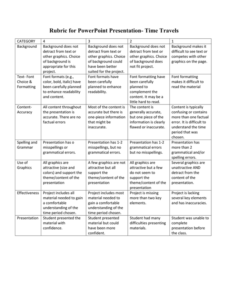
Rubric for PowerPoint Presentation- Time Travels CATEGORY Background 4 Background does not detract from text or other graphics. Choice of background is appropriate for this project. Font formats (e.g., color, bold, italic) have been carefully planned to enhance readability and content. 3 Background does not detract from text or other graphics. Choice of background could have been better suited for the project. Font formats have been carefully planned to enhance readability. ContentAccuracy All content throughout the presentation is accurate. There are no factual errors Spelling and Grammar Use of Graphics Text- Font Choice & Formatting 2 Background does not detract from text or other graphics. Choice of background does not fit project. 1 Background makes it difficult to see text or competes with other graphics on the page. Font formatting makes it difficult to read the material Most of the content is accurate but there is one-piece information that might be inaccurate. Font formatting have been carefully planned to complement the content. It may be a little hard to read. The content is generally accurate, but one piece of the information is clearly flawed or inaccurate. Presentation has o misspellings or grammatical errors. Presentation has 1-2 misspellings, but no grammatical errors. Presentation has 1-2 grammatical errors but no misspellings. All graphics are attractive (size and colors) and support the theme/content of the presentation A few graphics are not attractive but all support the theme/content of the presentation All graphics are attractive but a few do not seem to support the theme/content of the presentation Project is missing more than two key elements. Effectiveness Project includes all material needed to gain a comfortable understanding of the time period chosen. Presentation Student presented the material with confidence. Project includes most material needed to gain a comfortable understanding of the time period chosen. Student presented material but could have been more confident. Student had many difficulties presenting materials. Content is typically confusing or contains more than one factual error. It is difficult to understand the time period that was chosen. Presentation has more than 2 grammatical and/or spelling errors. Several graphics are unattractive AND detract from the content of the presentation. Project is lacking several key elements and has inaccuracies. Student was unable to complete presentation before the class.
