Composite Bar Charts Sales Income
advertisement
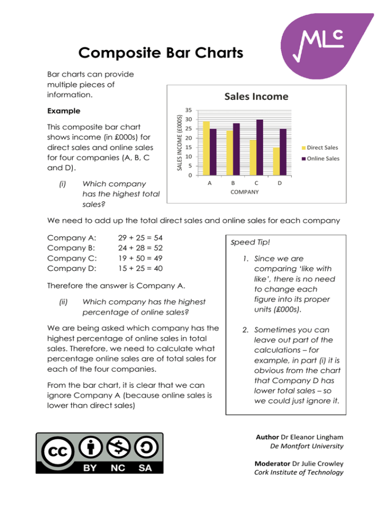
Composite Bar Charts Bar charts can provide multiple pieces of information. Example Sales Income This composite bar chart shows income (in £000s) for direct sales and online sales for four companies (A, B, C and D). SALES INCOME (£000S) 35 30 25 20 15 Direct Sales 10 Online Sales 5 0 (i) Which company has the highest total sales? A B C D COMPANY We need to add up the total direct sales and online sales for each company Company A: Company B: Company C: Company D: 29 + 25 = 54 24 + 28 = 52 19 + 50 = 49 15 + 25 = 40 Therefore the answer is Company A. (ii) Which company has the highest percentage of online sales? We are being asked which company has the highest percentage of online sales in total sales. Therefore, we need to calculate what percentage online sales are of total sales for each of the four companies. From the bar chart, it is clear that we can ignore Company A (because online sales is lower than direct sales) Speed Tip! 1. Since we are comparing ‘like with like’, there is no need to change each figure into its proper units (£000s). 2. Sometimes you can leave out part of the calculations – for example, in part (i) it is obvious from the chart that Company D has lower total sales – so we could just ignore it. Author Dr Eleanor Lingham De Montfort University Moderator Dr Julie Crowley Cork Institute of Technology Company B Company C Company D 28 / 52 x 100 = 30 / 49 x 100 = 25 / 40 x 100 = 54% 61% 63% Therefore the answer is Company D. Bar charts can be horizontal as well as vertical. Also, they can be used to show percentages or proportions. Example This bar chart shows Energy Production sources. It displays the proportion for each source (for example, in 2005, 0.38 of energy output, or 38%, was produced from coal). (i) Energy Production 2015 Output 0.21 0.32 0.4 0.07 Nuclear Coal 2005 Output 0.17 0% 0.38 20% 40% 0.41 60% 80% 0.03 100% Gas Other In 2005, total output from all fuels was 250 TWh. How much energy was produced from gas? The proportion produced from gas is 0.41, and so we calculate 0.41 x 250 = 102.5 TWh Note (ii) In 2015, energy production had increased by 8% since 2005. What was You do not need to the 2015 output from nuclear? understand everything in order to work answers out The 2015 output is 100% + 8% = 108% of the 2005 – for example, TWh stands output. Therefore the 2015 output is for ‘Terra Watt hours’ but 108% x 250 = 270 TWh you can easily answer the The nuclear proportion for 2015 is 0.21, so we questions without knowing have 0.21 x 270 = 56.7 TWh this. (iii) What was gas output in 2010? The correct answer is ‘We cannot say’ since no data for 2010 is given, nor can be implied from this chart. Author Dr Eleanor Lingham De Montfort University Moderator Dr Julie Crowley Cork Institute of Technology
