Background VLAD method
advertisement

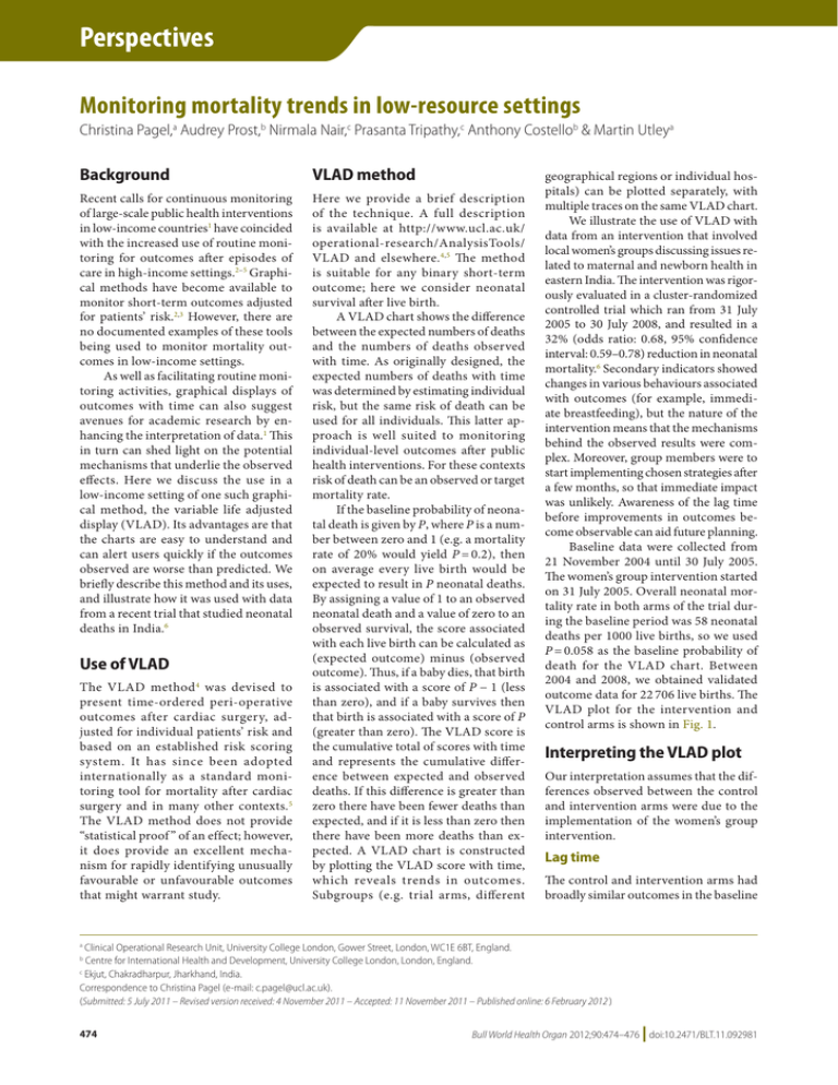
Perspectives Monitoring mortality trends in low-resource settings Christina Pagel,a Audrey Prost,b Nirmala Nair,c Prasanta Tripathy,c Anthony Costellob & Martin Utleya Background VLAD method Recent calls for continuous monitoring of large-scale public health interventions in low-income countries1 have coincided with the increased use of routine monitoring for outcomes after episodes of care in high-income settings.2–5 Graphical methods have become available to monitor short-term outcomes adjusted for patients’ risk.2,3 However, there are no documented examples of these tools being used to monitor mortality outcomes in low-income settings. As well as facilitating routine monitoring activities, graphical displays of outcomes with time can also suggest avenues for academic research by enhancing the interpretation of data.1 This in turn can shed light on the potential mechanisms that underlie the observed effects. Here we discuss the use in a low-income setting of one such graphical method, the variable life adjusted display (VLAD). Its advantages are that the charts are easy to understand and can alert users quickly if the outcomes observed are worse than predicted. We briefly describe this method and its uses, and illustrate how it was used with data from a recent trial that studied neonatal deaths in India.6 Here we provide a brief description of the technique. A full description is available at http://www.ucl.ac.uk/ operational-research/AnalysisTools/ VLAD and elsewhere. 4,5 The method is suitable for any binary short-term outcome; here we consider neonatal survival after live birth. A VLAD chart shows the difference between the expected numbers of deaths and the numbers of deaths observed with time. As originally designed, the expected numbers of deaths with time was determined by estimating individual risk, but the same risk of death can be used for all individuals. This latter approach is well suited to monitoring individual-level outcomes after public health interventions. For these contexts risk of death can be an observed or target mortality rate. If the baseline probability of neonatal death is given by P, where P is a number between zero and 1 (e.g. a mortality rate of 20% would yield P = 0.2), then on average every live birth would be expected to result in P neonatal deaths. By assigning a value of 1 to an observed neonatal death and a value of zero to an observed survival, the score associated with each live birth can be calculated as (expected outcome) minus (observed outcome). Thus, if a baby dies, that birth is associated with a score of P − 1 (less than zero), and if a baby survives then that birth is associated with a score of P (greater than zero). The VLAD score is the cumulative total of scores with time and represents the cumulative difference between expected and observed deaths. If this difference is greater than zero there have been fewer deaths than expected, and if it is less than zero then there have been more deaths than expected. A VLAD chart is constructed by plotting the VLAD score with time, which reveals trends in outcomes. Subgroups (e.g. trial arms, different Use of VLAD The VLAD method 4 was devised to present time-ordered peri-operative outcomes after cardiac surgery, adjusted for individual patients’ risk and based on an established risk scoring system. It has since been adopted internationally as a standard monitoring tool for mortality after cardiac surgery and in many other contexts.5 The VLAD method does not provide “statistical proof ” of an effect; however, it does provide an excellent mechanism for rapidly identifying unusually favourable or unfavourable outcomes that might warrant study. geographical regions or individual hospitals) can be plotted separately, with multiple traces on the same VLAD chart. We illustrate the use of VLAD with data from an intervention that involved local women’s groups discussing issues related to maternal and newborn health in eastern India. The intervention was rigorously evaluated in a cluster-randomized controlled trial which ran from 31 July 2005 to 30 July 2008, and resulted in a 32% (odds ratio: 0.68, 95% confidence interval: 0.59–0.78) reduction in neonatal mortality.6 Secondary indicators showed changes in various behaviours associated with outcomes (for example, immediate breastfeeding), but the nature of the intervention means that the mechanisms behind the observed results were complex. Moreover, group members were to start implementing chosen strategies after a few months, so that immediate impact was unlikely. Awareness of the lag time before improvements in outcomes become observable can aid future planning. Baseline data were collected from 21 November 2004 until 30 July 2005. The women’s group intervention started on 31 July 2005. Overall neonatal mortality rate in both arms of the trial during the baseline period was 58 neonatal deaths per 1000 live births, so we used P = 0.058 as the baseline probability of death for the VLAD chart. Between 2004 and 2008, we obtained validated outcome data for 22 706 live births. The VLAD plot for the intervention and control arms is shown in Fig. 1. Interpreting the VLAD plot Our interpretation assumes that the differences observed between the control and intervention arms were due to the implementation of the women’s group intervention. Lag time The control and intervention arms had broadly similar outcomes in the baseline Clinical Operational Research Unit, University College London, Gower Street, London, WC1E 6BT, England. Centre for International Health and Development, University College London, London, England. c Ekjut, Chakradharpur, Jharkhand, India. Correspondence to Christina Pagel (e-mail: c.pagel@ucl.ac.uk). (Submitted: 5 July 2011 – Revised version received: 4 November 2011 – Accepted: 11 November 2011 – Published online: 6 February 2012 ) a b 474 Bull World Health Organ 2012;90:474–476 | doi:10.2471/BLT.11.092981 Perspectives A tool for monitoring mortality Christina Pagel et al. Cumulative number of lives saved compared to baseline neonatal mortality rate of 58 per thousand Fig. 1. Variable life adjusted display plot for birth outcomes in the intervention and control arms of the Ekjut trial, India, 2004 to 2008 160 140 Control arm Intervention arm 120 100 start of trial 80 60 40 20 0 -20 -40 May 2005 November 2005 May 2006 November 2006 May 2007 November 2007 May 2008 Month / Year Note: The dashed vertical line marks the start of the trial when the women’s discussion groups were implemented in the intervention clusters. period. By summer 2005, the VLAD plot was negative for the intervention arm and positive for the control arm, indicating that the baseline mortality rate in the intervention arm was slightly higher than the baseline rate in the control arm. The women’s discussion group intervention started in July 2005 and the outcomes for the two arms were initially similar. After October 2006, the slope of the VLAD plot for the intervention arm was consistently positive, indicating that the mortality rate in the intervention arm was consistently lower than the baseline rate. This suggests that the lag time before the effects of the women’s group intervention appeared was approximately 14 months. Seasonal patterns During the first year, survival decreased in both arms during the winter (November 2005 to February 2006), and then increased during the summer of 2006. Decreases in survival were again seen in the control arm during the winters of 2006 to 2007 and 2007 to 2008, but not in the intervention arm. This suggests that the most notable effect of the women’s groups may have been to prevent deaths during the winter, a finding that suggests an avenue for further research. Baseline risk estimate It is important to note that VLAD charts are very sensitive to the risk estimates used, so it is vital to carefully consider what the baseline risk should be: too high an estimate of baseline risk will give the false impression that outcomes are very good and may engender complacency, whereas too low an estimate of baseline risk will give the converse impression that there are many more deaths than there “should” be. If outcomes improve with time, as is often the case, it is important to periodically review the baseline risk value. We also note that if there is significant loss to follow-up and the mortality rate for the population lost is significantly different from the population observed, then the VLAD chart needs to be interpreted cautiously. This is discussed in further detail in the online resources available at http://www.ucl.ac.uk/operationalresearch/AnalysisTools/VLAD. The main value of VLAD plots lies in their visual presentation of the data. We have not discussed the statistical tools that can be used with graphical monitoring, details of which can be found elsewhere.3,5 Discussion There is increased interest in monitoring health outcomes such as mortality with time, and data on births and deaths are more readily available now than just a decade ago. We describe how a graphical monitoring method Bull World Health Organ 2012;90:474–476 | doi:10.2471/BLT.11.092981 originally used for cardiac surgery outcomes can be applied to outcomes such as neonatal deaths, and illustrate this with birth outcomes from a recent trial in India. This graphical method is intended to be used together with standard statistical methods as a way to obtain complementary information that can be used to understand the impact of public health interventions. We stress that it is not intended to replace statistical analysis. That said, the analysis of VLAD charts in conjunction with local expertise and knowledge can be a valuable component of data evaluation, and can help guide programme planning and policy-making. For example, VLAD charts can be used to monitor the effectiveness of programmes to improve maternal, newborn and child health in low-resource settings. The visual display of mortality information is a powerful way to communicate results to public health managers, community leaders and the pubic. Health facilities can also use this tool to monitor birth outcomes as part of perinatal audits. The process for producing a basic VLAD chart is simple, requiring only straightforward data manipulation skills. However, it is important to bear in mind the caveats discussed above when interpreting these charts, particularly the importance of periodically reviewing the baseline risk estimates. An application for Excel 2003® (Microsoft Corporation) that can be used to produce VLAD charts with an academic licence is available free from the corresponding author. ■ Acknowledgements We thank Professor Steve Gallivan for testing the Excel® (Microsoft Corporation) VLAD software and for helpful comments. Funding: Ekjut and the Centre for International Health and Development received funding from The Health Foundation, The Wellcome Trust and the United Kingdom Department for International Development (DFID). Christina Pagel’s time on this project was funded by a discretionary contribution from the Dean of the Institute of Child Health at University College London. Competing interests: None declared. 475 Perspectives A tool for monitoring mortality Christina Pagel et al. References 1. Victora CG, Black RE, Boerma JT, Bryce J. Measuring impact in the Millennium Development Goal era and beyond: a new approach to large-scale effectiveness evaluations. Lancet 2011;377:85–95. doi:10.1016/ S0140-6736(10)60810-0 PMID:20619886 2. Smith IR, Rivers JT, Mengersen KL, Cameron J. Performance monitoring in interventional cardiology: application of statistical process control to a single-site database. EuroIntervention 2011;6:955–62. doi:10.4244/ EIJV6I8A166 PMID:21330243 3. Sherlaw-Johnson C, Morton A, Robinson MB, Hall A. Real-time monitoring of coronary care mortality: a comparison and combination of two monitoring tools. Int J Cardiol 2005;100:301–7. doi:10.1016/j. ijcard.2004.12.009 PMID:15823639 476 4. Lovegrove J, Valencia O, Treasure T, Sherlaw-Johnson C, Gallivan S. Monitoring the results of cardiac surgery by variable life-adjusted display. Lancet 1997;350:1128–30. doi:10.1016/S0140-6736(97)06507-0 PMID:9343500 5. Clinical Practice Improvement Centre. VLADs for dummies. Australia: Wiley Publishing; 2008. 6. Tripathy P, Nair N, Barnett S, Mahapatra R, Borghi J, Rath S et al. Effect of a participatory intervention with women’s groups on birth outcomes and maternal depression in Jharkhand and Orissa, India: a cluster-randomised controlled trial. Lancet 2010;375:1182–92. doi:10.1016/S01406736(09)62042-0 PMID:20207411 Bull World Health Organ 2012;90:474–476 | doi:10.2471/BLT.11.092981


