Representing and Presenting Data
advertisement

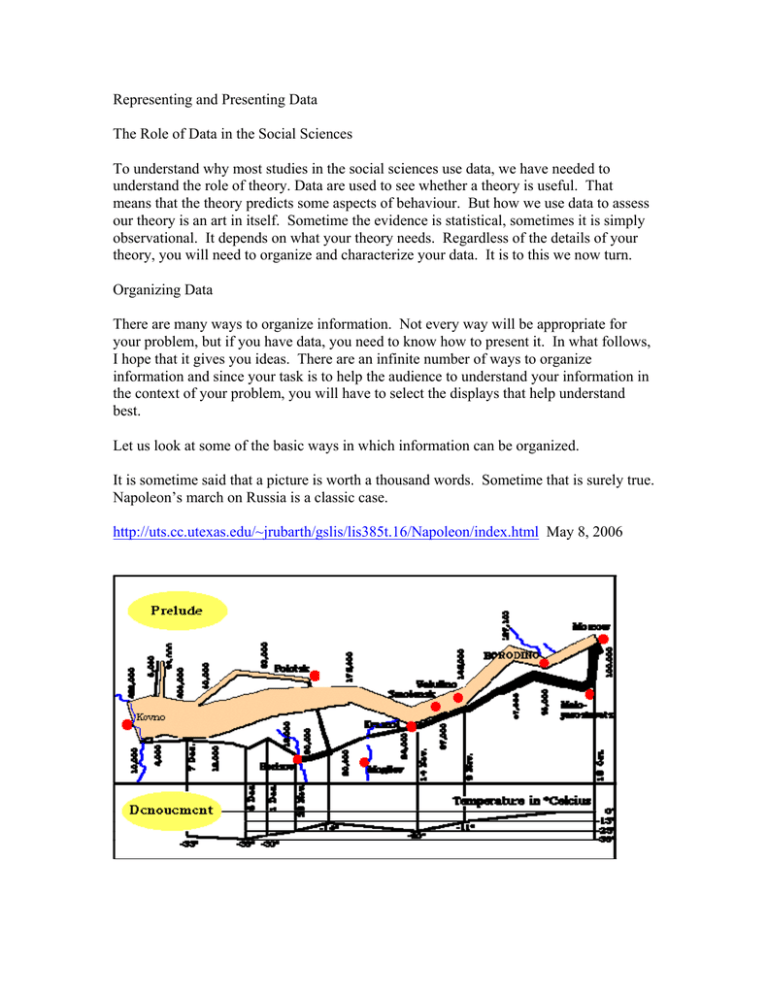
Representing and Presenting Data The Role of Data in the Social Sciences To understand why most studies in the social sciences use data, we have needed to understand the role of theory. Data are used to see whether a theory is useful. That means that the theory predicts some aspects of behaviour. But how we use data to assess our theory is an art in itself. Sometime the evidence is statistical, sometimes it is simply observational. It depends on what your theory needs. Regardless of the details of your theory, you will need to organize and characterize your data. It is to this we now turn. Organizing Data There are many ways to organize information. Not every way will be appropriate for your problem, but if you have data, you need to know how to present it. In what follows, I hope that it gives you ideas. There are an infinite number of ways to organize information and since your task is to help the audience to understand your information in the context of your problem, you will have to select the displays that help understand best. Let us look at some of the basic ways in which information can be organized. It is sometime said that a picture is worth a thousand words. Sometime that is surely true. Napoleon’s march on Russia is a classic case. http://uts.cc.utexas.edu/~jrubarth/gslis/lis385t.16/Napoleon/index.html May 8, 2006 “The map, based on the 1869 chart by Minard, graphically illustrates (both literally and figuratively) how the size of the French army dwindled during the march into Russia and was reduced to almost nothing on the wretched rout back into Poland. The map can be read in several ways. The size of the peach colored bar indicates the relative strength of the French army during the march on Moscow. The black bar shows the dwindling French army during the retreat. In the lower portion of the map, the temperature in degrees Celcius is shown, along with dates during the retreat.” The picture in this case gives a highly informative characterization of the way in which Napoleon’s army was devastated from its beginning as a massive body of men in xxxx to its final return a year later as a devastated trickle. Another basic way is a table. Although basic, a table must be organized. The dimensions of the table must convey useful information. Suppose we believe that crime is universal so that the crime rate should be the same in every country. Obviously, one thing we might want to look at is whether in fact crime rates are the same in different countries. One way to see this is in a table: Year 1972 1973 1974 1975 1976 1977 1978 1979 1980 1981 1982 1983 1984 1985 1986 1987 1988 1989 1990 1991 1992 1993 1994 1995 Australia 948 880.4 880.9 890.9 910.2 958.7 1075 1137.2 1260.7 1367.8 1496.3 1706.5 1782.2 1730.1 1680.6 1888.7 1901.1 1974.1 2009.9 2146.5 2041.1 2160.7 2130.5 2131.9 Canada 874.6 896.3 1039.6 1143.2 1161.1 1162 1185.9 1252.3 1462.3 1518.2 1501.5 1456 1421 1407 1440 1421 1386 1328 1490.9 1674.8 1640.4 1465.7 1326.2 1321 Burglary: Rate per 100,000 of population New England Zealand Wales 895.5 894.8 837.5 799.9 952.6 984.2 1126.6 1061.6 1194.1 1048.9 1386.6 1229.7 1525.6 1151.7 1560.7 1118 1721.2 1255.9 1855.3 1448.3 2114.3 1623.8 2316.1 1629.7 2251.9 1793 2580.3 1736.9 2385.8 1860.3 2356.3 1797.3 2349.7 1623.2 2372.1 1633.5 2635.1 1991 2745.5 2040 2967.7 2659.7 2906.4 2662.5 2450.7 2452 2374.6 2392.1 United States 1140.8 1222.5 1437.7 1525.9 1439.4 1410.9 1423.7 1499.1 1668.2 1632.1 1475.2 1337.7 1263.7 1287.3 1344.6 1329.6 1309.2 1276.3 1235.9 1252 1168.2 1099.2 1041.8 987.6 Germany 1472.1 1448.1 1581 1689.4 1716.3 1844.6 1972.4 1915.8 2068.7 2299.3 2512.7 2597.1 2457.3 2523.2 2699.9 2829.4 2632.9 2450.3 2464.8 2337 2966.1 3144.1 2936 2862 Japan 274.3 250.5 247.7 255.3 254.4 249.3 251 247.8 244.1 228 211.4 190.7 184.3 183.8 183.7 204.4 198.1 Source: XXXXX Now on the face of it, these crime rates differ. At this point we do not have to get into sophisticated definitions of what do we mean by differ although you can see that this might be an issue in a statistical sense. The problem that I have with the table is that while it may illustrate the point, there is a lot of information in the table. Perhaps there is too much information. It is hard to see whether countries differ by very much. In this case, perhaps a picture would help: BURGLARY IN SEVEN COUNTRIES 3500 3000 2500 Australia Canada Zealand 2000 Wales States 1500 Germany Japan 1000 500 0 1970 1975 1980 1985 1990 1995 2000 For me, this is a much better way to represent the data. Why? From the picture it is much easier to see “what distinguishes the countries”. Notice that Germany is generally higher than the other countries. It is easy to see that Japan is much lower. We can also more easily observe where other countries fit in. But this is not such a good picture. The axes are not properly labeled. The years are pretty clear, but we should have an indicator on the vertical axis that tells us what the units of measurement are. Consequently, a better figure would look like: BURGLARY IN SEVEN COUNTRIES 3500 3000 Rate per 100,000 of population 2500 Australia Canada Zealand 2000 Wales States 1500 Germany Japan 1000 500 0 1970 1975 1980 1985 1990 1995 2000 What else can we do to characterize the information in the table? One of the things that we can do is to characterize the averages, again in a table average high low trend Burglary per 100,000 of population: 1972-1995 New England United Australia Canada Zealand Wales States 1545 1332 1994 1620 1325 2161 1675 2968 2663 1668 880 875 838 800 988 0.057 0.023 0.075 0.076 -0.006 Germany 2309 3144 1448 0.043 *73-94 Japan 227 274 184 -0.017 There are many other ways to characterize information in pictures and graphs. For example we may want to represent all the crime that takes place in Canada for a particular year in a pie graph: Crimes Shares in Canada 2001 ATTEMPTED MURDER 0% FEDERAL STATUTES 5% MANSLAUGHTER 0% MURDER ROBBERY 0% 8% OTHER CRIMINAL CODE 28% OFFENSIVE WEAPONS 1% HAVE STOLEN FRAUDS GOODS 3% 1% GAMING AND PROSTITUTION BETTING 0% 1% OTHER VIOLENT CRIMES 10% BREAKING AND ENTERING 11% THEFT, MOTOR VEHICLE 6% THEFT, OVER AND UNDER 26% This leads to a pretty clear representation of the information and gives a sense of which crimes are relatively important in terms of numbers without seeing the actual values. Unlike previous data it represents a cross-section at a moment in time whereas the earlier figures referred to time series: values over time. Suppose we know the total number of crimes and the population. We might be interested in knowing how likely it is that an “average” person will be crime free over his or her lifetime. If there are 30 million Canadians and 3 million crimes per year, then a person has roughly a one in ten chance of being “exposed” to a crime each year. This means that you have a nine in ten chance of not being a victim each year. In two years, you have a probability of not being victimized of (9/10)x(9/10)=81/100 chance of not being victimized. In three years (9/10)x(9/10)(9/10), etc. Or, in a figure: 90 Year Likelihood of Being "Crim e Free" : 2001 data All Criminal Code CRIMES OF VIOLENCE 1.2 MURDER ATTEMPTED MURDER MANSLAUGHTER 1 Probability of being crime free ROBBERY OTHER VIOLENT CRIMES 0.8 PROPERTY CRIMES BREAKING AND ENTERING 0.6 THEFT, MOTOR VEHICLE THEFT, OVER AND UNDER HAVE STOLEN GOODS 0.4 FRAUDS OTHER CRIMES 0.2 PROSTITUTION GAMING AND BETTING OFFENSIVE WEAPONS 0 0 20 40 60 Years 80 100 OTHER CRIMINAL CODE FEDERAL STATUTES Lifetime Exposure to Crime Your homework: Choose some data that you believe bears on your topic and devise some graphs or tables to represent it. What implicit theory lies behind your presentation?


