Review
advertisement
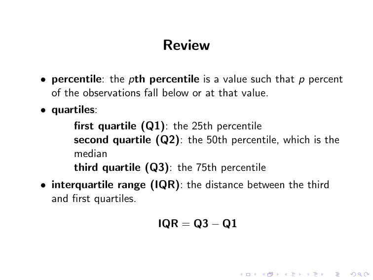
Review • percentile: the pth percentile is a value such that p percent of the observations fall below or at that value. • quartiles: first quartile (Q1): the 25th percentile second quartile (Q2): the 50th percentile, which is the median third quartile (Q3): the 75th percentile • interquartile range (IQR): the distance between the third and first quartiles. IQR = Q3 − Q1 • The 1.5× IQR Criterion for Identifying Potential Outliers An observation is a potential outlier if it falls more than 1.5× IQR below the first quartile or more than 1.5× IQR above the third quartile. • The Five-Number Summary of Positions minimum value, first quartile Q1, median, third quartile Q3, and the maximum value. • box plot: • An observation in a bell-shaped distribution is regarded as a potential outlier if it falls more than three standard deviations from the mean. • z-score: the z-score for an observation is the number of standard deviations that it falls from the mean. x= observation − mean standard deviation Guidelines For Constructing Effective Graphs • Label both axes and provide a heading to make clear what the graph is intended to portray. • To help our eyes visually compare relative sizes accurately, the vertical axis should usually start at 0. • Be cautious in using figures, such as people, in place of the usual bars or points. It can make a graph more attractive, but it is easy to get the relative percentages that the figures represent incorrect. • It can be difficult to portray more than one group on a single graph when the variable values differ greatly. Consider instead using separate graphs, or plotting relative sizes such as ratios or percentages.
