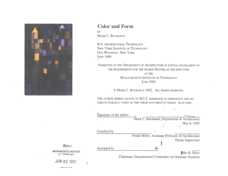
Color and Form
BY
MARK
C.
BUCHANAN
B.S. ARCHIrECTURAL
TECHNOLOGY
NEW YORK INSTITUTE OF TECHNOLOGY
OLD WESTBURY, NEW YORK
JUNE 1989
SUBMITTED TO THE DEPARTMENT OF ARCHITECTURE IN PARTIAL FULFILLMENT OF
THE REQUIREMENTS FOR THE DEGREE MASTERQF ARCHITECTURE
AT THE
MASSACHUSETTS INSTITUTE OF TECHNOLOGY
JUNE
©
MARK
C.
BUCHANAN
1992
1992.
ALL RIGHTS RESERVED.
THE AUTHOR HEREBY GRANTS TO M.I.T. PERMISSION TO REPRODUCE AND DISTRIBUTE PUBLICLY COPIES OF THIS THESIS DOCUMENT IN WHOLE OR IN PART.
Signature of the author
Mark C. Buchanan, Department of Architecture
May 8,1992
Certified by
Frank Miller, Assistait Priofess'Or of Architecture
Thesis Supervisor
Accepted by
MASSACHUSETTS INSTITUTE
OF TECHNOLOGY
JUN 0 5 1992
Phn R. Myer
Chairman, Departmental Committee on Graduate Students
1
Color and Form
by
Mark C. Buchanan
Submitted to the Department of Architecture
on May 8, 1992
In partial fulfillment of the requirements for the
Degree of Master of Architecture
Abstract
I have always been interested in painting,
particularly in the use of color to describe space, time
and emotion. This thesis integrates painterly
concepts in the making of architecture. Some issues
explored include color complementarity, material
color, and the expressive use of color in the design
process. By thinking of color as I design I endeavor
to enhance the habitable experience and enable color
to actively generate the creation of architecture.
The vehicle for color study is the design of a
pedestrian bridge in Tacoma Washington. The focus
is to produce several schemes exploring color and
material and its sequencing along the bridge. The
programmatic scope is constrained to maximize
issues of color and form making.
The design used various media to visualize
the design and explore two color systems. Additive
color systems lead to painting, pastels, colored
pencil, and plaster casting. The computer facilitated
image processing, geometrical modelling, and color/
texture mapping in a "subtractive" color system.
Thesis Advisor: Frank Miller
Title: Professor of Architecture
Painterly - characteristic of a
painter or the art of painting,
esp. in reference to tonal and
color relationships.
Random House College
Dictionarv,1982
Acknowledgments
To my mentors...
Departure of ships, Paul Klee.
"When all is said and done, I prefer those who exploit me to those who follow me.
The former have something to teach me."
Georges Braque
Contents
A bstract..........................................................................................................................................................................................
3
Acknowledgments....................................................................................................................................................................................................................5
Foreword ........................................................................................................................................................................................
Introduction ....................................................................................................................................................................................
8
8
1. W a sC l r .................................................................................
10
11
.......................
Caveats: (Above all do no harm .........................
...................................
1. 2 Color'suses........................................................................................
.....................
....................................
............
..........
.............
..............................................
................................
11
.............
1.2.1 Semantic/ symbolic......................................................................................................
..............................................................................................
1.2.2 Color naming ...............................................................................................................................................................................................................
1.23 Classification................................................................................................................................................................................................................13
12.4 Search...........................................................................................................................................................................................................................
12.5 Quantitative.................................................................................................................................................................................................................
12
12
13
14
14
1.2.6 Ordinal .........................................................................................................
14
1.2. r in l............................................................................................................................................................................................14
1.2.8 Expressiveness...........................................................................................................
...............................................................................................
1.3 ColorSystems...................................
....
.
.
.
.
.
.
.
.
.
.
15
.
13.1 Color as Pigment ...................................................................................................................................................................................................
13.2 Color as Light ..............................................................................................................................................................................................................
133 Combining Pigment and Light color systems ..............................................................................................................................................................
16
17
18
2.0 Relatng Color and Architecture.................. ...
20
.....
............................
3.0 The Project.............................................................................................................................................................................26
3.1 Site Descriptionand ProgrammaticConstrants
3.2
Bridge Types:
Pr.g.ma..........i
.
..........
.
................. ....
3.3 Schemes .....................
..........................................
......
..
....
...
..
.............. . .. ..........
.
...
...
-2
...........................
.... ... ..................
...........
............
........
..............................
...........
.. .. .............
32
33.1 Scheme One ..................................................................................................................................................................................................................
3.3.2 Scheme Two: ..............................................................................................................
.............................................................................................
333 Scheme Three:..........................................................................................................-----.........................................................................................
4.0 "ColorDistinctions"...........
.
.
.
.
.
.
.
.
.
.
.
.
4.0. "Choo nD is in
lor
t
30
..
33
46
55
.6
ei raons.......................................................................................
60
. ...
........................................................................................................................................................
4.1.
4.1.3 Systematic/structuraldeployment of color...........
.....................
4.1.4 Color inherent in a material ....................................................................................
................................................................................................
4.1.5 Color theory ................................................................................................................
.......................................................
.....................................
6
6
63
63
...................... ..........64
4.2 Interpretationsand autonomous systems: ..............................................................................................................
66
...................................
................................................................................
....
Variation
Parametric
4.3
73
..........................-................................................................
References ...................................
76
....
Conclusion ......................................................................................................
Bibliography----------------------------------------------------------------------------------------------------------------------------------------77
Illustrations and Source
78
Introduction
Foreword
"...all
"...In studying more closely the spectrum of
experience the physical world offers us, the
study of color provides compelling insights and
discoveries. To study color, in the broadest
sense, is to study how we perceive the physical
world through our senses."
- Deborah Huff
New York Institute of Technology, 1986.
true creation is a thing born out of nothing."
- Paul Klee
Every day we are surrounded by color and light and yet we often take the
perceptual experience for granted. In doing so we limit our understanding of the environment. To clarify one's understanding of color there must be a recognition of conventional biases towards color and its "appropriate" use. The ability to look outside of
convention stems from a willingness to acknowledge that we don't know everything
about color and inquire into new uses for color in architecture. What I ask of myself and
the reader is a willingness to suspend our personal tastes and begin to look at color
through beginner's eyes.
Introduction
This thesis is an attempt to relate concepts found in painting and architecture.
What interests me is the way painters see the colors in their environment. Like the
musician who hears music when reading the score artists see color distinctly different
than architects. My intention is to use this thesis as a vehicle for describing a painterly
notion of color and landscape and formulating a vocabulary for color as an architectural
design tool.
Borrowing from: modern landscape painters, the cubists, Paul Klee and Kepes
(et al), I endeavor to communicate how color concept can enhance the experience of
architecture. Distinguishing what is communicable about the way color is seen by the
artist is difficult. Looking outside of interpretation I identified what is autonomous about
color in order to illustrate the poetics of an artist's vision. Through the comparison of
autonomous and interpretive color applications I recognize my own biases facilitating an
explicit language for describing color in my designs.
Recognizing the norms that govern color in architecture enables the informed
selection of colors in the design process. While referencing art, architecture, and nature;
I clarified color issues in my design through a series of explorations about color and
material.
Chapter One
1.0 What is color?
-"color" means colors-
'We now assert, extraordinary as it may in some
degree appear, that the eye sees no form, in as
much a light, shade , and color constitute that
which is to our vision distinguishes object from
object and parts of objects from one another.
From these three, light, shade, and color, we
construct the visual world."
- Goethe, Theory of Colors
"Color- isprimarily quality; it issecondarily
weight, for it has a brightness as well as a hue.
Thirdly, it isalso measure, for in addition to
these other values ithas limits, size, extentthese being its measurable characteristics."
- Paul Klee, Diaries, p. 171
Color is reflected light... How we perceive a color ultimately depends on the
context. Color is relative to its surroundings. Therefore when looking at color it is
important to recognize the color itself and the color relative to its context. Color and
context include:
1.Color itself:
2. Context:
a. Quality of light
b. Pigmentation
c. Texture
d. Size
a. Surrounding elements and their light /
pigment / texture / size
b. Proximate and proportional relationships
between each material (object and context)
In order to design a message that is distinct, reliable and gets the attention of the
observer the designer must identify both the idea and the hierarchy of the information.
By grading the efficacy of various means communicating with color I have endeavored
to establish design methodologies appropriate to the applications. This thesis applies the
methodologies in various stages of the design process and samples from a range of
possible approaches. More often than not the design incorporates several readings.
Some of the tasks are: conveying semantic and symbolic information, naming,
classifying, searching, quantifying, ordering (structuring space), making prominent and
pre-attentive, and relaying expressiveness.
The next few pages are a listing and brief description of how color impacts the
viewer's perception of a message. This is a generic overview to introduce the reader to
some of the concepts described later.
"What is Color?"
1.1 Caveats: (Above all do no harm.)
While in most cases color can work in
parallel with other message types, there are some
interdependencies:
Interestingly, incorrect color does not hinder
recognition, but many objects have expected colors.
Our visual system is susceptible to a
variety of messages:
Positional
Facial: Texture, contrast of value,
contrast of hue, translucency.
Silhouette: orientation, size, shape
Dynamics: index, path, extent, speed
A large number of colors will increase
complexity and decrease the performance of tasks,
therefore keep it simple.
As the complexity of forms increases; the
amount of color variations, particularly the amount of
hues tends to decrease (if legibility is desired). In
other words there is a reciprocity between color and
form. As color increases the form is more tame and
as form increases in complexity there is more room
for color diversity.
Color has relatively low spatial, temporal,
and positional resolution. This can impact legibility
and our ability to judge size and shape.
Other: focus, stereo
The Human Visual System
We process spectral information through two
distinct pathways: chromatic and achromatic.
These interacting factors can be adjusted to
suit the considerations of legibility and
emphasis. Sustained legibili
t large
bodies of text is accomplished
combination of colors whose achromatic
contrast is large and whose chromatic energy
is of low to moderate level.
Za
legibility
Color is primarily foveal and photopic.
Some people have color vision deficiencies
(approximately ten percent of the male population).
(The next eight subtopics are derived from a hand-out
for; 4.999 Issues of Color in Media Technology, Prof.
Walter Bender and Paul Hubel)
value contrast
1. 2 Color's uses
1.2.1 Semantic/ symbolic
Color can be used to both represent reality and as a symbol.
Yellow:
ripe (bananas)
yield
"yellow pages" (telephone book)
The Human Visual System
Conversely, color is more colorful with
less contrast of value. When achromatic
contrast is held between ow to moderate
levels, high chromatic energy becomes visible.
This energy is precisely what can be exploited
for purposes of accenting. Highlighting can
take the form of warning signals, attention
grabbing devices, billboards, all of various
evels of emphasis.
highlight
low achromatic
contrast
high achromatic
contrast
chromatic contrast
Red:
stop
ripe (apple, tomato)
Green:
spoiled meat
unripe (banana, tomato)
go
Blue:
cold
sky
1.2.2 Color naming
Color is used as a label
Berlin and Kay researched various color
terms and found examples of color names that
translated across cultures. These color names are:
monolexemic (single word, not a compound)
first learned
translatable in various languages
generic (e.g. not semantic)
conventional (there is a form of agreement
about their labeling)
The Human Visual System
We have less spatial and temporal sensitivity
to chromatic than achromatic stimuli.
1.2.3 Classification
Color is capable of grouping objects.
Boynton's 11 colors that are almost never
confused:
White, Gray, Black
Red, Green, Yellow, Blue
Pink, Brown, Orange, Purple
contrast sensitivity
achromatic
chromatic
(note: most of these colors are Red hue variations)
spatial frequency
1.2.4 Search
Color is a powerful tool in searching.
For example, if I were to show you a picture of one hundred rectangle and one
circle and told you to find the circle you would have to look at all the objects until you
found the circle. However if the circle was red and the rectangles green then the task of
finding the circle is simple and quick.
4. Search
Color is a powerful tool in searching.
(from Mackinlay)
(from Mackinlay)
1.2.5 Quantitative
Color can be used to measure.
(Psuedo color is an example)
More accurate
position
hue
texture
value
saturation
shape
orientation
size
Less accurate
(from Mackinlay)
1.2.6 Ordinal
i
Color can be used to sort and order
This is similar to Search however ordinal identification allows for a greater
range of value and less hue range. A change in value allows for a grouping
of objects to a common hue and yet remain distinctly individual within a
system of hues.
1.2.7 Prominence/ pre-attentive
Color can be used to get our attention. There is a time for whispering and a
time for shouting.
(from Mollitor)
5. Quantitative
6. Ordinal
Color can be used to measure.
Color can 6 e used to sort or order.
(from Mackinlay)
(from Mackinlay)
1.2.8 Expressiveness
Color can convey an expressive quality.
More accurate
position
.orientation
size
This is the main focus of the thesis work.
More information and specifics is discussed in later
chapters.
value
saturation
hue
The Two Dimensions of Color: Alignment and
Amplification
The effect of a color's message is determined by the
color's relation to the surround. The specification of
this color to color relationship is key to effective
communication.
By using computers and various photo montage and
collage techniques I address this issue of context and
color relativity.
Less accurate
Quantitative
More accurate
position
i
value
saturation
hue
texture
orientation
size
Less accurate
Ordinal
7. Prominence/pre-attentive
8. Expressiveness
Color can be used to get to our attention.
There are times for whispering and times for
shouting.
Color can convay on expressive quality.
(from Mollitor)
More accurate
loud
flicker
wiggle
rotate
fade
size
value
quiet
~..-~
hue
Less accurate
Prominence/pre-attentive
Expressiveness
wild
1.3 Color Systems
1.3.1 Color as Pigment
Pigmented color is created from minerals and synthetics. This color system
uses red, yellow, and blue as the primary colors. Complementary pairs are derived from
combining a secondary color and its primary component. Simply stated, Red is paired
with green (green =blue+yellow). Note that a primary color's complement is always the
component of the two other primaries:
Primaries:
RED, YELLOW, BLUE
Secondaries:
Green, Violet, Orange
Complementary pairs:
RED
Green
YELLOW
Violet
BLUE
Orange
HUE
is the name of a color, such as "red".
VALUE
is the amount of tinting, from white to black, added to the
pigment.
CHROMA
is the saturation or strength of the pigment -the amount.
The figure to the left is a Munsell color atlas. Munsell notated most of the possible
pigmented colors in a three dimensional globe. The north-south axis denotes the value of
a color (white on top and black at the southern pole). The distance from the center of the
globe to the surface expresses the chroma of a hue (the atlas' core is low chroma, surface
is high). The Munsell color notation is considered a standard for color identification.
1.3.2 Color as Light
Color is also light. As the physicists would
describe; all colors come from white light and the
individual hues (wavelengths) can be seen in white
light by splitting the wavelengths through a diffuser
(a prism). The diagram on the right displays the
mixing of colored light. Red, Green, and Blue are the
primaries in this system. Combinations of the
primaries produce the secondary hues of cyan,
magenta, and yellow. Note that all three primaries
when combined produce white light.
The CIE Color Standards are the industry
benchmark by which all light is calibrated and
notated.
1.3.3 Combining Pigment and Light color systems
I explored the possibilities of combining two systems of color mixing. The
initial thesis work is primarily using pigmented mediums in painting, pastels, and
colored and achromatic sketches. As the design developed, I incorporated computer
geometrical modelling. Color mixing in the computer involves thinking of color as light.
The light mixing system can be thought of as a subtractive mixing. That is; red plus blue
does not equal violet but rather magenta and red plus green equals yellow.
True integration of both color systems in the design occurs in the placement of
my pigmented studies into the computer enviromnent. By scanning in slides and
flatwork I developed several "palettes" that were originally created with pigments.
These "palettes" influenced the creation of rendering materials for image processing.
The process then goes full circle when I print the computer images using a color
postscript printer (pigmented thermal wax).
Matching a pigment color to a light color and then matching screen color to
printed output was a challenge. In some cases the color remained consistent, in others
the output was less desirable.
....
....
.....
2.0 Relating Color and Architecture
What separates the understanding of color in painting and architecture is the
fundamental difference between static and transient color perception. The artist Robert
Slutzsky, Professor of Architecture at The Cooper-Union explains:
"Art does not reproduce the visible, but makes
visible."
- Paul Klee, Paul Klee and the Bauhaus
"The subject: A lemon beside an orange is no
longer a lemon, the orange no longer an orange;
they have become fruit. Mathematicians follow
this law. So do we."
- Georges Braque
Surface and concealment, illumination and opacity, in the
physical and metaphysical sense have always been the elemental resonating forces of painting and architecture. Oscillating
between quantifiable entities and ineffable presences, both
mediums employ color. ...In painting, the factive plane supporting
a pigmented surface yields to fictive 'content.' Its pulse is
measured by the intensity of this generic contradiction between
'actual' and 'virtual' space. Chroma narrates not only its own
process of coming to presence, but that of referential illusion too.
But ifpainting is ultimately not only about itself, it nevertheless
takes root in color and surface. Perceived ideally in optimum
light, actual space, and the absence of distraction it is an affair
between a flat object laden with emergent imageries and a
willing receptor dedicated to complete contemplation. Here color
maintains its permanence i.e.., the color red is consistently read,
given, of course, that its redness is psychically defined by its
larger configurational contexts.
Simply stated, painting is ultimately responsible to its own canvas. The
viewer's relationship to the space created on the canvas is physically seperated and the
focus point static. The context (the canvas) is controled by the artist and the colors
remain true to the painter's vision. Interaction of colors, is manageable and their outcome predictable. As the painting becomes larger (greater than human height) the
possibility to percieve one's self in the painted space increases. This is evident in large
paintings and particularly in murals. Also, it is important to recognize that the perception of twenty inches of blue is very different from twenty feet of blue. Our perception is
always relative to the context (of a view).
In architecture the viewer is in the context
and the interaction of colors is relative to the viewer's
perspective. Architecture offers the third dimension
for exploring color relationships and the impact of
changing loci. The speed with which the viewer
moves grately impacts the perception of color. For
example; if one were to stare at a yellow and purple
vertically striped wall at a standstill the individual
color recognition would be high. However, moving
at ten miles per hour a thinly striped wall would
appear grey. This is due to the optical mixing of two
colors brought on by movement. (For more information about optical mixing and after image effects refer
to Lois Swirnoff in Dimensional Color),
Robert Slutzsky, on architecture:
Architecture reverses the statics
of this ideal object-receptor
relationship. There is little in the
way of 'ideal' view, for its
receptor is mobile and usually
motivated by extra-pictorial
intentions. Structured not only
for visual perception but other
perceptions as well, architecture
becomes the unavoidable victim
of those changing forces that
mark its presence, subject to
the fickleness of nature and the
planned and random use of its
participants. At the same time,
when not intensifying architectural theatricies, color aids and
On Language:
"Perception involves more than what meets the eye: it involves processing and organization of recorded data. When we name an object, we
actually name a concept: such words as 'octahedron', 'collage', 'tessellation', 'dome'each designate a wide variety of objects sharing certain
characteristics. When we devise ways of transforming a octahedron, or
determine whether a given shape will tessellate the plane, we make use of
these characteristics which constitute the grammar of structure."
- Arthur L. Loeb
abets the more mundane functions that constitutes the total
architectural experience. It promotes the viewer-user's active
response, enhancing the legibility of volumetric and planar
configurations, architecture being more dependent on drawing
(disegno) than color. But even in its relatively achromatic state,
built form receives and plays with color in an ambient way,
reflecting those sources of illumination that happen to be. Its
existence is thus never entirely 'colorless'; 'color' always appears.
Robert Slutzsky, "Painting,Achitecture... Color"
Unlike painting, architecture must remain accountable for the habitable experience. The responsibility to maintain a reality keeps architecture in a dialogue between
meaning and physicality. Painting is not bound by social norms of appropriate color
selection. "Yet architecture shares with painting color's other propensities, particularly
its capacity to serve as a conceptual tool for structuring space (R. Slutzsky).'
There is an omission in the way architects think of color and its use. Many
architects use color as a conceptual coding and always secondary in the design process.
The issue here is that color can be integral in the design process and infonn the making
of space. Only a few architects use color as a tool for structuring space and conveying
meaning (more later). My question is; "why if architects are professional about form are
they not professional about color?" Like two sides of a coin, form and color are integral
components that shape perception. This thesis uses various color concepts as a system or
design tool for making architecture.
My process for developing a vocabulary for
intelligently communicating color and form is three
fold:
The first step is to catalog various references
(1)
into specific approaches for using color. By naming
the objects and constantly updating their relationships
within a vocabulary (system) I am identifying the
concepts and creating distinctions that enhance my
color communication. - See Arthur L. Loeb quote.
(2)
Secondly, I identify what is interpretive
color use from that which is outside of interpretation.
Specifically, identifying color descriptors that are
subjective or semantic (associative- laden with
meaning) from descriptors that are more generic.
One of the reasons for doing this identification is to
be rigorous and specific in the communication of the
interaction of color. For example, when associating
yellow with ripe bananas there is a large tolerance for
variation in hue, value, and chroma. A banana can
appear yellow ("ripe" -association) yet be greenish or
brownish when next to a lemon. However when I
describe the banana's color as a specific hue, value,
and chroma the room for interpretation is greatly
reduced. This is helpful when clear communication
is desired (note: sometimes it is desirable to be
ambiguous).
Thirdly, I identify conventional associations of specific colors I chose to use in
(3)
the design of the bridge and my personal associations to the same palette. This process is
in endeavor to be accountable for a conventional perception of color in the habitable
experience while exploring an expressive color palette that I like.
:v~
4m.
I4
Theo van Doesburg
"The new architecture permits colour to act
organically as a direct means of expressing its
relations within space and time. The state of
balance of organic relations is rendered visible
solely through the medium of colour. The task
of the modern painter consists in creating with
the aid of colour a harmonious whole in the new
four-dimensional space-time-field - and not a
surface in two dimensions. Colour (and the
colour-shy must try to understand this) is not a
decorative part of architecture, but its organic
means of expression." (1924)
Chapter Three
3.0 The Project
3.1 Site Description and Programmatic Constraints
I chose to design a bridge as a vehicle for exploring color issues. The site is in
Tacoma Washington spanning across the Thea Foss waterway connecting downtown and
the "tide flats" -Tacoma's industrial area. The reason for a bridge is because of its
realtively simple program and due to its length, it enables me to design color and form at
a range of sizes (human scale to vehicular experience). The intention is to focus on color
and incorporate color concept in the design process. This is evident in the following
pages of design documntation.
Site Specifics: The Thea Foss Waterway is three and one half miles of continuous
shoreline adjacent to Commencement Bay and Tacoma's Central Business District
(CBD). Downtown is eighty feet above sea level and the opposite bank is approximately
ten feet above high tide. Tacoma has conducted studies and submitted a redevelopment
plan to encourage public and private growth and enhance waterway activities.
At the beginning of Thesis I was set on spending considerable time
investigating architectural issues such as; the relationship of the bridge to the access
along the waterway and the possibility of habitation on the bridge. These issues among
others were not addressed. Instead I chose to concentrate on creating design mthodolgies
for including color in my design process.
The project
Albers Mill
Sit 509 fl,,8.
Was
N.~~Yshi.on
Stale Ilitorical
btw Shophlst.-.j.
-
. $),
'
7
0
o'6
~ Wletut
V
-4.
Vj!IJ!
"AA)~
~
ll
Ihtu0.etc
oblrIa
'iP~pdp/ejog
___A
-
~
oun 1rig,
....
~
~
tj :to
A,1,1k
vd
;
';I
I-lerL Ww
Osoo
rm
lv
Srt Di
Un7o
J
Std
~ ,tID~l.
3.2 Bridge
Types:
uwfAllW<A(
TI
Pq
;77
0D
_
Li LLE
a
L""-
r~a
e'.
an
a
s
moTW
I r te
r
e
te
ten-
r
f'sJ
is
.repe,
,"
'o
e
b-mco
dediy
st
ess
teI2VI
exi~
-r
cd'
'teesis
alei tte Erags
NCEOny
a~v
Weis
ng
r
.re
cem
jss
ex-r
aI
sr-
ig--.
su d
n-g;
".mrs
rdCag
-,
far
.
"
'-
';A
y s
b'
1 ..
tngJ~e
but
.
re
..
Se
h- tesaeude,
atc3
.
asWei
O,9
er
--
.Me
1r
unnenuLp-
-- --
L II~
~..
-
'-
~,
4.
Is
~-
Is
'a
.
'a
3.3 Schemes
b
--
N-x0
t
.,-
:.
b:
A.
b :
The following pages display three schemes for the design of the bridge in
Tacoma. Several color approaches were used simultaneously in each of the three
schemes.
...
..
.....
3.3.1 Scheme One
The primary focus of the first scheme is the
identification of a structural rhythms for color and
form. Parametric variation and and the gradation
(mixing) of color are the approaches. The attempt is
to use color to describe a dimensional relationship of
bridge elements.
I referenced the structural rhythms in Paul
Klee's work and in The Thinking Eye (P. Klee) as a
departure point my design and also to understand the
systems Klee used to generate some of his paintings.
4
4
,A£
a
(-1
.b
-4
rifllrl
-4
I
--
~i1iIII
I
~
4
AbA
I
-4.--
-44--.
~-
--
4*-
4~-~~-4
t ,TP-OC-Tu RA-t2#ftM&
4 -
b
71
1/
(
*1~
1
4
t
4.
-4.
-A
91114
AI,
Li
6
bN :
"
a
- -c.
4
Z.o.
"B~
t4~.-
:W4
:-.~
.. ........
*
V.
Color for scheme one:
2
3
+-
1
0I
2
.!L
lbo
Iva
(4b
'got
40
ME,
6
Ek
7 0)
* 69
--I-------
i-i----4- I-t-4-4--44-kI±fi
D J'--l~
El
..
. .. ...
14t
.
5: 5' 1: 1-3 z I
tSi-'L.
1
I I I. I
~
I I I I I-*i----
*1
~
5
4-3
~1172~
tz=z97z~
f
~T
:~
r~z~~7~f I'
".-.m."."..-......-.
.
..
.
.
.
...
,
- .. .. ..
s..
*
~
.~
~
I
t
N0~7
z:.:;v
4$
:
-4.
--
I
Att7
3;-...
&
40
4
.........
...
.,.
vd-~V~,U%
3
~'4i2r5
pA~Ts
Pi
~zrc77zzcJF~
A
12L
r3
ri ~
yvaosi mls
.
-h-
-.
--..-.-
~
~~~
............
.. .. .
+w.--
~
..... ...
-
x
SFA--:+x.
-
*....
.... .
...
.....
IN'
3.3.2 Scheme Two:
.
--.-.-.-.-.-.-.-.-.-.
............
. ...............
............................
........
. . . ..
77
77777
j..
............. .
-.
*.-.-
47
.............................................................................
I I II...........................................................
................
- I.....................................
I.....................
I...
...................................................................................................
......
.......
..............
.
.
-
4F
f1/
3.3.3 Scheme Three:
The last design pass concentrates on the
control of the color and the mapping and sampling of
materials. Also, the pedestrian deck and the the car
deck are seperated. The change of elevation allows
for light to pass through the bridge's structure and
allows the pedestrian to see over the cars.
The color explorations were conducted
primarily on the computer. Time was spent on
mapping color and texture onto the materials
assigned to the bridge. Animation was also used to
explore motion and the perception of color as speed
increases. A video of the animations is available in
the Rotch visuals collection.
Color saturation was decreased and chroma
was lowered in the third scheme.
.
.
.... ..
-
I-
1;
I
4x
y
Chapter Four
4.0 "Color Distinctions"
4.1 Methods and Approaches to Implementing Color:
The word distinction is used because it implies a desriptor that is open to new
interpretations or revisions to its original state(different from a definition which is fixed).
My first step is to create a set of distinctions for the use of color and how it can organize
the perceptual and formal experience. The creation of these distinctions comes from
collecting references from painting, architecture, and art. I studied: textiles, landscapes,
and pigmented castings (i.e.., concrete, sand, and plaster) through painting and study
models exploring material and color. From these studies I categorized and created
similar approaches to color in the design process.
4.1.1 Choosing color for esthetic reasons
In this process the artist selects color appropriate to the meanings and vision of
the composition. Constraints are limited and the reality of the painting is responsible
only to itself. Similarly in the built environment all surfaces are treated equal to the
painter's canvas. Selection of color may subscribe to some conventional notion of
appropriateness, i.e.. fire engine red or salmon pink. However, the artist or architect is
primarily concerned with the conveyance of an emotion or style.
Color Distinctions
4.1.2 Color coding
This refers to assigning a meaning to color
that is not inherent in the color itself'. There are two
separate approaches to color coding:
(1)
One is a mechanical approach to
assigning color such as; "all hot water pipes are to be
coded red."
Another approach is to assign
(2)
meaning consistent with a convention or cultural
norm. Nature is often the most popular reference:
For example; snow is a continuous surface
and therefore all continuous surfaces should be
white. Kandinsky said "green is nature's gray" and
most associate yellow as virtual light. llowever, if
the color is abstracted from its relerence, i.e.. the
landscape the meaning is lost and anomalies will
arise. This is why the color green is not always seen
as a reference to leaves in an urban selt ing.
In Van Eyck's Ilome for I Jnwed Mother's
the colors do not relate to the hdscape:
consequently the associative meanings are lost. As
you enter, the colors express movement through a
color rainbow or color wheel. For example, two
primary colors are separated by the coiimponent of the
two; blue and yellow are separated by green and so
011.
4.1.3 Systematic/structural deployment of color.
Deploying color as a conceptual tool for structuring space.
Borrowing from a painterly notion of color as a method for structuring space on
the canvas, one finds examples that can be applied to architecture: Spatial depth,
transparency, and light can be communicated through the careful selection of hues with
differing values and subtle chromatic changes.
In Louis Barragin's architecture subtle shades of pinks juxtaposed provide a
softness and warmth to the heavy plaster walls. Furthermore, when these subtle hues are
complemented with highly chromatic colors, the spatial experience is enhanced.
Vibrations of color occur and the connection to color concept is immediate.
Color vibration or revving, occurs when the reflected light of two colors
produces a third hue. Corbu uses this technique in many of his buildings. For example
in the Unit6 d6 Habitati6n each room has one colored wall, i.e.. blue, and the rest are
white. The color of all walls change relative to the light and proximity to the blue wall.
By painting one surface blue, Corbu designed a room where all walls are subtle tints of
blue/white enhancing the perceptual experience.
While color and fonn are bound by the same geometric constraints in Corbu's
architecture, Adolf Loos deploys color differently. For example, in the Moller house the
ceiling color moves down the wall enhancing multiple readings of the form. This is
created by building an exchange between the wall and ceiling through color. Loos
paints his architecture so that the understanding of the spatial relationships is enhanced.
I think the difference between Loos and Corbu is that Loos thinks of color as a
geometrical form which he deploys techtonically and Corbu thinks of color like a painter
interested in the reflective qualities of hues. Nonetheless, both explore systematic color
applications.
4.1.4 Color inherent in a material
There are two categories in this distinction;
material with consistent color throughout its cross
section and color impregnated material.
Consistently colored materials are generally
casted, i.e.. pigmented concrete, plastics, and colored
metals. Material such as wood, although may have
variations in color (e.g.., grain, knots) still has an
inherent and consistent color.
Color impregnated materials include frescos,
pigmented plaster, and anodized metals. The
distinction between this category and materials with
painted surfaces is that the process of coloring alters
the material itself. For example, the technique of
fresco combines two elements, plaster and paint, and
produces third element; an amalgam.
Using color inherent materials is one way of
thinking about color directly in the design process.
4.1.5 Color theory
The description of color as a number within
a convention
Color theorists like Goethe and Johannes
Itten created a vocabulary for describing color.
Properties such as Ilue, Value, and Chroma were
assigned to positions on a wheel or triangle as a way
of graphically illustrating the relationships between
each hue and the result of mixing two colors. Terms
were created like; primary, secondary, and tertiary
colors. Other's chose to describe color mathematically. A.H. Munsell developed color
notation, a system of assigning color a number locating its vectors within a globe or atlas
of color.
Painters like Paul Klee and Wassliy Kandinsky used color notation to explore
formulaic compositions and 'colored musical scores.'
Color theorists propose that by being able to describe color one has to know color.
Therefore through knowledge and description color can be communicated.
Communication of a color concept is the purpose behind color theory.
Brouno Taut and Robert Slutzsky are two architects that have used color theory
to influence their designs. Slutzsky use color number to generate the geometrical form
and determine the proximities and proportions of the colors used. Bruno Taut explores
color primaries in relationship to complementary colors in "Uncle Tom's Cabin" in
Berlin. Both use color theory to generate architecture.
4.2 Interpretations and autonomous systems:
The process of developing a color vocabulary as a tool for the design process
will take three steps:
Associative Approach
- Identification of norms of color (cultural & regional)
- Determining direct associations of a color to:
a) Food
b) Landscape or nature
c) Emotional response and perceptual
understandings
(1)
(2)
Objective Approach
- An attempt to identify universal aspects not governed
by norms.
a) Autonomous systems of color (Syntax)
b) Syntax vs. Grammar
- distinguishing what is inherent from that
which is a conventional specific use.
Grammatical rules (semantics) are created
out of one's interpretation of form-use and are
influenced by convention and culture.
lherefore it is important to acknowledge the
domain one is working in so that there is a clear
understanding of what is interpretive (grammatical)
and what might be considered autonomous (syntax).
What this means to the world of color and
architecture is that there are two distinctly different
domains for color -Syntactic color and grammatical
color.
Syntactic color is the use of color abstracted
from meaning and recognized for its nonnative
associations and inherent properties. The domain of
-associative color/form" might be understood as a
process that includes color concept in form making
and is without meanings or associations to habitation.
"Color/architecture" is when colored form is
assigned a specific use (such as inhabitation) or a
labeling of a type, like "column." The color of the
forn is subject to conventional understandings of
appropriate color selections. In addition, meaning is
given to the color that is not inherent to the color
itself. The rules for selection of color are interpretive
and may be thought of as in the domain of grammars.
x
4.3 Parametric Variation
zar.sx.
*
U
*
U'
*
I~;>iI
67
Eli
U
U
....
.....
...
..
- -
11
...
........
rn~eu.hL
wo4to
2.
S
I-
q
W~
1
- N1
--
1I
I
~
5
.
41-3
it~ q
1
~1.11;
5 14
L
21
53 -1
loci
3 Z~f~
-2
32
S
I S I S
-7 A
14,
A2
Al.
jrcie'nhiI ALu dav"Ae.,- to/avf predce- /e
a'-2el owh .smaller rxwjsw.41d
-r CA
lokaie ansi' frtel
Aelape
relernce
68
ee/~r
A
/a#
'i
rdtn le.,
help
,c/~ ewce~ohowi 1v -i;
ro/c.
2
f*1MS pIn eV '1dz
Yar 61Q /anc-efl-se b/adLr
/aryer Many M~e other br~n
/or- soisch o/her tyoltOrs
/
&Ca
2
ike-
~oA4'~
W'
k a
wi
fdll
3
~
t
"-
~
~
1
z
2)
~
.;_
.4
-~
2~
___
44
rv-
1111
~
L4
4~
*;
I
t-f.. , I
3
~*
, -1,
21
1
S
' ILN
lx Vel'
4
~
3
& & C,""Am-rol fo i
*60.
1-5
tu
,oo
~
~
1
B
t~i C
it
1 2-1~~
AV) secib
;I
4 rz1i
e31
2
z
I[Io -
83
T
t
e-
714
71
---------
.....
.....
..
..........
I
~
\
-,
i--
2
-- 4.
I
1
s
*
g3
References
...
.
.
.
.
.
ii
-
1a-
L~L~
Conclusion
In endeavor to leave the reader with some useful insights into color I have
outlined what was successful and what I see missing:
What worked:
1) I had a chance to explore color issues I have been thinking about since my freshman
year in college (1985).
2) This thesis is an opportunity to vent my ideas and generate a new approach to using
color in my designs. Furthermore I am fortunate to have selected an audience that listens
for new color design methodologies and supports a knowledge of color as a part of an
architect's education.
3) My color knowledge increased
4) 1 am now familiar with mixing color in many mediums and the problems that can
occur when one designs in several color spaces.
5) Lastly, the larger pocture. Although this is the end of my thesis it is the beginning of a
new approach to color in my design process. This is what I wanted out of thesis.
What is missing:
What is missing is a rigorous architectural solution to the bridge. Like the sculptor's
armature, the bridge provided a structure that supported the color studies, however the
bridge design never lived in the foreground of the composition.
Finally, the reproduction of color in the thesis is not completely accurate. This is to be
expected given the technology available, yet perhaps there could have been a little tighter
reproduction.
Tips for the next thesis on color:
Technology is still primitive and the output of monitors and printers will vary
dramatically -chose your equipment carefully. Aligning the gamut of output devices can
be difficult and extremely confusing.
Selected Bibliography
Biren, Faber, ed. Munsell: A Grammer of Color.
New York, NY (Van Nostrand Reinhold Co.), 1969.
Kagan, Andrew. Paul Klee/ Art and Music,
Ithaca, NY (Cornell Press), 1983.
Klee, Felix (ed.). The Diaries of Paul Klee,
Berkeley, CA (University of California Press), 1968.
Maholy-Nagy, Sibyl (ed.). Paul Klee: Pedagogical Sketchbook,
New York, NY (Praeger, Inc.), 1953.
Matthaei, Rupprecht, ed. Goethe's Color Theory.
New York, NY (Van Nostrand Reinhold Co.), 1971.
Munsell, A. H.. A Color Notation.
7th ed. Baltimore, MD (Munsell Color Company), 1926.
Sergio Polano (ed.), "Carlo Scarpa,"
A+U extra edition 10 (1985).
Slutzsky, Robert. cHUbE cHrOME,
Basel, SW (P. Henssler & Co.), 1988.
Swirnoff, Lois. Dimensional Color,
Boston, MA (Birkhauser) 1989.
Spiller, Jfirg, ed. Paul Klee: the thinking eye,
New York, NY (George Wittenborn), 1961.
Spiller, JUrg, ed. Paul Klee: Notebooks Volume 2: The nature of nature,
New York, NY (George Wittenborn), 1970.
Illustrations and Source
Unless otherwise noted the source of all illustrations is the Rotch Visual Collection
at M.I.T..
Illustrations not cited are the author's.
page 1 Architecture, Paul Klee
page 3 Rehersal on the Stage, Edgar Degas
page 3 Landscape, K. Malevich
page 16 Munsell color atlas, L. Swirnoff
page 17 mixing colored light, D. Hubel
page 22 Landscape, Edgar Degas
page 22 Polyphony, Paul Klee
page 22 back cover of Ramplan versus Plan Libre, Rizzoli Press
page 24 Pablo Picasso
page 25 Polyphonic Architecture, Paul Klee
page 25 architecture of Le Corbusier and Adolf Loos
page 26 bridge competition entry, Paulo Soleri
page 27 Tacoma and the 11th street bridge, postcards
page 28 views of the eleventh street bridge
page 29 bridges along California highways, unkown source
page 60 Ouar, Paul Klee
page 60 Insula Dulcamera Paul Klee
page 61 Unwed Mothers Home, Aldo van Eyck, source unknown
page 62 Ancient Sound, Paul Klee
page 63 Horse ranch, Louis Barragdn
page 63 Cube transformation, Robert Slutzsky
page 65 Bruno Taut's "uncle Tom's Cabin", Polly McKiernan
page 73 Parting at Evening, Paul Klee
page 73 Abstraction to a Flowering Tree, Pul Klee
page 74 Burrano Italy
page 74 Procida Italy, Perspecta 17, Yale University Press
page 74 and page 75 6bidos Portugal, "Inland Architect"
page 74 Bruno Taut's "uncle Tom's Cabin", Polly McKiernan
page 75 Muler Haus, Adolf Loos
rjljt
